Tango Durham Branding
Digital
- Branding Strategy
- Operational items and signage
- Website design and creation
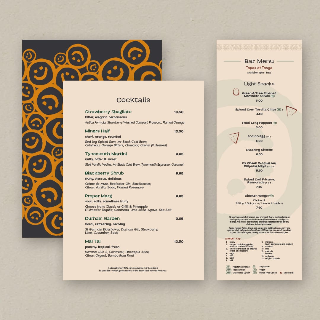
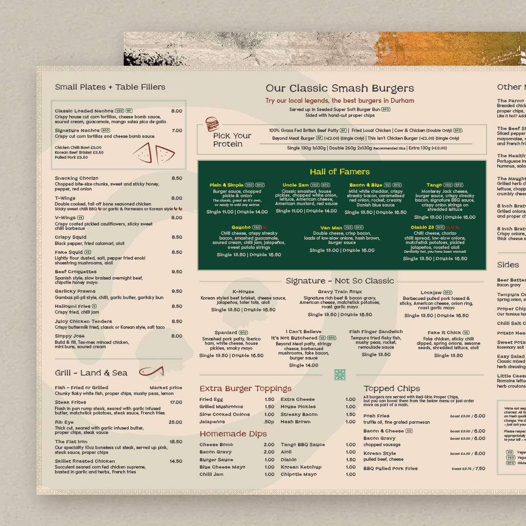
- Menu redesign
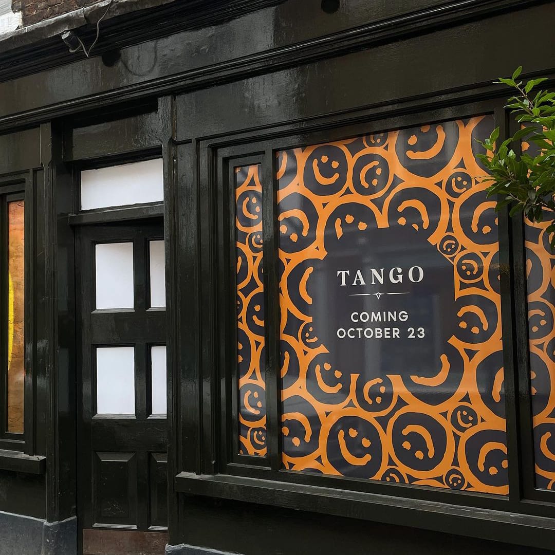
Tango is a burger-based restaurant in Durham, classed as local legends for their burgers within the area. Tango is our second project from the Zen Group’s portfolio, and we were tasked to revamp Tango as they were moving venue location within Durham and wished to build upon their current brand, focussing on their established customer but also attracting new markets whilst being able to grow the overall expanding offering.
As with The Rabbit Hole, this project started with visits and workshops with the owners to understand their new vision for Tango, implementing our standard 3-point process, we were able to craft a new brand foundation. The result was to establish Tango as a ‘Social Bar and Kitchen’, allowing guests to “kindle conversations over Latin American inspired flavours that dance on the palate”.
For this branding update, we explored various themes relating to the Tango dance, the movements, and origins, plus, wider Latin American values and historic design. The logo itself had a minor refresh, but we were able to introduce a range of brand collateral and elements such as patterns, textures, colour, and iconography with influences from our research. One key element was a mural which fuses elements of Durham, such as the Elvet Bridge and connections to the area’s history with the smiley face icon as a pop of bright colour, into one piece of art. The mural was used in relocation advertising and you’ll now see it across a selection of menus.
We introduced the smiley face graphic icon as a key part of the brand which can be found on the mural, signage and across the website and menus. It’s all about bringing a cheeky splash of fun elements to the branding that represents one of the brand values.
We also redesigned the website to bring in the new branding, while re-working the user experience for easier access to see key information about Tango, such as the menus and booking platform.
The result creates a bigger, better Tango with respect to its roots and allows for a wider scope of offerings and audience, where guests can come together in the heart of Durham to share good times and great food.
The Rabbit Hole Branding
Digital
- Branding Strategy
- Operational items and signage
- Website design and creation
- Brand social assets
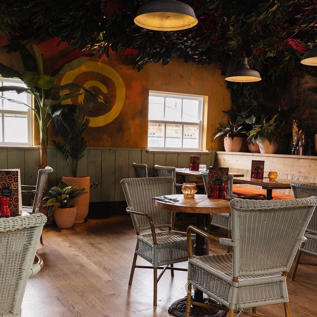
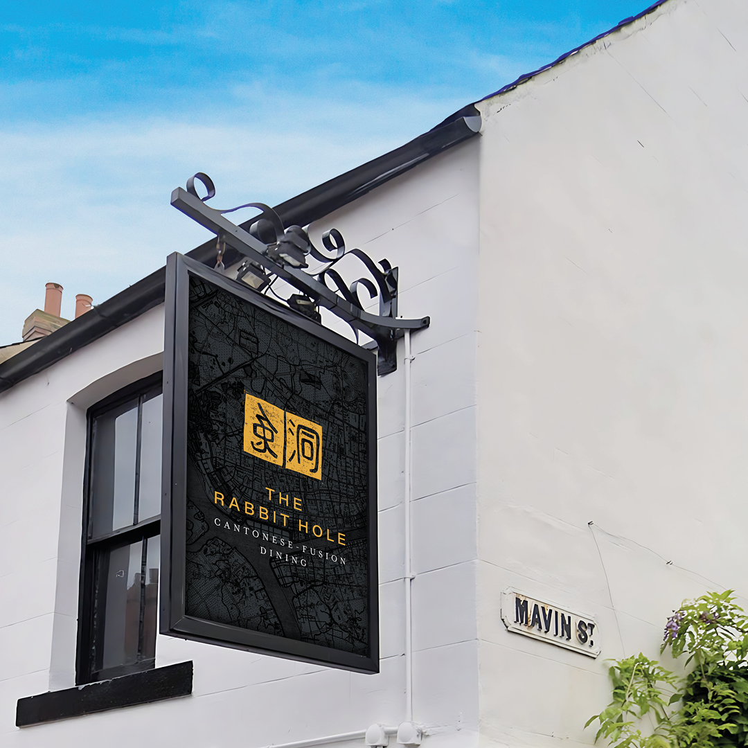
The Rabbit Hole is a Cantonese Fusion Restaurant in the heart of Durham.
The concept is within the Zen Group’s portfolio. We were chosen to work on a complete revamp of the brand to clearly communicate their offering, feel approachable yet luxurious, and to create a cohesive brand language across all of a guest’s touchpoints.
We were very excited to work with a local brand which was already established and loved in the area. Following initial visits to the site, discussions, and workshops with the owners, we got to understand their vision and the market we were targeting. We implemented our 3-point process. With research into the area, food, and culture, we created a story that encompassed the values and proposition of the brand. The results were ‘Explore time-honoured Cantonese and fusion dishes, uncovering new flavours that stir your senses.’
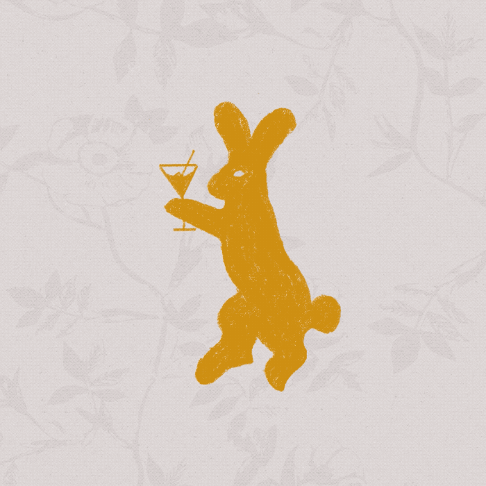
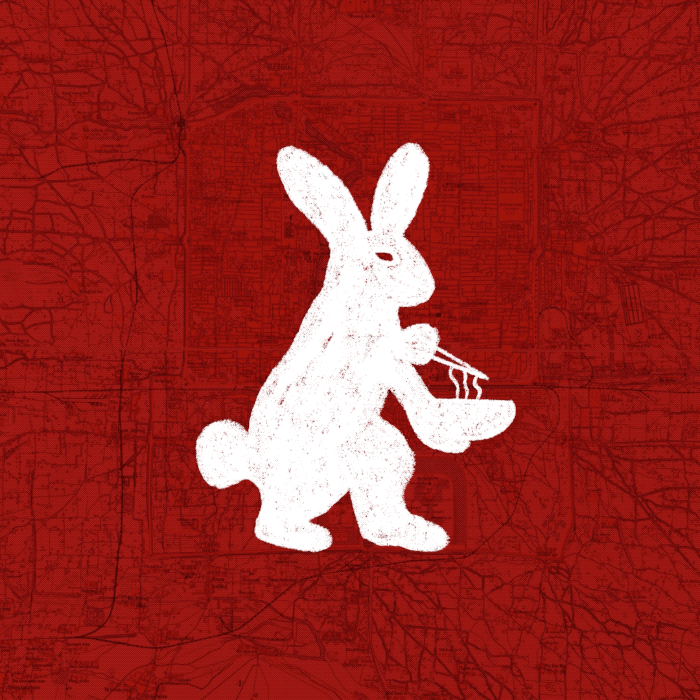
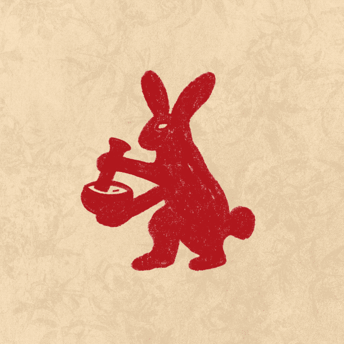
With further research into the culture of the rabbit name we discovered the rabbit has a lot of significant meanings and interpretations – The traditional Chinese character used for rabbit is a pictographic character of the wild rabbit with long ears and a short tail. The rabbit also symbolises the moon. According to ancient legend, Chang’e Flying to the Moon where Chang’e drank the elixir of life and flew to the moon with a white rabbit in her arms, therefore it was believed the spot on the moon to be the rabbit. The moon rabbit is seen pounding the elixir of life in a pestle and mortar.
We used this reference to create the new logo and we also created a character mascot of the rabbit as an illustration so that we could show him come to life in animation – grinding the pestle and mortar, lifting noodles from a bowl with chopsticks, sipping a martini, playing a saxophone – bringing him to life on the website and as social media assets that we created as part of the branding work to show all the offerings that the venue includes.
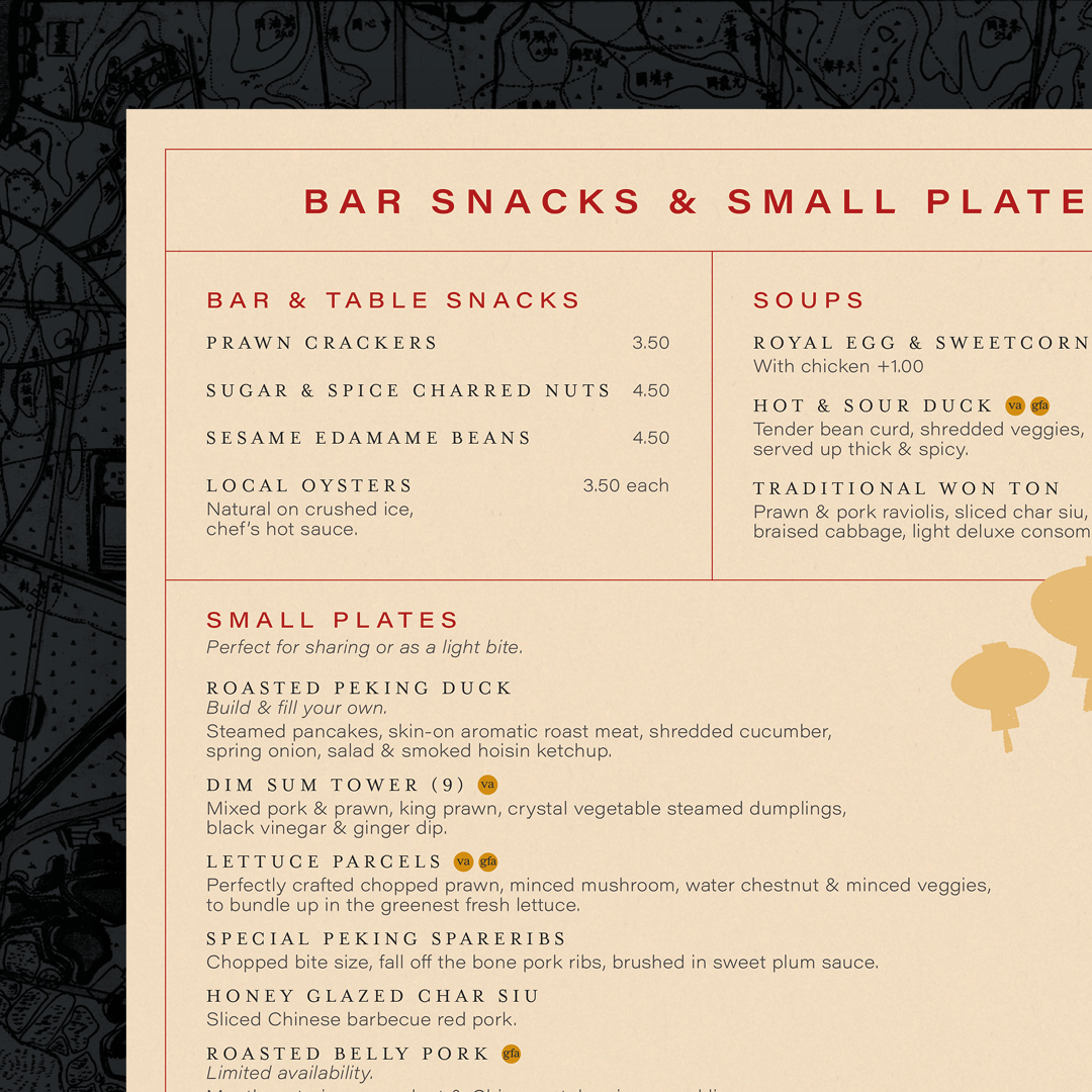
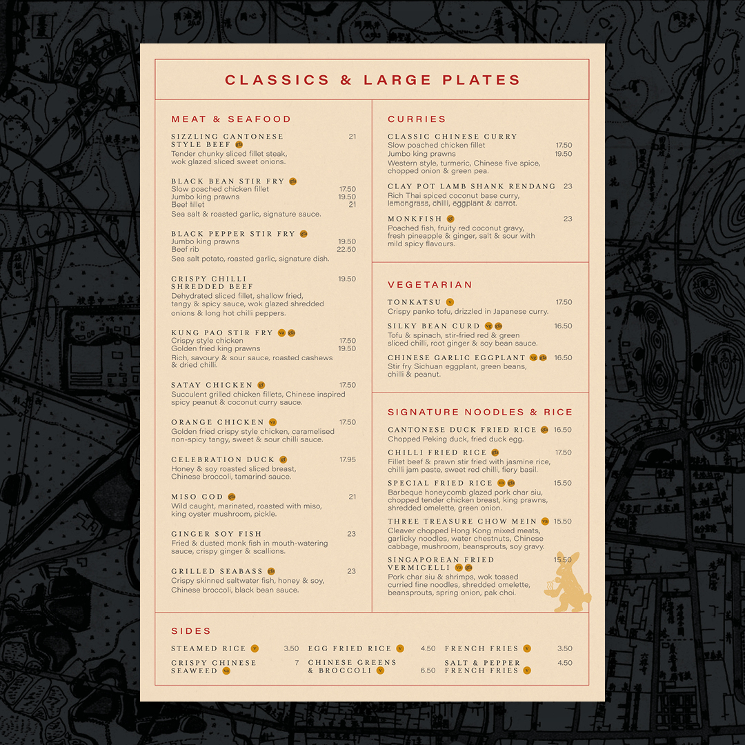
The website and items such as menus include textures and style references to Cantonese life and art, Chinese handscrolls and seals, and the logo created is styled as in Chinese culture, families and artists would use signature stamps to sign off important documents and pieces of artworks, so we created a unique stamp as The Rabbit Hole logo.
Colours and typefaces used all have a reason whether they relate to tradition, add richness or a splash of modern contrast.
Stirring the senses is at the heart of the story and sums up the experience at The Rabbit Hole as a journey of exploration.
Branding and Strategy
Digital

- Brand Strategy
- Brand Development
- Creative Campaign
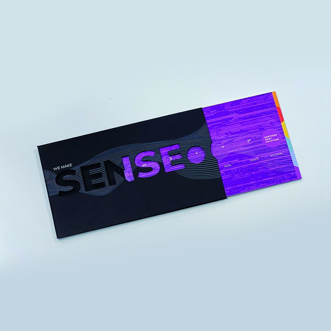
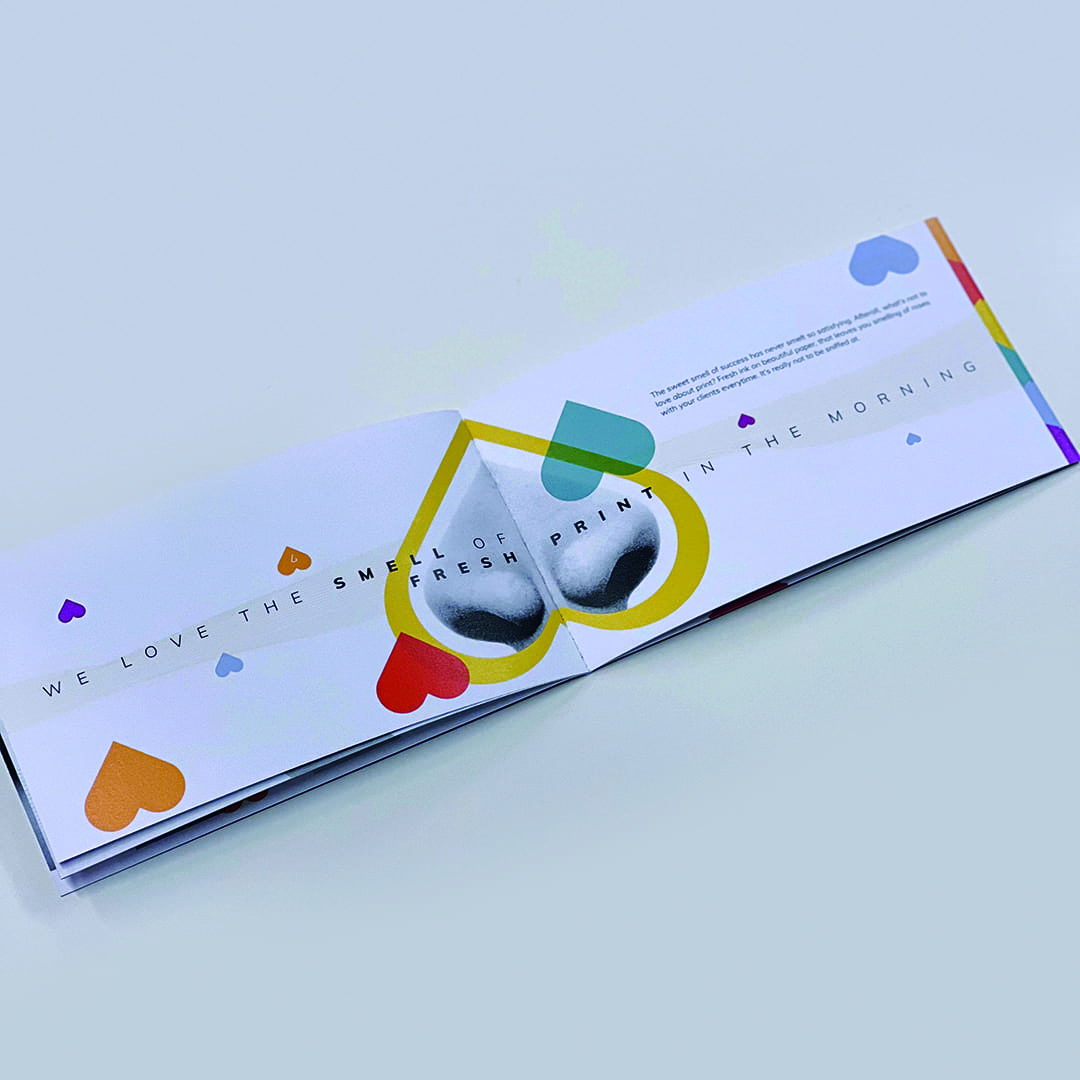
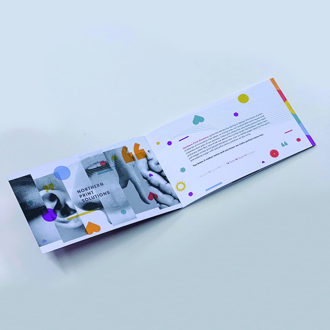
Printing solutions that press all the right buttons.
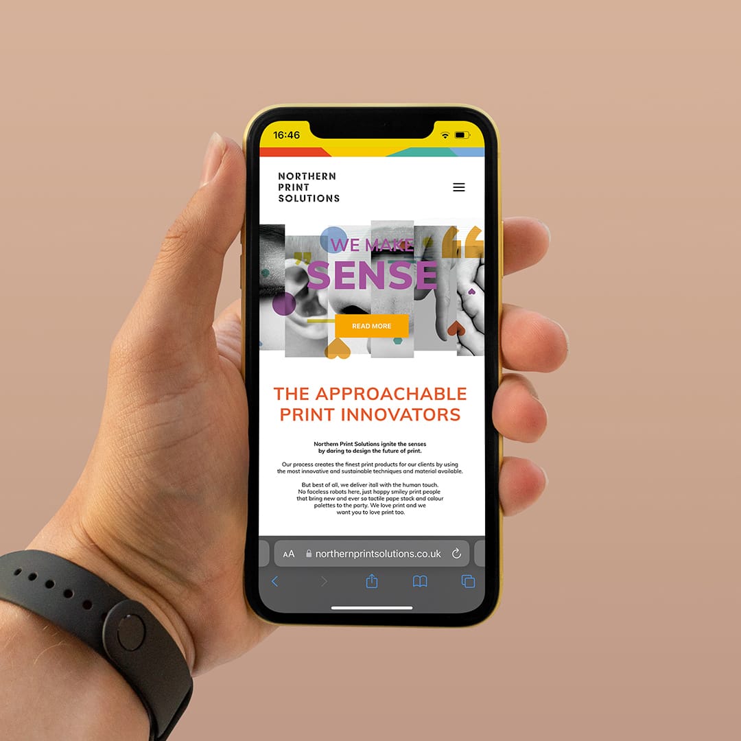
Northern Print Solutions are a bespoke printer based in the North East of England. We recently worked closely with them on their vision for moving forward with their branding and strategy to target specific markets.
It’s always good to hear from our clients how they felt about the journey of working with us.
Cath Riley, Director of Planning, People and Commercial Operations at Northern Print Solutions said:
With big ambitions for the next five years, our business recognised that the power of our brand would be fundamental to achieving the huge changes that we faced both externally and internally. The team at Curate invested significant time up front with us, getting to understand where our business was, where we wanted to be and the challenges we faced. With a fresh pair of eyes, they came up with a brand refresh that maintained the personality that our clients knew and loved us for, yet resonated significantly with our changing target market.
The results to date have been incredible, which has generated a significant step-change in the business, including:
- Greatly improved target market brand engagement, resulting in a positive change in our inbound leads
- Instead of 1/20 leads meeting target qualification 5/10 now meet qualification
- 20x ROI
- Enhanced rate of cultural change and adoption of business practices to meet our target market needs as our team understands tour brand more than ever
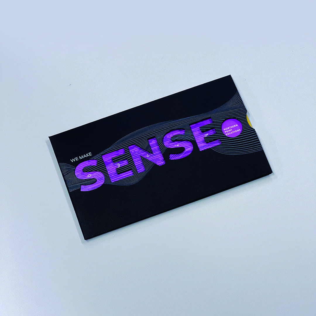
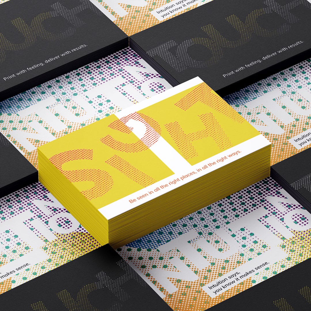
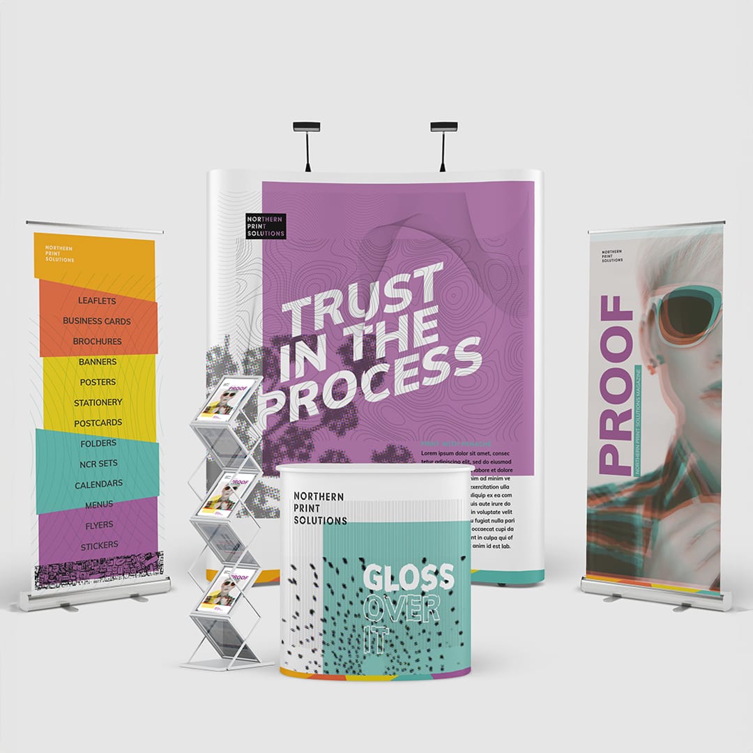
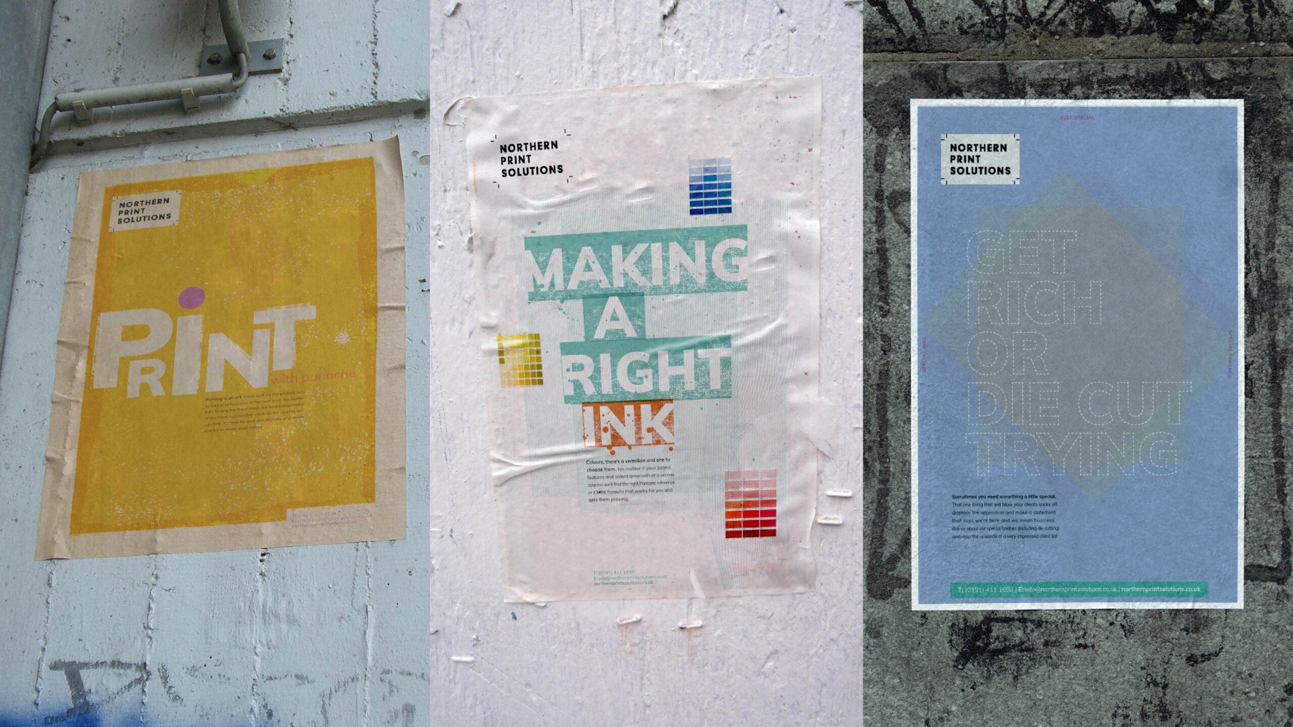
We created a thorough brand strategy document that built a pathway for the business to follow and worked closely with the whole team to encourage a greater understanding and belief in the changes that were being made. This included updating their brand guidelines to a new colour palette, more expressive typography and a range of graphics and visuals to represent printing techniques that worked whether they were communicating in print or digitally online so that their messaging could transition across a bespoke tactile print piece or across their website and social channels.
We then created a campaign that helped express their key message through all the senses and how their business effects them, “we make sense” from the sweet smell of fresh print to the tactile touch of a textured stock.
It’s a great feeling to see another happy client and some very positive results.
TGI Fridays May Party Month Campaign
Digital
- Brand support
- Campaign Creative
- Promotional Marketing
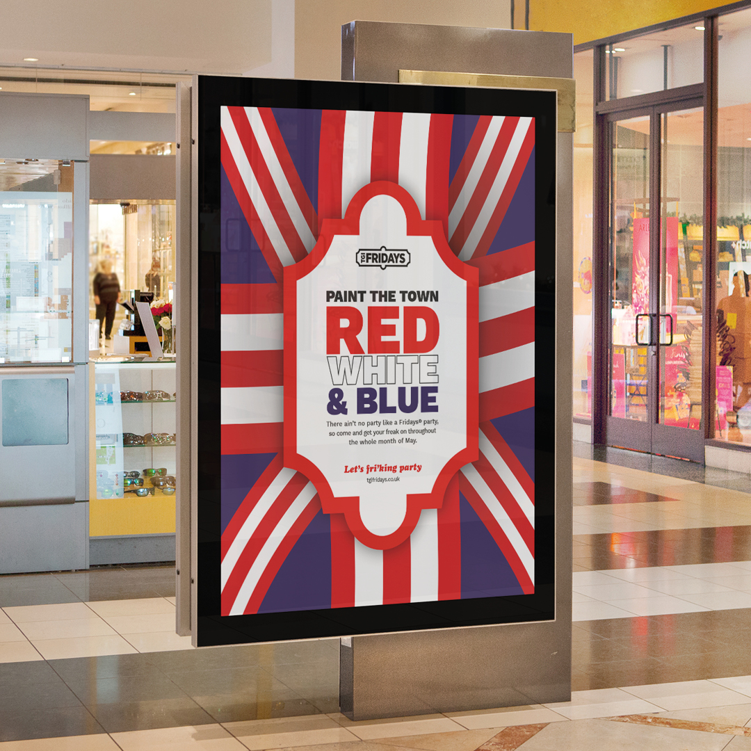
The month of May this year was certainly a month of celebrations. Eurovision, multiple Bank Holidays, The Royal Coronation, and of course a few Fridays in to boot! The team at TGI Fridays briefed us to create a series of campaign concepts to tie the whole month together as a ‘party month’ to celebrate and showcase all the activities, promotions and events they were holding during that time.
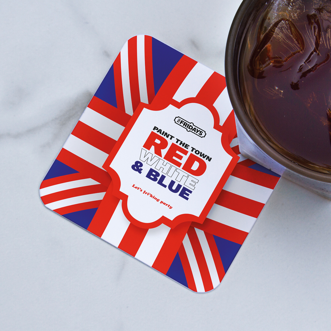
We presented a series of options to the marketing team and our “Paint the town red, white and blue” was a favourite within the directions. By adding blue to their usual palette of red and white stripes we were able to celebrate their unique perspective of celebrating a truly British summer from the viewpoint of an iconic American brand.
The campaign worked across multiple levels and a whole host of assets were created to support the planned in-store activity. These included posters, in-store screens, social media assets and table displays. Each working collectively to inform the customer of all the good times that TGI were creating for them.
A series of specially crafted cocktails were also created by the in-house mixologists and named with a distinctly Eurovision theme. It was British, it was European, it was American, it was unique, it was TGI in May.
Virgin Active Family Branding
Digital

- Family brand creation
- Illustration
- Animation
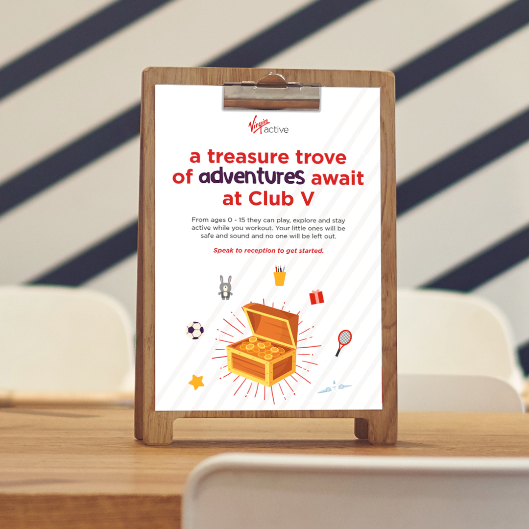
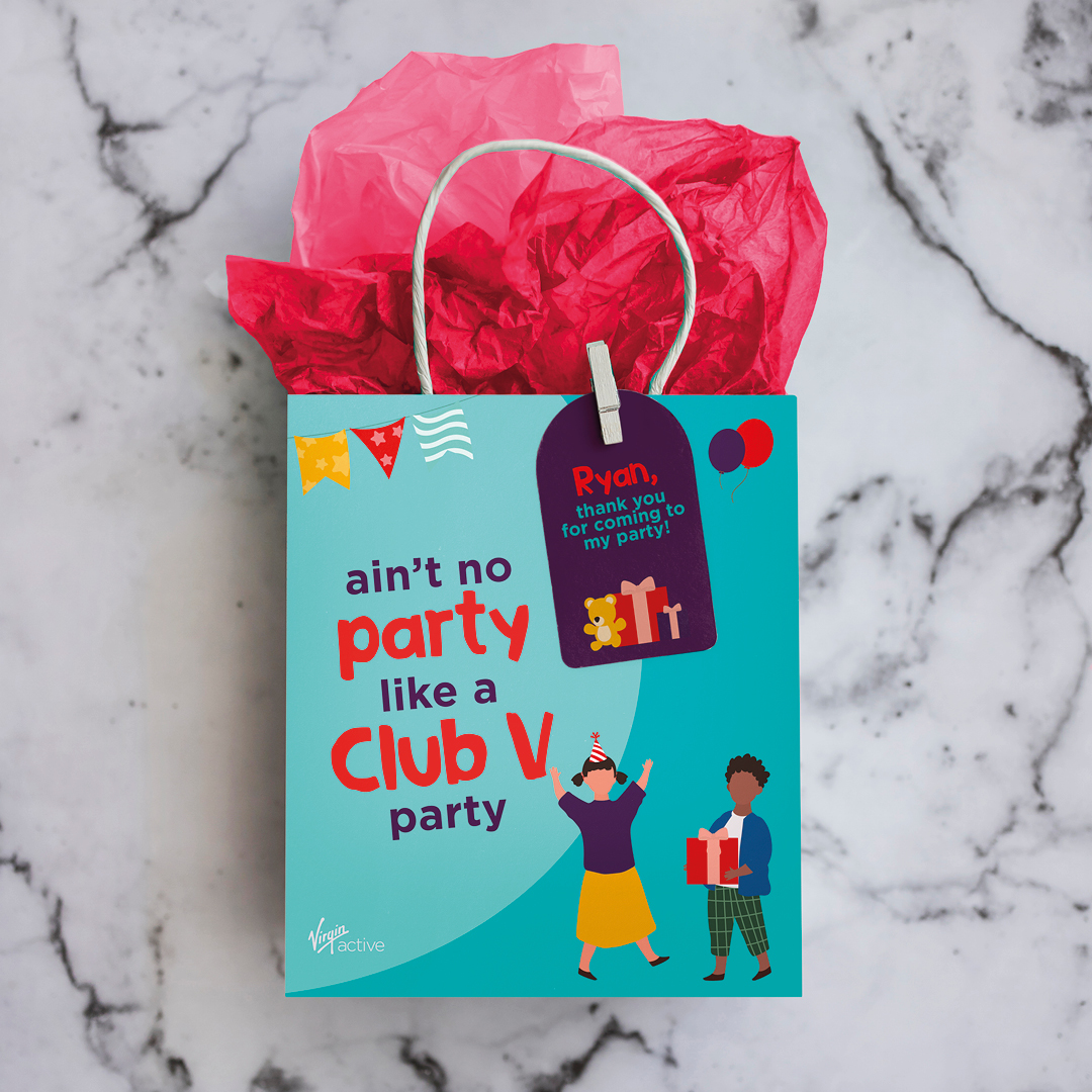
Virgin Active are all about movement for everyone. Their family clubs have an excellent offering for ages 6 weeks to 16 years, including a crèche, Club V full of engaging, inspiring activities, Kids’ camps and swim clubs and galas.
As their creative partner, we were asked to work on the family branding and communications as a sub-section of their overarching brand. Same values and purpose, but with more appeal to various age groups and activities.
To achieve this, we created a tiered design pack so that the style all looks consistent as part of a pack and works together with any cross over categories, but also had a visible difference between the items that are for younger age groups compared to the 14-16 year old range.
We designed a set of inclusive illustrations of young people engaged in all the different types of fitness and wellness activities. We included various pieces of equipment and accessories, so that we could use these to visually represent everything that Virgin Active offer. This was created as a flexible design pack so that we can always keep adding and creating new pieces when the need arises.
We included a mix of photography and smaller aspects of illustration when it gets to the older age groups within the pack and used the brand colours and added some specific new ones to this family brand pack to make sure we had enough flexibility to create the images required but still feel like part of the main Virgin Active palette. We also introduced an additional typeface to add character and a more fun element to highlight the words that were key, active words.
We then applied these to various pieces of collateral and communications, eg a brochure, emails, social media assets, digital screens, posters, flyers and invites.
A bit of subtle animation on the social assets and digital screens adds a bit of fun and brings them to life.
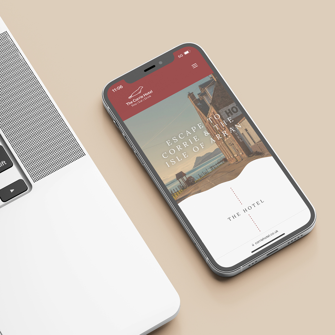
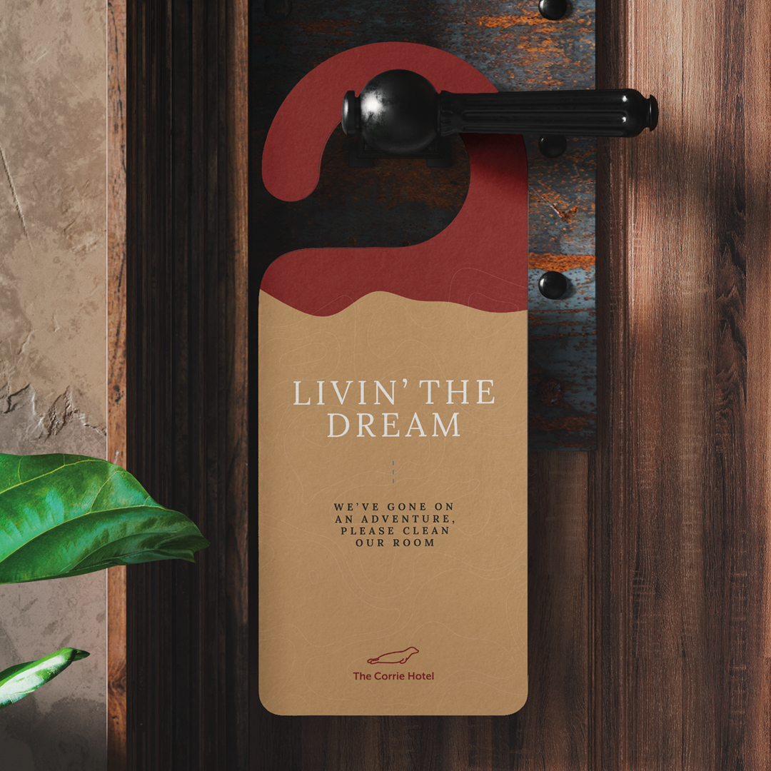
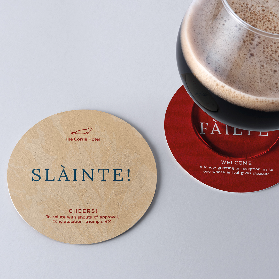
The Corrie Hotel Brand Development and Website
Digital

- Brand development
- Menus
- Website design and build
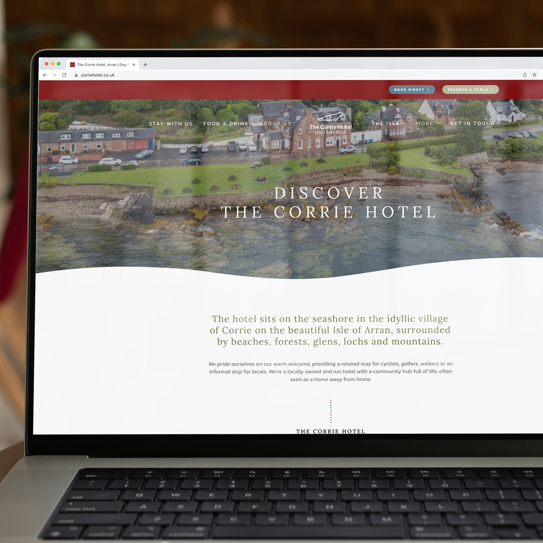
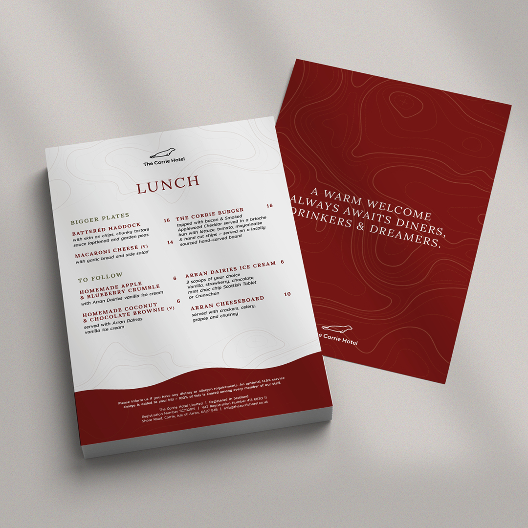
We were asked to help them transform their brand and proposition, (but not their logo), so that they could become a strong hub for visitors and locals on the island. They wanted their brand to be synonymous with The Isle of Arran and be one of the foremost recognisable places to visit.
So, for this we made a point of learning all about the history of the building and the location and to understand the attractions on the Isle. We investigated everything from weather patterns and topography to visitor attractions and ferry timetables. This gave us a great insight into any issues guests would have during a visit to what is a slightly more remote location.
By working with the team as a creative partner, we gained a real insight and started to understand the real hidden gems of such a trip, and this allowed us to create a full brand pack that promoted The Corrie Hotel in the best way to their guests. It was a useful process for their whole team and allowed the brand to become one of the most accessible in the region for tourism.
But the real cherry on the cake was when we applied all of this to their new website, which we developed from the ground up ensuring the user experience and information available all works together for the most enhanced guest journey. It has become a real shop window for The Corrie Hotel and shows the hotel interiors, beautiful location and localised information and attraction information to the fullest.
It was a real 360 approach as the website really thrives because of the work we put into establishing the brand proposition and the brand really works because it now has the website it deserves.
Andrew Garbutt and Rodger Meadows, The Corrie’s joint owners said:
The team at Curate were a pleasure to work with from the start to the fruition of our new website. They took time to understand our market, customer and business in depth and were great at both listening and getting the job done. They have a keen eye for design and ensuring it was the perfect match for our market and commercially for the business. They are also very likeable people, and we would have no reservations in recommending them to others.
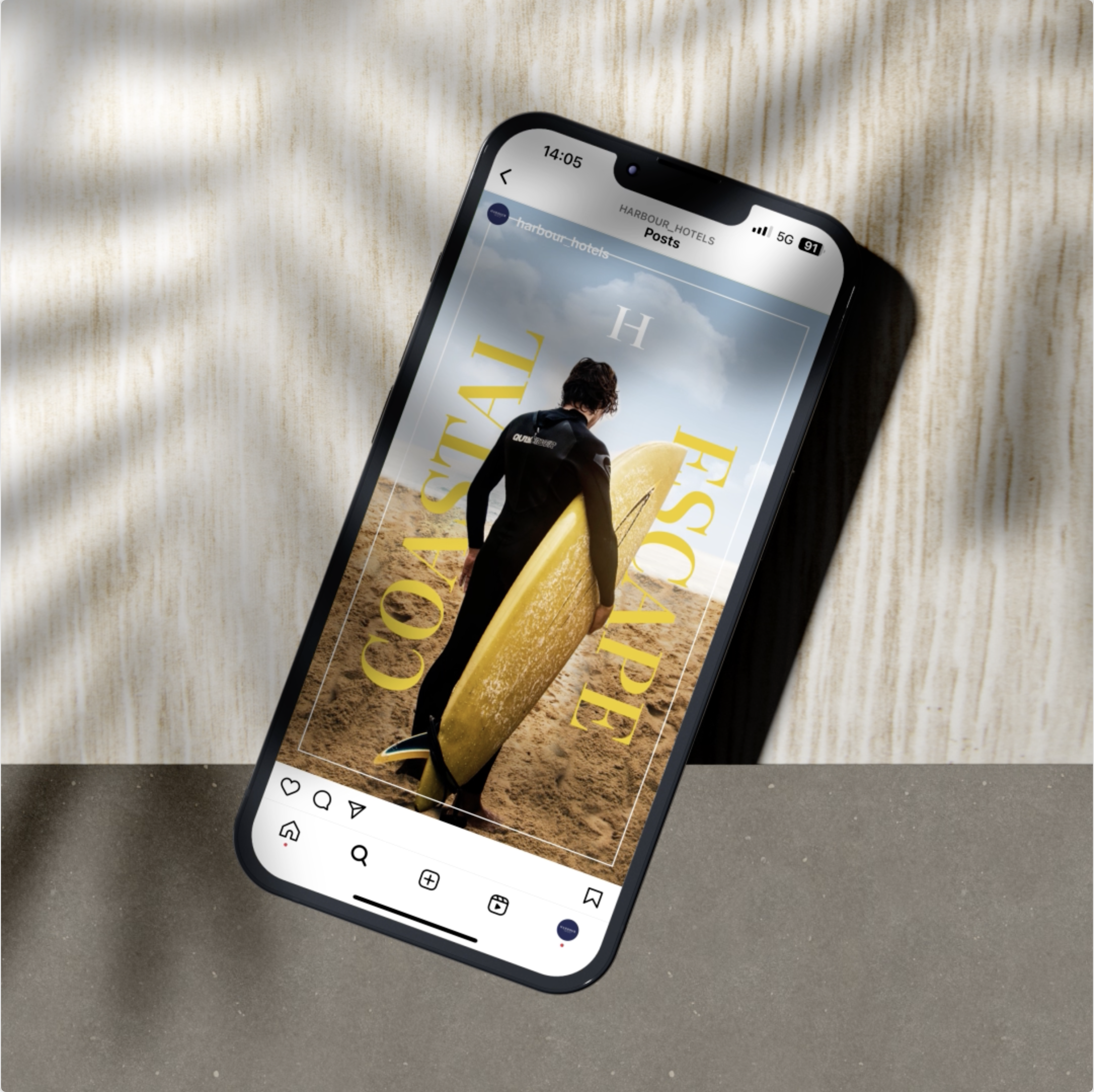
Harbour Digital Activity
Digital
- Brand support
- Digital Campaigns
- Social Media
Harbour Hotels have come a long long way since their initial conception. They now own and operate 15 hotels across the county, with ambitious plans to grow across the leisure and hospitality sector in the coming years.
We were initially brought on board to create a stronger brand presence through the production of a solid, but flexible set of guidelines and collateral. These guidelines were set to work across the board, but had a strong emphasis on their printed and digital collateral. But times change and so did Harbour’s audience. As they became younger, more trend conscious they needed to create social media that engaged this increasingly more tech savy audience.
Harbour understoood that they couldn’t create posts and content that felt formulaic and standard. They needed to break the mould more often than not. As their creative partner, we understood the need for flexibility within their guidelines and this also applied when creating a set of engaging social media templates.
When is a template not a template? When we build them is the answer to that. Brands don’t want or need a structure that limits what and how they can communicate. They want to excite and grab the attention of the customer, without losing their core styling or tone of voice. Harbour’s social media doesn’t always have to play by the rules, it can break out to create impact for campaigns and offers and be more restrained for serious messages. It should always feel on brand but be willing to flex when needed.
Above all we made the process a simple one. Partnering up, understanding exactly what they needed and why, making impact where possible and engaging their audience with a graphical style that didn’t feel templated.
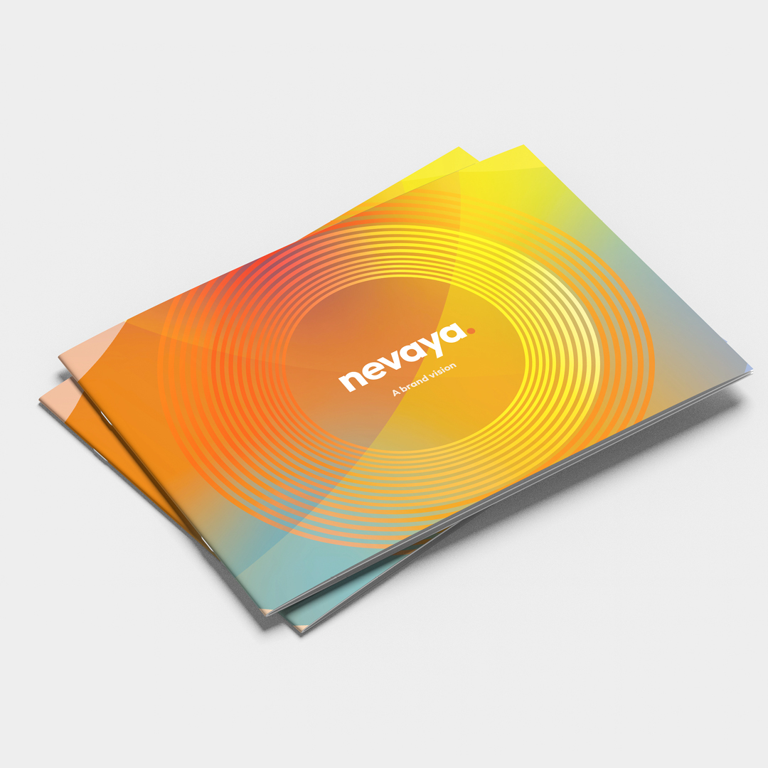
Nevaya Brand Refresh
Digital

- Brand development and curation
- Website design and build
- On-going support
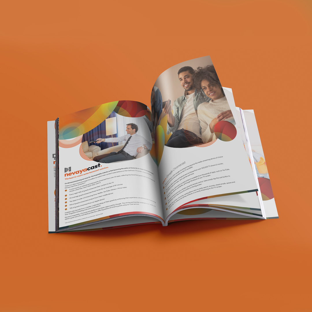
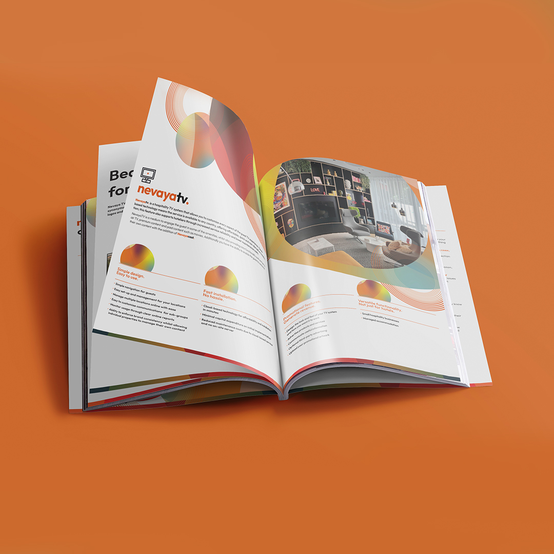
Nevaya deliver TV solutions for the hospitality industry with a host of partners and clients across the globe. They have created an array of amazing products that protect the end user's privacy, whilst also allowing them to cast their own media to in-room hotel TV’s in a completely seamless process.
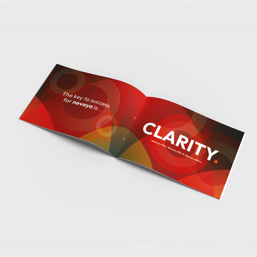
We were tasked with taking their brand to the next level by developing a full set of extensive guidelines, define their proposition and set the standards for their many sub-brands and modules.
The first step was to understand the brand and its many products, so we could clearly define their ‘who, what and why’ theories. We felt that we needed to create a clear picture around each sub-brand and filter all the documentation that supports these products. The process was really thorough as we had to understand how each sub-product worked and what their USPs are.
Once we had defined the brand proposition, we set about creating colour palettes, defining typography and building visual assets. The tone of voice was also added to the mix to create a complete brand that is both flexible enough to be creative but also be structured and consistent enough to create impact.
We always work very closely with brands during and following a project like this and use the guidelines we’ve set in place to create much more of their brand collateral in a consistent and recognisable manner. This so far has covered everything from stationery to product documentation and email templates.
Nevaya is a constantly developing brand that is growing from strength to strength, so keep keep an eye out for their work the next time you’re staying at a hotel. They’ll probably be on a screen near you.
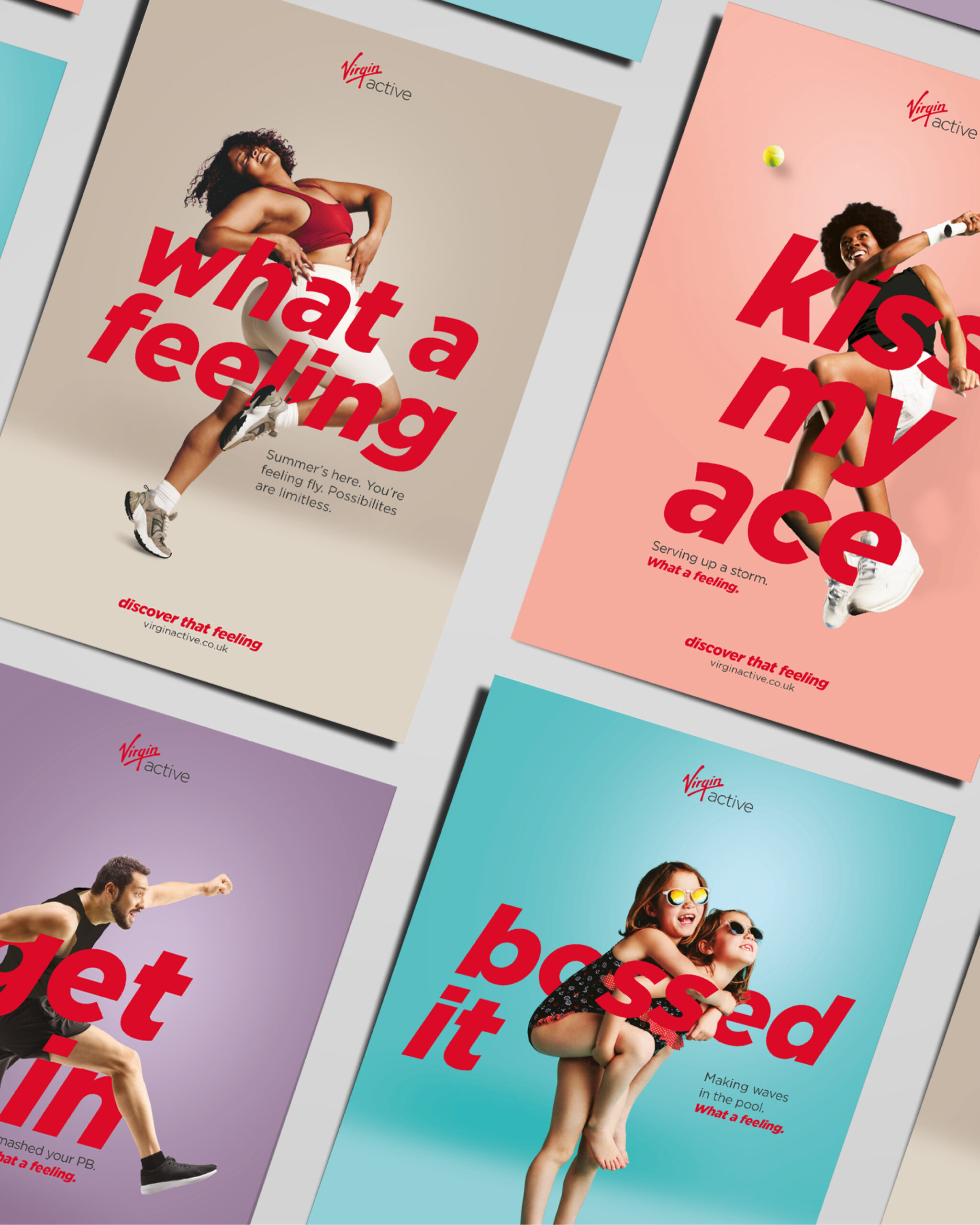
Virgin Active Summer Campaign
Digital
- Campaign
- Brand Messaging
- Copywriting
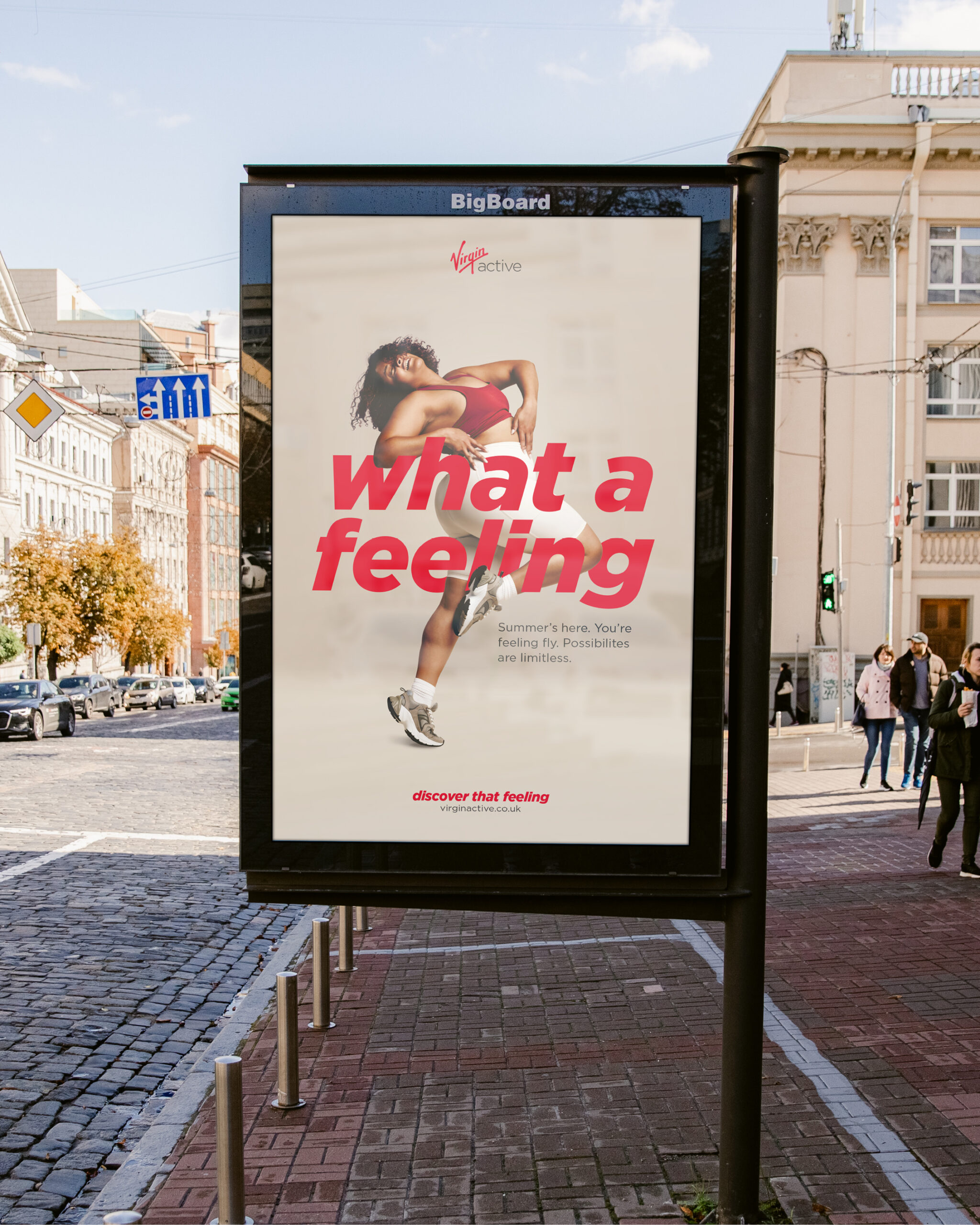
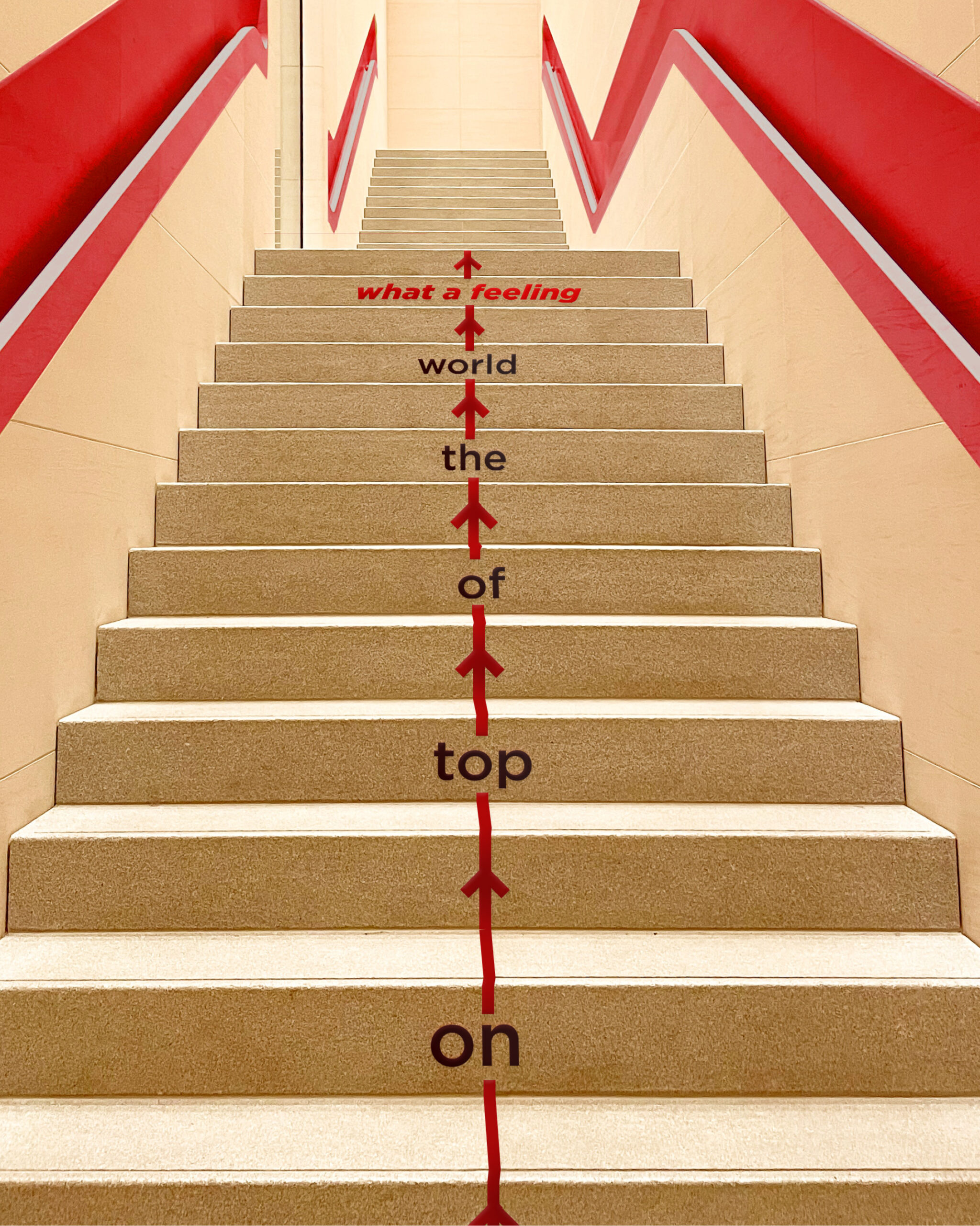
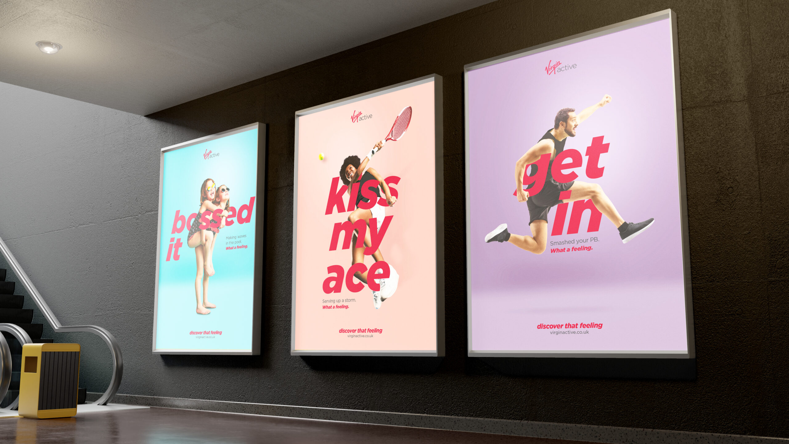
We wanted the imagery to be punchy and bold and really make a statement with the typography intertwined, working with the Virgin Active tone of voice and brand colours to create a premium feel. We chose the imagery with an emphasis on the emotion and feeling to really support the campaign headline of “What a feeling”.
The campaign assets are live in print and digital forms on the website, social media, leaflets, posters and digital screens. We also animated the digital assets to create energy and movement.
We’re so happy with the results. We just have to see if we can touch our toes now. What a feeling.
Branding and Website Design
Digital
- Branding
- Stationery
- Website design and build
- Social media support
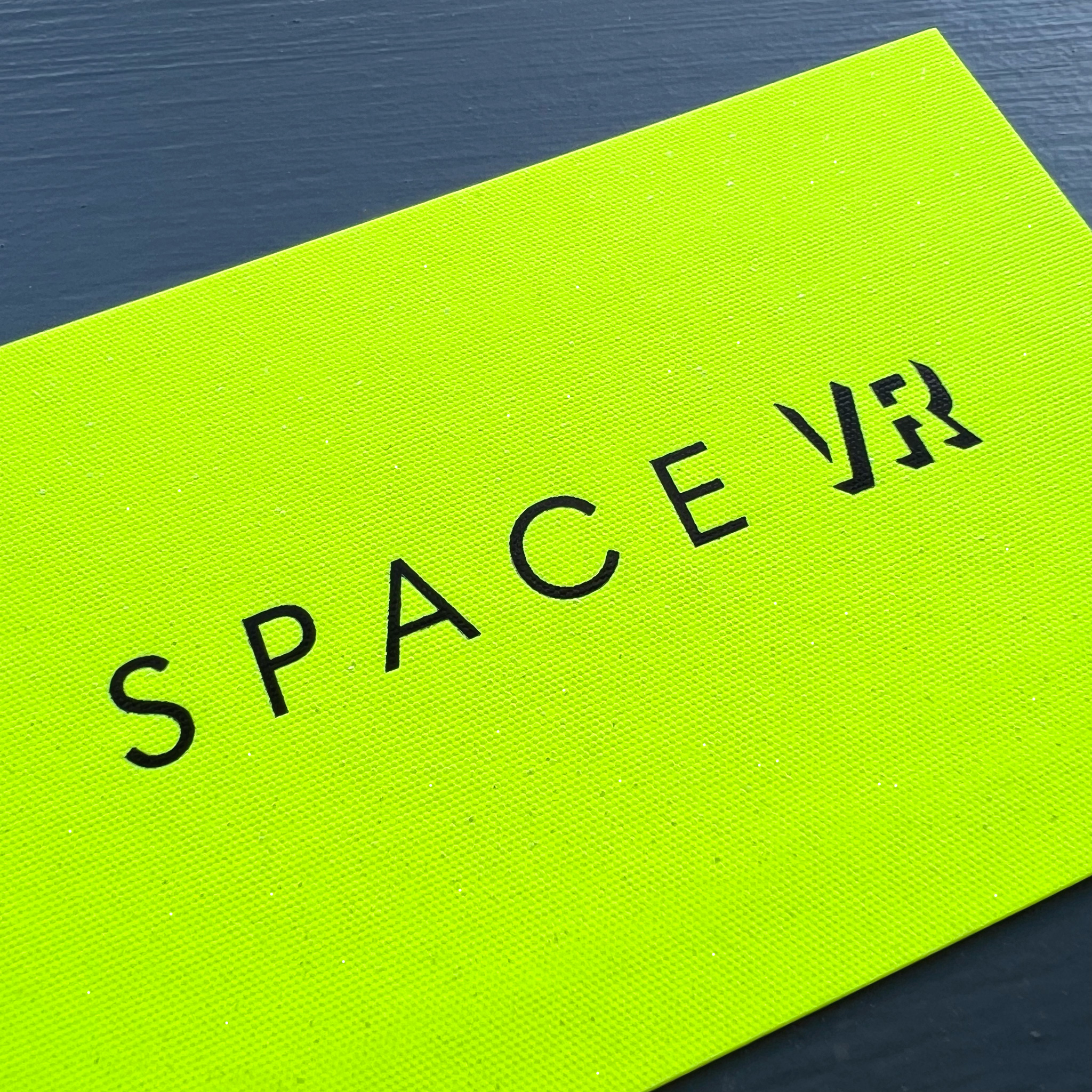
Space VR is a virtual reality and CGI animation company, primarily servicing the architectural sector. With cutting-edge technology and a team of very talented artists, they bring a client’s vision to life. From interior design and architecture to product design and animation, they have it covered.
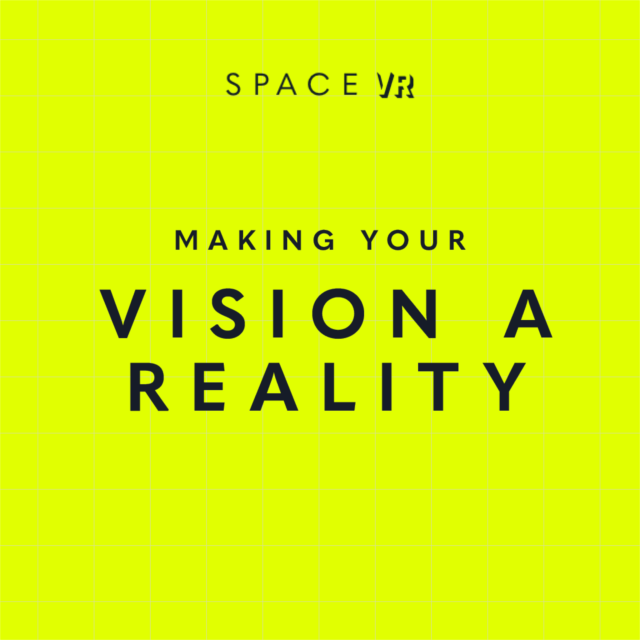
We work with their team as their creative partner and created their new identity and brand to launch their services. The aim was for the design to feel fresh, forward-thinking and slick, so that it shows off their services in a visual and informative way. This means that whether you understand VR, CGI and photogrammetry or don’t know your 3D from your 360s, their branding and messaging meant they could clearly market their services whilst educating and highlighting the benefits to the customer.
We created icons for each of their services to visually represent them with a clear description of the services.
The typefaces we chose were to look clean and project the ‘VR’ part from the page. We chose a colour palette that includes a soft grey/blue and a super-vibrant acid yellow, to create a sophisticated and confident contrast. Images and video of the services are key within their website to showcase their offering to the fullest, so we worked the branding to support and elevate this with a subtle mapping texture background.
We selected a gorgeous G F Smith paper – Gmund Action Vibrant Arsenic 430gsm for the business cards, printed with IPW1, which had real stand-out.
The team at Space VR were very happy with the results and so are we.