The Rabbit Hole Branding
- Branding Strategy
- Operational items and signage
- Website design and creation
- Brand social assets
The Rabbit Hole is a Cantonese Fusion Restaurant in the heart of Durham.The concept is within the Zen Group’s portfolio. We were chosen to work on a complete revamp of the brand to clearly communicate their offering, feel approachable yet luxurious, and to create a cohesive brand language across all of a guest’s touchpoints.
We were very excited to work with a local brand which was already established and loved in the area. Following initial visits to the site, discussions, and workshops with the owners, we got to understand their vision and the market we were targeting. We implemented our 3-point process. With research into the area, food, and culture, we created a story that encompassed the values and proposition of the brand. The results were ‘Explore time-honoured Cantonese and fusion dishes, uncovering new flavours that stir your senses.’
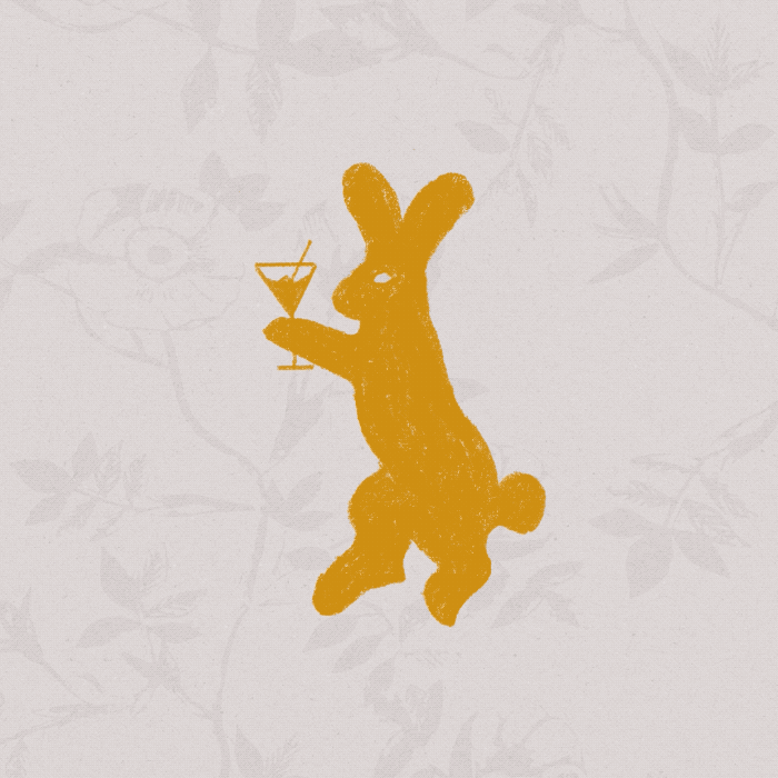
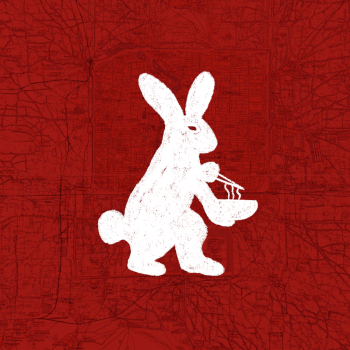
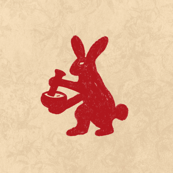
With further research into the culture of the rabbit name we discovered the rabbit has a lot of significant meanings and interpretations – The traditional Chinese character used for rabbit is a pictographic character of the wild rabbit with long ears and a short tail. The rabbit also symbolises the moon. According to ancient legend, Chang’e Flying to the Moon where Chang’e drank the elixir of life and flew to the moon with a white rabbit in her arms, therefore it was believed the spot on the moon to be the rabbit. The moon rabbit is seen pounding the elixir of life in a pestle and mortar.
We used this reference to create the new logo and we also created a character mascot of the rabbit as an illustration so that we could show him come to life in animation – grinding the pestle and mortar, lifting noodles from a bowl with chopsticks, sipping a martini, playing a saxophone – bringing him to life on the website and as social media assets that we created as part of the branding work to show all the offerings that the venue includes.
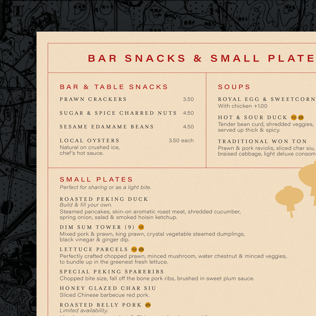
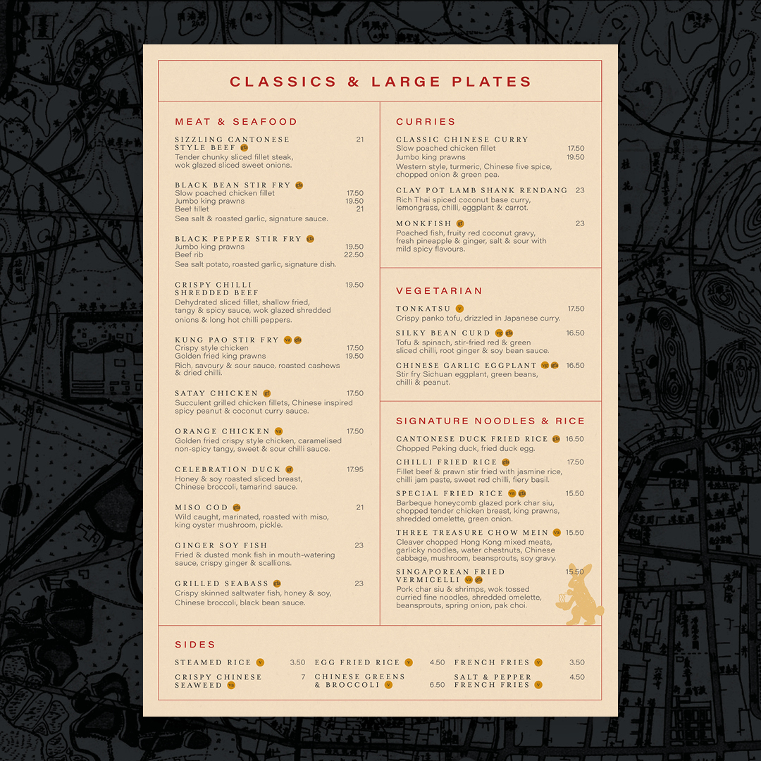
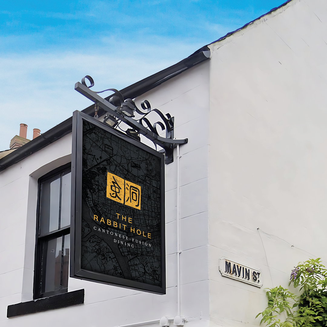
The website and items such as menus include textures and style references to Cantonese life and art, Chinese handscrolls and seals, and the logo created is styled as in Chinese culture, families and artists would use signature stamps to sign off important documents and pieces of artworks, so we created a unique stamp as The Rabbit Hole logo.
Colours and typefaces used all have a reason whether they relate to tradition, add richness or a splash of modern contrast.
Stirring the senses is at the heart of the story and sums up the experience at The Rabbit Hole as a journey of exploration.