The Corrie Hotel Brand Development and Website

Digital

  • Brand development
  • Menus
  • Website design and build

The Corrie Hotel was built in 1850 on the Isle of Arran. This cosy hotel sits on the seashore in the idyllic village of Corrie, surrounded by beaches, forests, glens, lochs and mountains. It’s the perfect stop for cyclists, golfers, locals, and walkers looking for a warm welcome and great food.

We were asked to help them transform their brand and proposition, (but not their logo), so that they could become a strong hub for visitors and locals on the island. They wanted their brand to be synonymous with The Isle of Arran and be one of the foremost recognisable places to visit.

So, for this we made a point of learning all about the history of the building and the location and to understand the attractions on the Isle. We investigated everything from weather patterns and topography to visitor attractions and ferry timetables. This gave us a great insight into any issues guests would have during a visit to what is a slightly more remote location.

By working with the team as a creative partner, we gained a real insight and started to understand the real hidden gems of such a trip, and this allowed us to create a full brand pack that promoted The Corrie Hotel in the best way to their guests. It was a useful process for their whole team and allowed the brand to become one of the most accessible in the region for tourism.

But the real cherry on the cake was when we applied all of this to their new website, which we developed from the ground up ensuring the user experience and information available all works together for the most enhanced guest journey. It has become a real shop window for The Corrie Hotel and shows the hotel interiors, beautiful location and localised information and attraction information to the fullest.

It was a real 360 approach as the website really thrives because of the work we put into establishing the brand proposition and the brand really works because it now has the website it deserves.

Andrew Garbutt and Rodger Meadows, The Corrie’s joint owners said:

The team at Curate were a pleasure to work with from the start to the fruition of our new website. They took time to understand our market, customer and business in depth and were great at both listening and getting the job done. They have a keen eye for design and ensuring it was the perfect match for our market and commercially for the business. They are also very likeable people, and we would have no reservations in recommending them to others.

Always good to get great feedback. 😊 So, if you’re looking to get away from it all in a place that is one of the most welcoming in the UK then pay The Corrie Hotel a visit… and say hi to Clyde. He’s the carved seal you’ll find in the bay. Unless he’s on another of his travels… 😉

Interested to see how we can help your brand?

Get in TouchSee More Creative

Interested to see how we can help your brand?

Get in TouchSee More Creative

Harbour Digital Activity

Digital

  • Brand support
  • Digital Campaigns
  • Social Media

Harbour Hotels have come a long long way since their initial conception. They now own and operate 15 hotels across the county, with ambitious plans to grow across the leisure and hospitality sector in the coming years.

We were initially brought on board to create a stronger brand presence through the production of a solid, but flexible set of guidelines and collateral. These guidelines were set to work across the board, but had a strong emphasis on their printed and digital collateral. But times change and so did Harbour’s audience. As they became younger, more trend conscious they needed to create social media that engaged this increasingly more tech savy audience.

Harbour understoood that they couldn’t create posts and content that felt formulaic and standard. They needed to break the mould more often than not. As their creative partner, we understood the need for flexibility within their guidelines and this also applied when creating a set of engaging social media templates.

When is a template not a template? When we build them is the answer to that. Brands don’t want or need a structure that limits what and how they can communicate. They want to excite and grab the attention of the customer, without losing their core styling or tone of voice. Harbour’s social media doesn’t always have to play by the rules, it can break out to create impact for campaigns and offers and be more restrained for serious messages. It should always feel on brand but be willing to flex when needed.

Above all we made the process a simple one. Partnering up, understanding exactly what they needed and why, making impact where possible and engaging their audience with a graphical style that didn’t feel templated.

Interested to see how we can help your brand?

Get in TouchSee More Creative

Interested to see how we can help your brand?

Get in TouchSee More Creative

Nevaya Brand Refresh

Digital

  • Brand development and curation
  • Website design and build
  • On-going support

Nevaya deliver TV solutions for the hospitality industry with a host of partners and clients across the globe. They have created an array of amazing products that protect the end user's privacy, whilst also allowing them to cast their own media to in-room hotel TV’s in a completely seamless process.

We were tasked with taking their brand to the next level by developing a full set of extensive guidelines, define their proposition and set the standards for their many sub-brands and modules.

The first step was to understand the brand and its many products, so we could clearly define their ‘who, what and why’ theories. We felt that we needed to create a clear picture around each sub-brand and filter all the documentation that supports these products. The process was really thorough as we had to understand how each sub-product worked and what their USPs are.

Once we had defined the brand proposition, we set about creating colour palettes, defining typography and building visual assets. The tone of voice was also added to the mix to create a complete brand that is both flexible enough to be creative but also be structured and consistent enough to create impact.

We always work very closely with brands during and following a project like this and use the guidelines we’ve set in place to create much more of their brand collateral in a consistent and recognisable manner. This so far has covered everything from stationery to product documentation and email templates.

Nevaya is a constantly developing brand that is growing from strength to strength, so keep keep an eye out for their work the next time you’re staying at a hotel. They’ll probably be on a screen near you.

Interested to see how we can help your brand?

Get in TouchSee More Creative

Interested to see how we can help your brand?

Get in TouchSee More Creative

Virgin Active Summer Campaign

Digital

  • Campaign
  • Brand Messaging
  • Copywriting

We’re feeling very excited to see our Summer Campaign for Virgin Active is now live. It was great fun as always working with the Virgin Active team creating a message for acquisition and retention to express how wellness and exercise can make you feel. From the small wins to the big achievements, Virgin Active can help you discover that feeling.

We wanted the imagery to be punchy and bold and really make a statement with the typography intertwined, working with the Virgin Active tone of voice and brand colours to create a premium feel. We chose the imagery with an emphasis on the emotion and feeling to really support the campaign headline of “What a feeling”.

The campaign assets are live in print and digital forms on the website, social media, leaflets, posters and digital screens. We also animated the digital assets to create energy and movement.

We’re so happy with the results. We just have to see if we can touch our toes now. What a feeling.

Interested to see how we can help your brand?

Get in TouchSee More Creative

Interested to see how we can help your brand?

Get in TouchSee More Creative

Branding and Website Design

Digital

  • Branding
  • Stationery
  • Website design and build
  • Social media support

Space VR is a virtual reality and CGI animation company, primarily servicing the architectural sector. With cutting-edge technology and a team of very talented artists, they bring a client’s vision to life. From interior design and architecture to product design and animation, they have it covered.

We work with their team as their creative partner and created their new identity and brand to launch their services. The aim was for the design to feel fresh, forward-thinking and slick, so that it shows off their services in a visual and informative way. This means that whether you understand VR, CGI and photogrammetry or don’t know your 3D from your 360s, their branding and messaging meant they could clearly market their services whilst educating and highlighting the benefits to the customer.

We created icons for each of their services to visually represent them with a clear description of the services.

The typefaces we chose were to look clean and project the ‘VR’ part from the page. We chose a colour palette that includes a soft grey/blue and a super-vibrant acid yellow, to create a sophisticated and confident contrast. Images and video of the services are key within their website to showcase their offering to the fullest, so we worked the branding to support and elevate this with a subtle mapping texture background.

We selected a gorgeous G F Smith paper – Gmund Action Vibrant Arsenic 430gsm for the business cards, printed with IPW1, which had real stand-out.

The team at Space VR were very happy with the results and so are we.

Interested to see how we can help your brand?

Get in TouchSee More Creative

Interested to see how we can help your brand?

Get in TouchSee More Creative

Launch Collateral

Digital

  • Brand support
  • Menu creation
  • Opening collateral artwork
  • Back of house document design

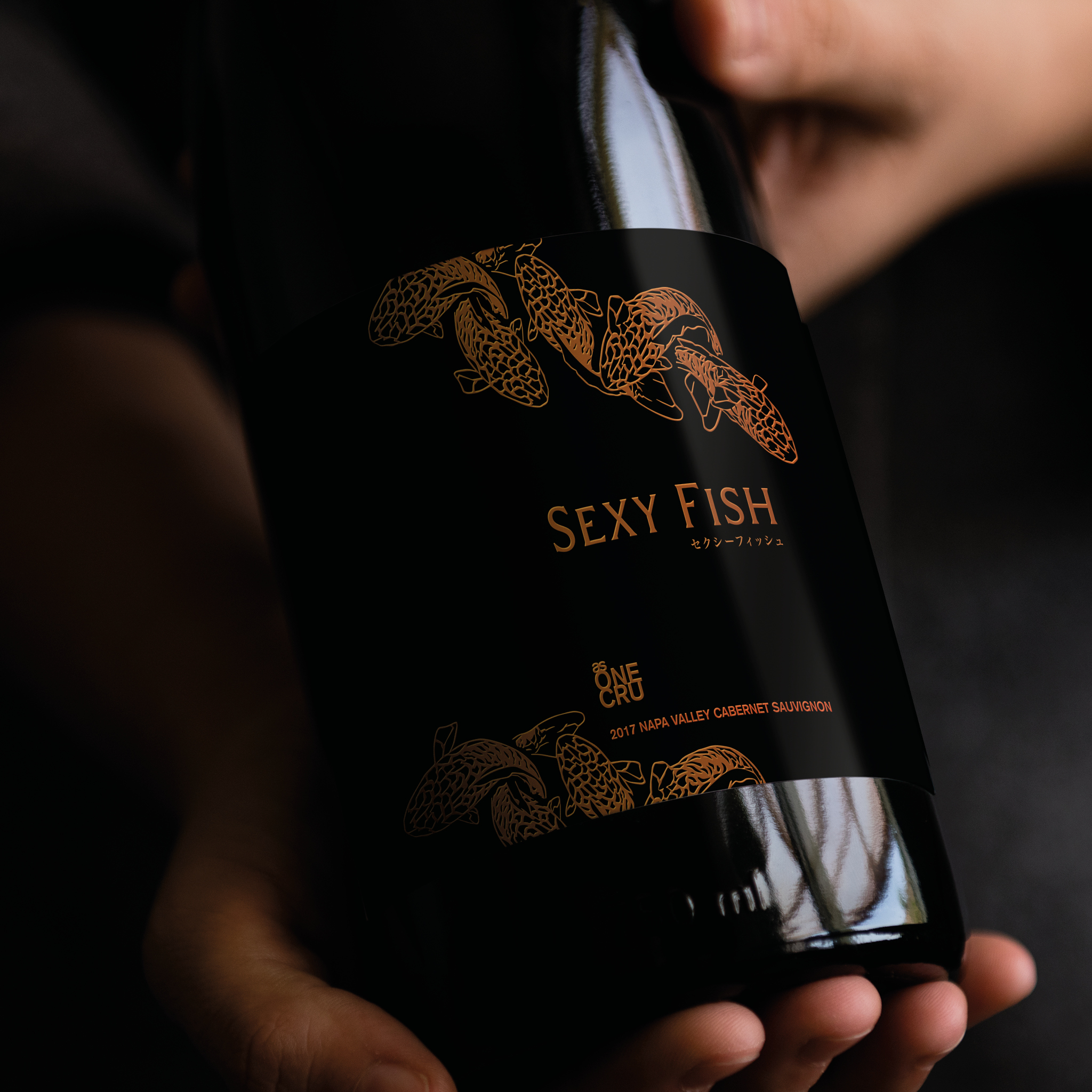
Sexy Fish Miami is a dining experience like no other. A surreal underwater world-inspired space, with original Damien Hirst artwork, a spectacular Asian inspired menu, theatrical cocktails and top International DJs and entertainment.

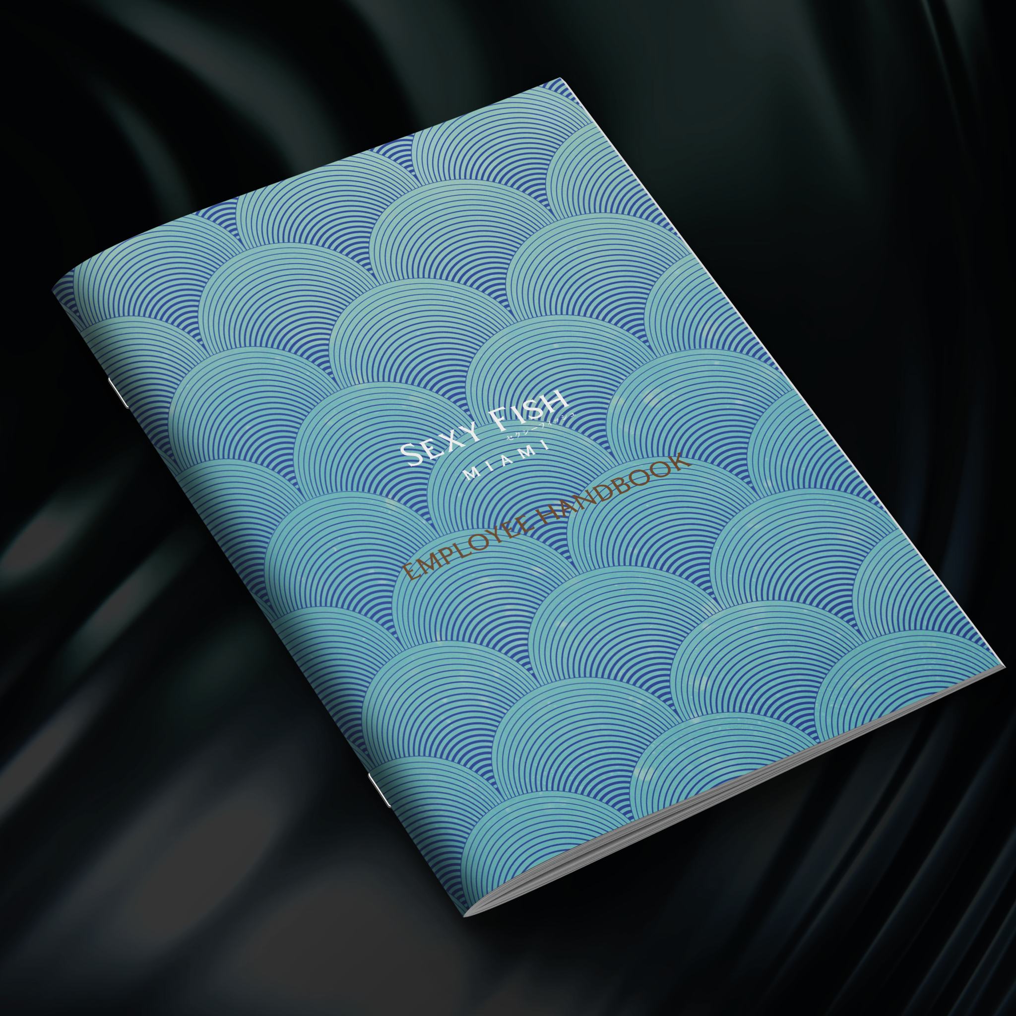
Having worked with the team on their Sexy Fish London location to support with their brand items, we were asked to help support with their launch for Sexy Fish Miami. We produced handbook documents for back-of-house, operational items from labels to menu layouts, and digital assets such as social assets for DJ nights and email assets.

This location involved it’s own beautiful illustrations by Adam Ellis, and making sure the marketing worked with the Miami audience. Working with the team internationally means working with different time-zones, markets and tailoring menu content and events to this market has been really fun and interesting to work with.

It’s amazing to see that it’s now celebrating its 1st Anniversary. Congratulations all round.

Interested to see how we can help your brand?

Get in TouchSee More Creative

Interested to see how we can help your brand?

Get in TouchSee More Creative

Boutique Hotel Branding

Digital

  • Brand creation and curation
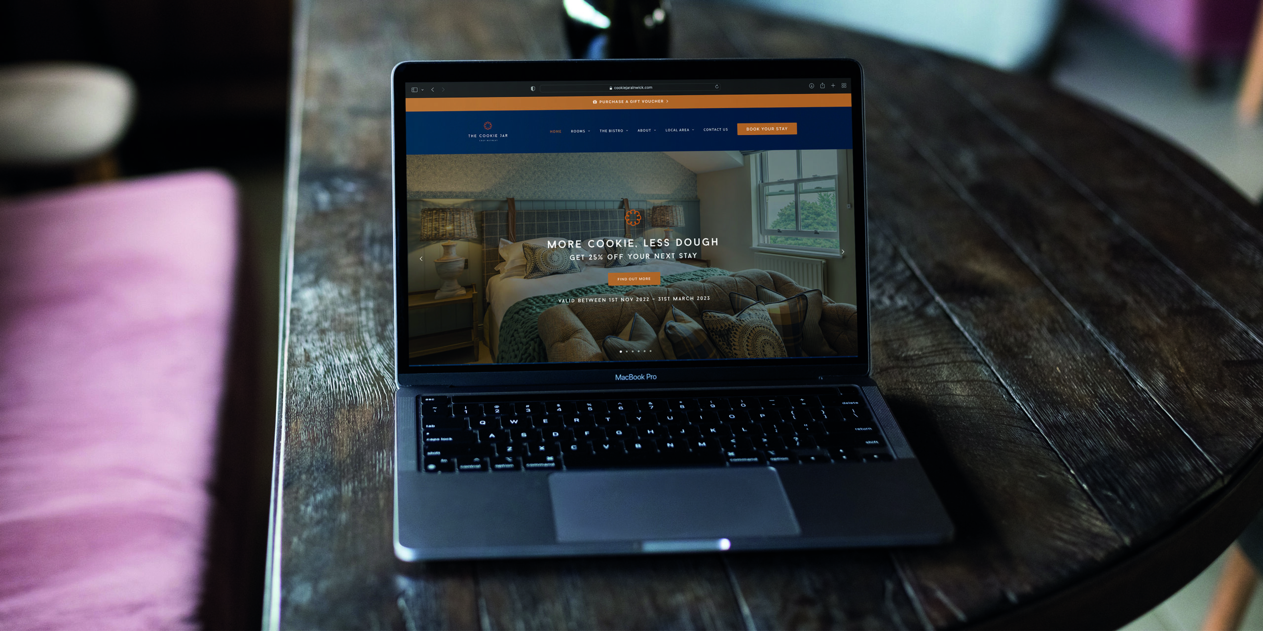
  • Website development and creation
  • Tone of voice and copy
  • Print and digital assets
  • On-going support

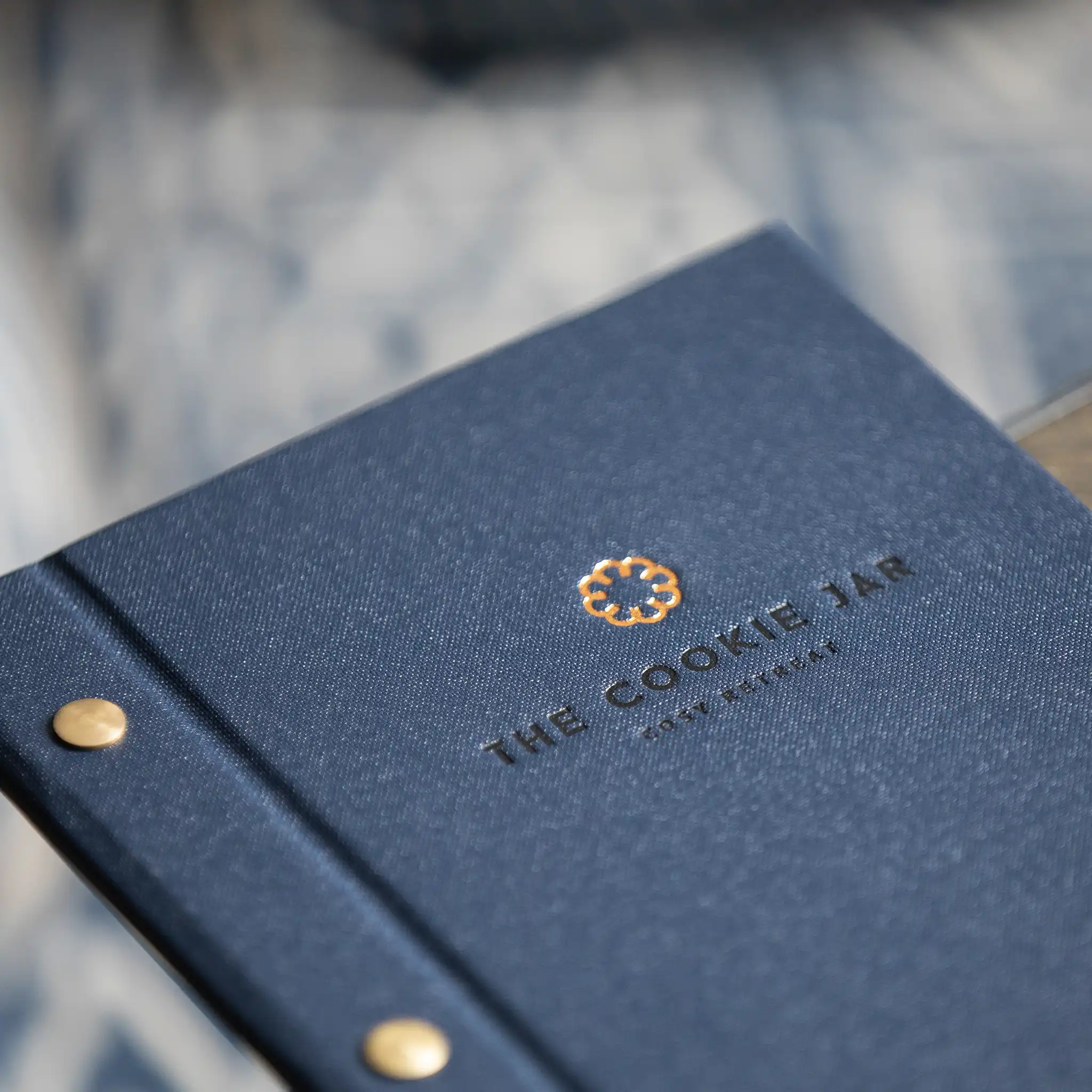
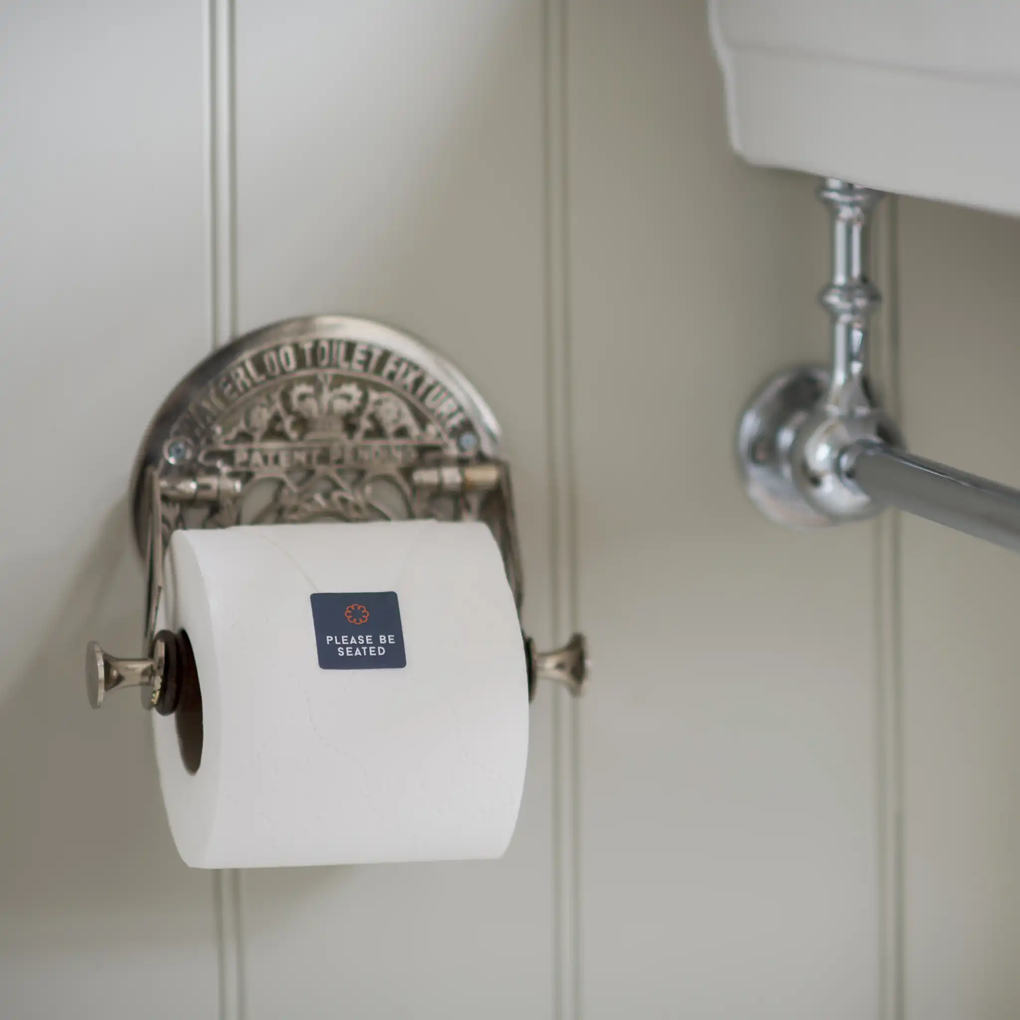
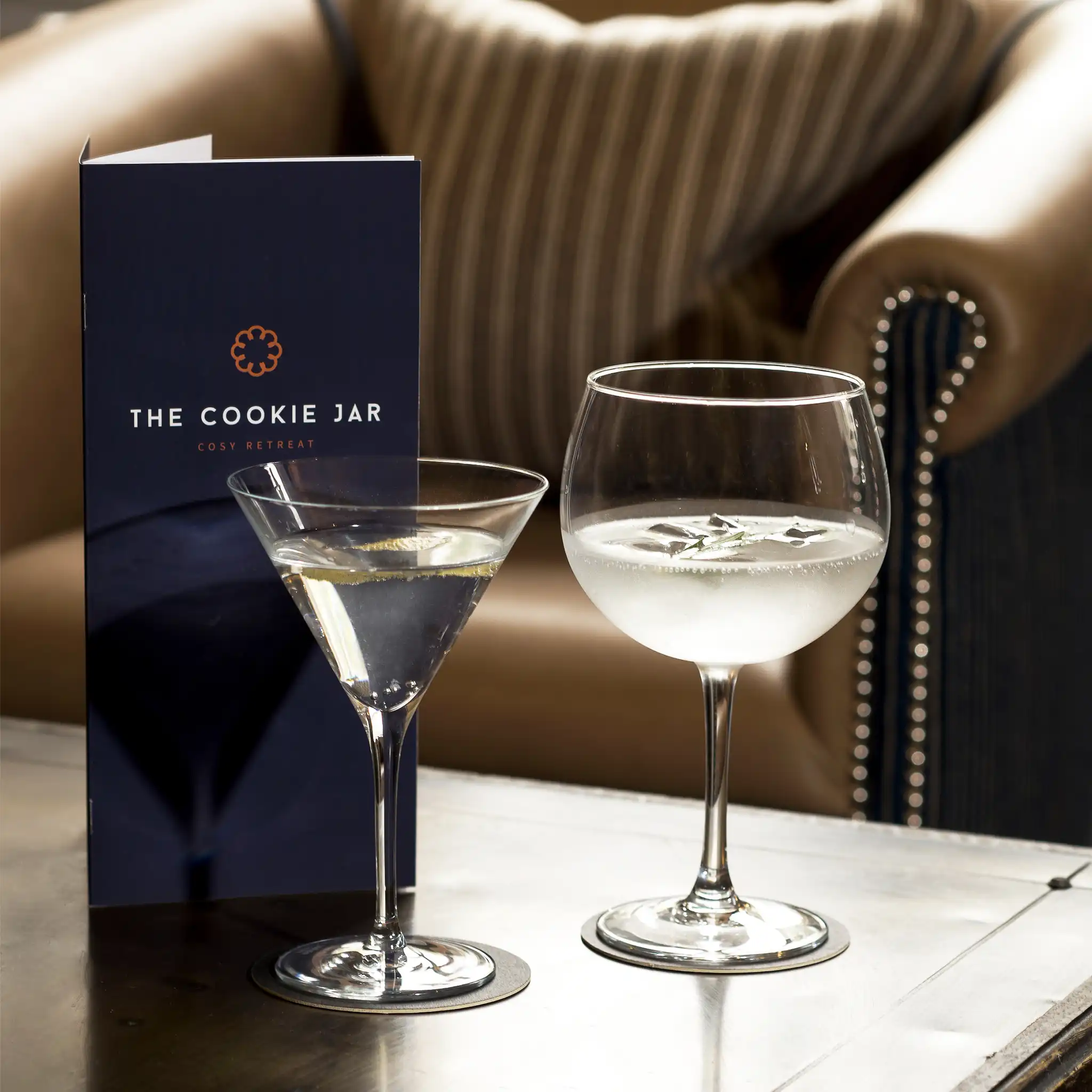
Welcome to The Cookie Jar. This wonderfully cosy retreat in the heart of Alnwick, Northumberland was once the Convent of Mercy. Tastefully renovated into 11 luxurious rooms and suites, this boutique hotel offers all the comforts of home with an added little bit of unexpected cookie-ness. We’ve been on the Cookie journey from the very beginning.

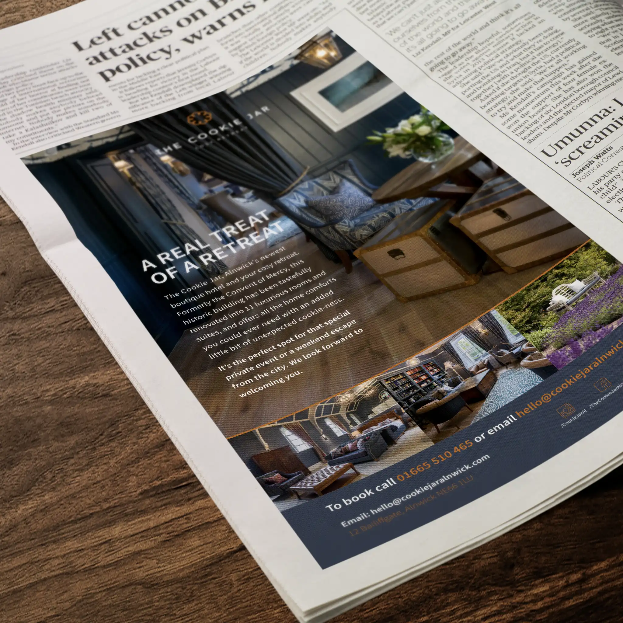
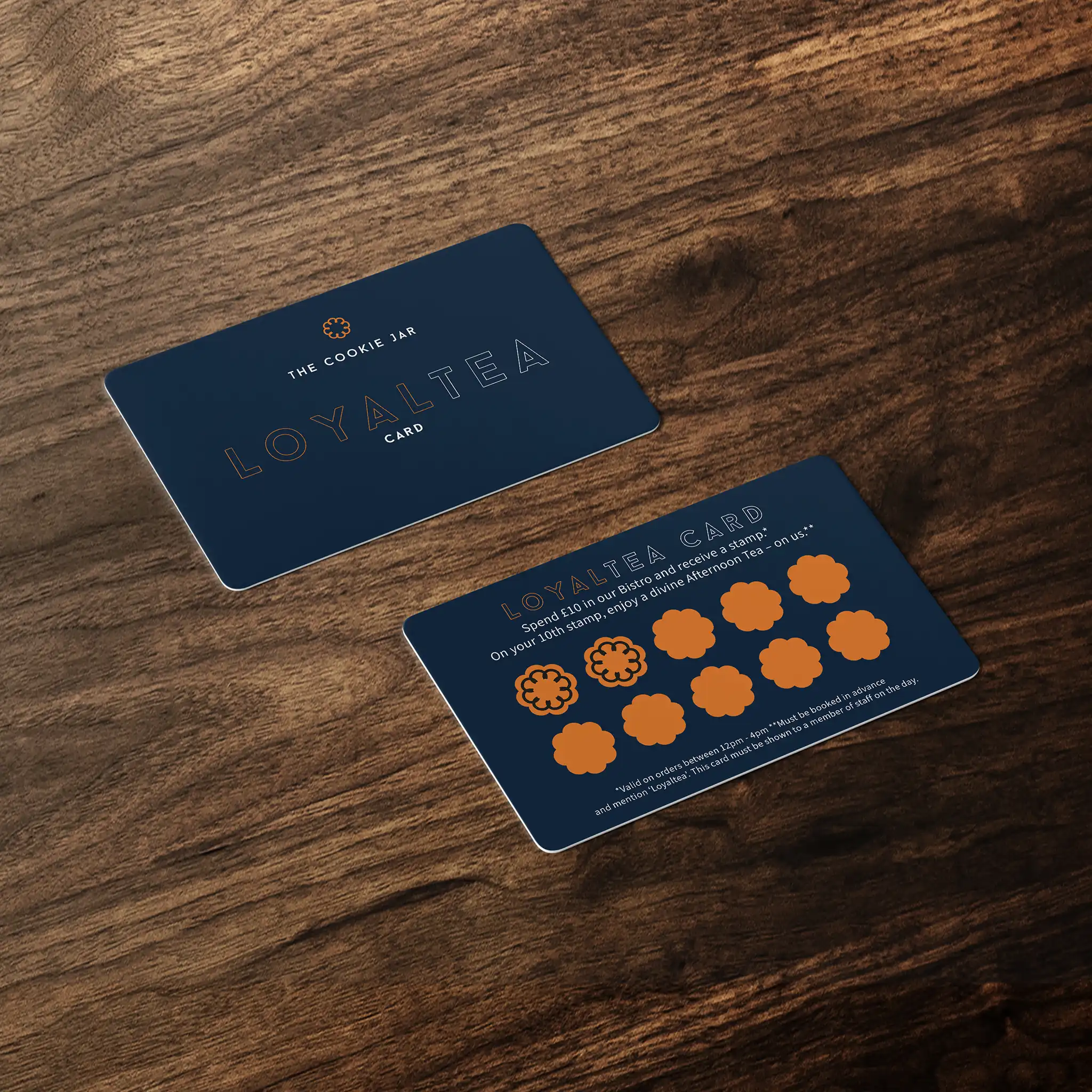
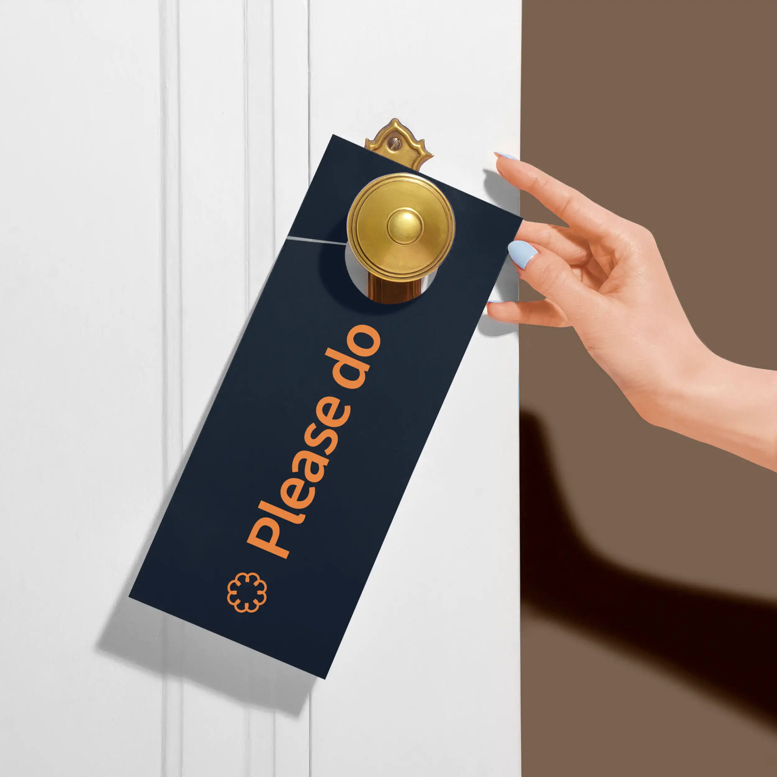
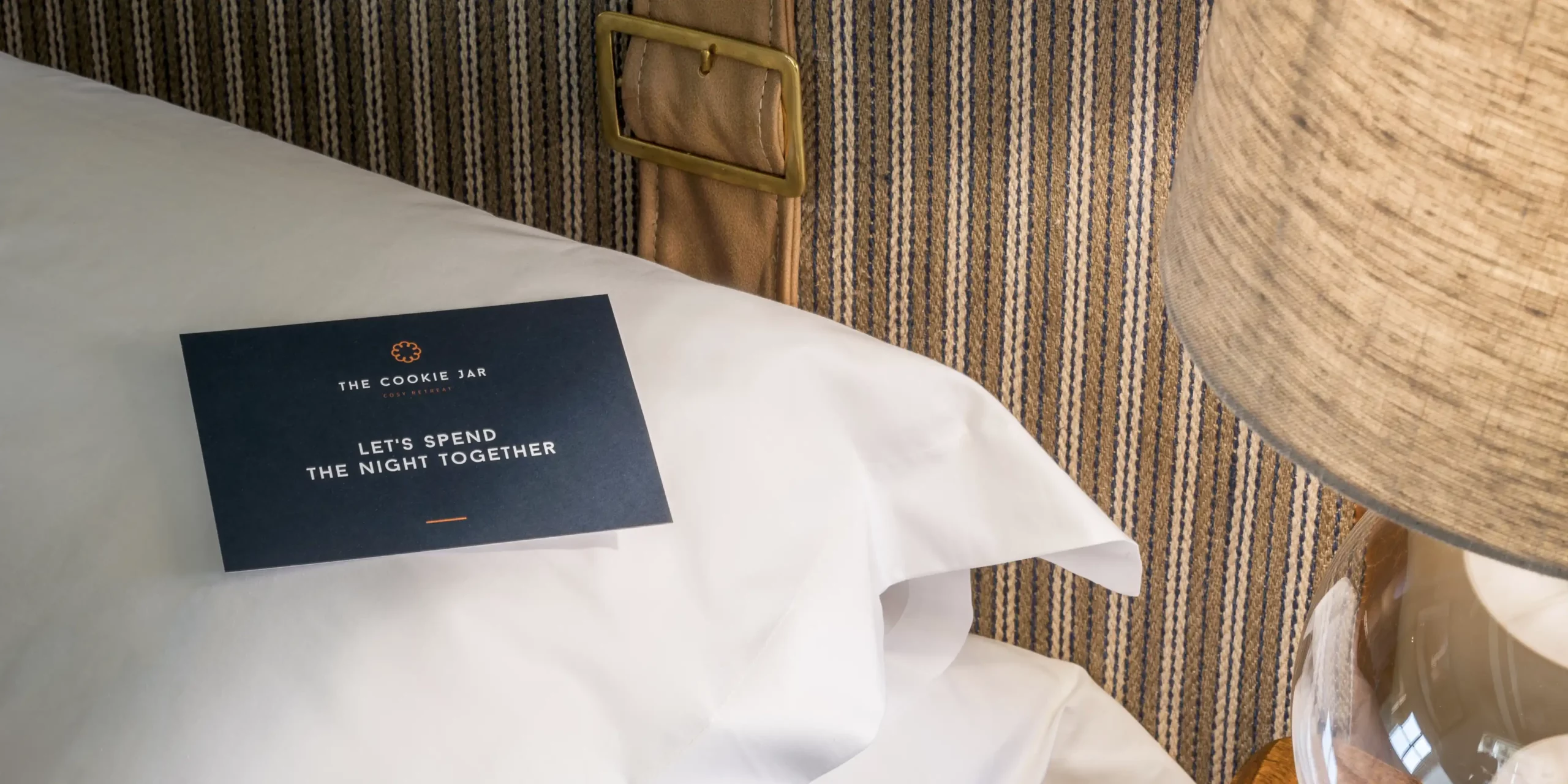
As we explored the site in the middle of its conversion with the owners, we knew this was going to be something special and something to be proud of. We created the branding, the story, the tone of voice and all brand assets including the website design and creation, and all the little Cookie touches throughout.

Now with the hotel in full flourish, we support their team as their creative partner with anything they need. From their regular email newsletter – ‘The Digestive’, to press ads, sales campaigns, menu and website updates.

Interested to see how we can help your brand?

Get in TouchSee More Creative

Interested to see how we can help your brand?

Get in TouchSee More Creative

Brand Development

Digital

  • Brand development
  • Menu design and creation
  • Tone of voice development
  • Brand strategy
  • Brand support

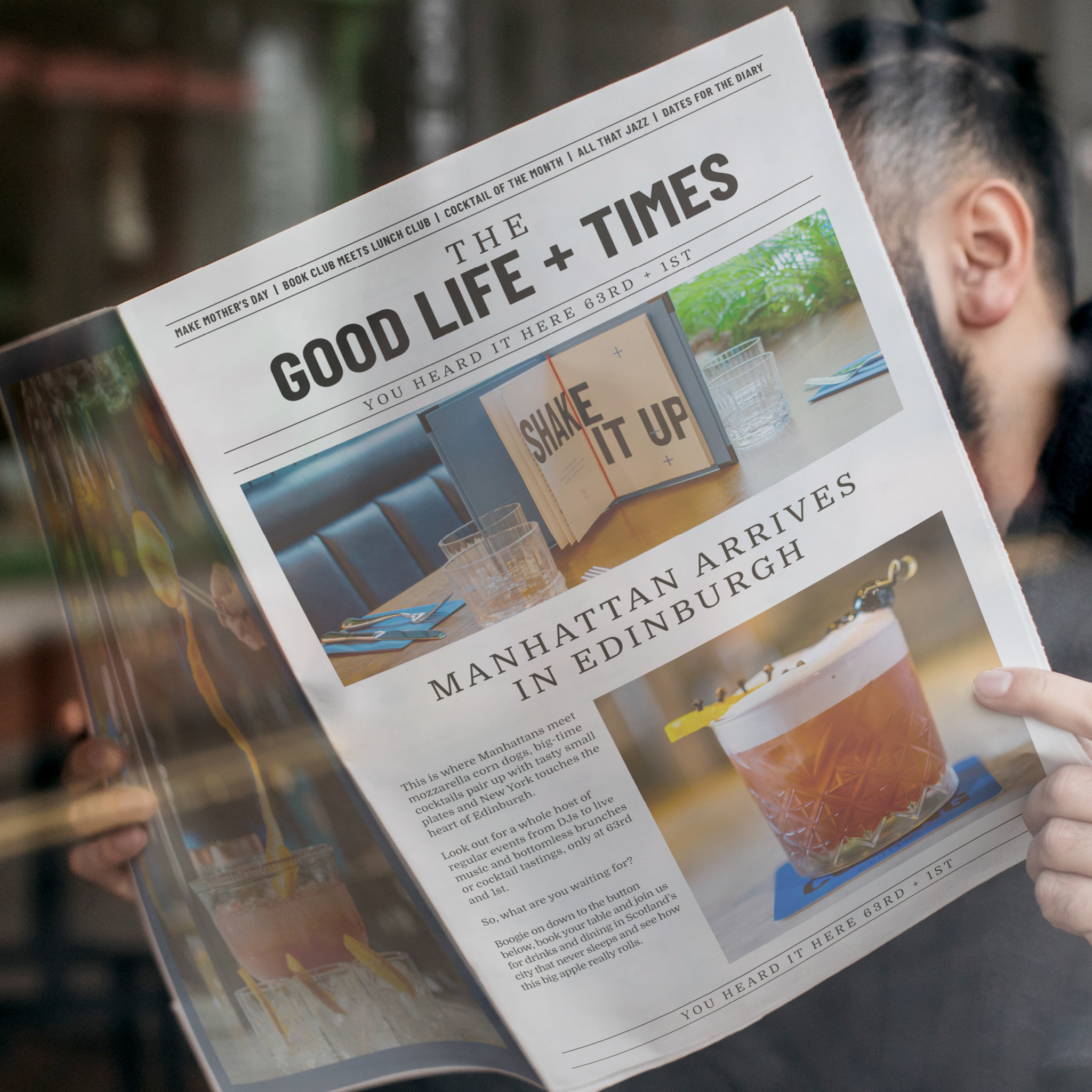
Inspired by the original TGI Fridays bar situated in New York back in 1965, 63rd+1st is a cocktails and plates lounge, that essentially brings a slice of NYC to a range of locations in the UK. We were asked to support the team in developing the brand, work on the brand strategy, and support them with their vision for the future.

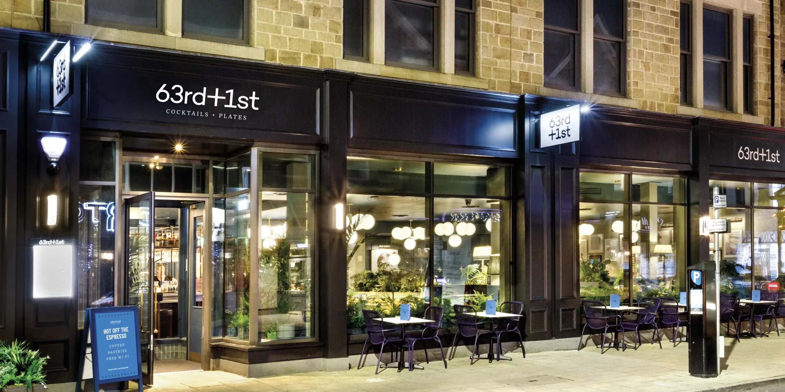
This brand is in its infancy, and we’re excited to be involved, getting our teeth into it and developing a full brand strategy with their team to really understand the concept and direction they wanted to take the brand in.

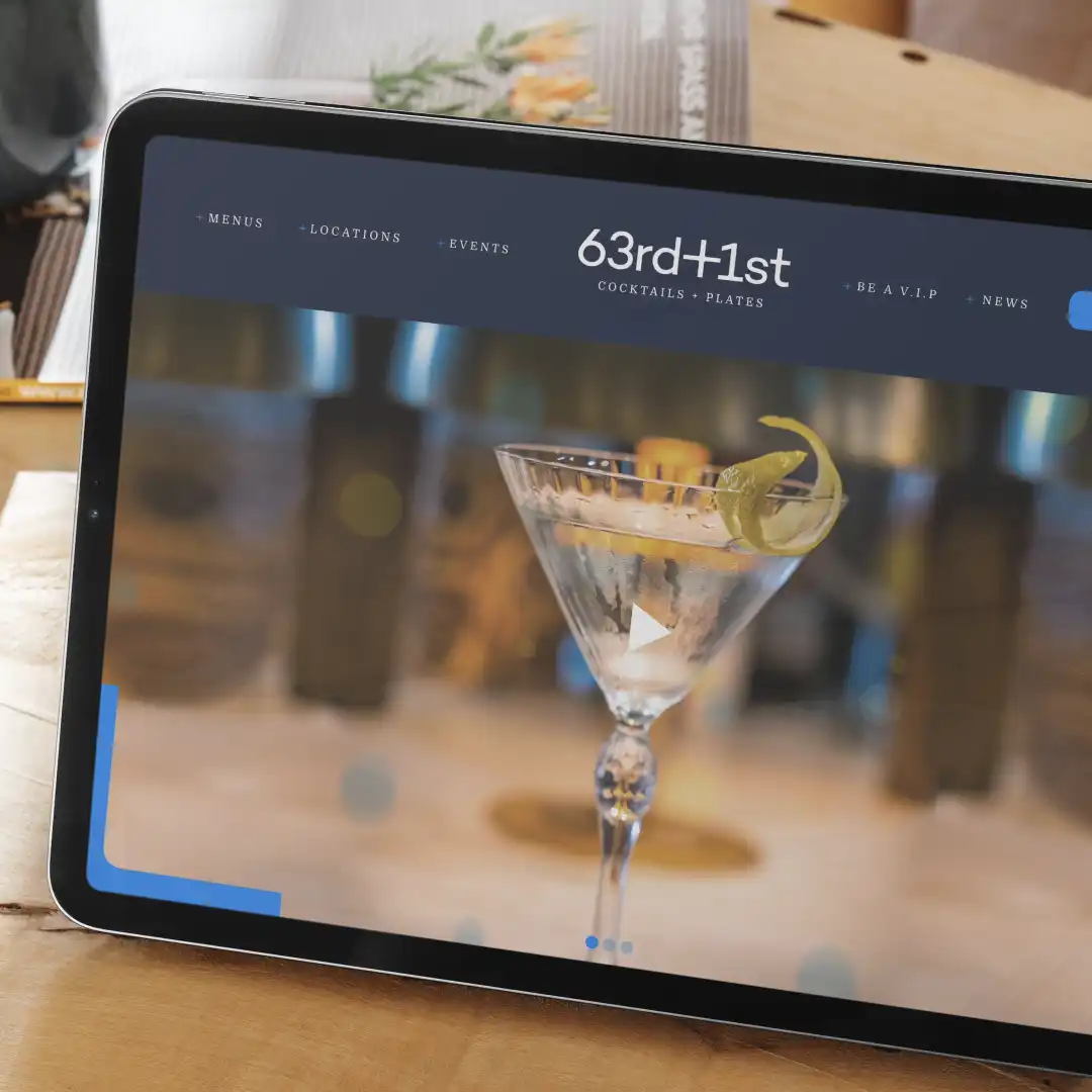
We developed the creative and tone of voice across a range of assets they could work with, including website redesign and restructure, newsletter templates, communication, and brand awareness pieces, launch collateral and social campaigns.

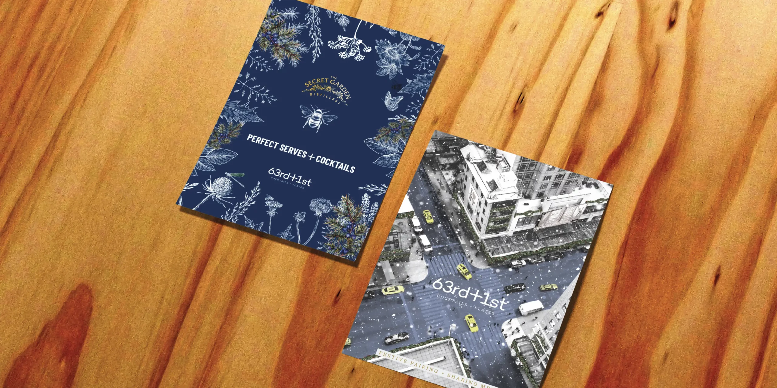
We also worked on new menu development and designs to make sure the whole brand feels like a real slice of NYC.

Interested to see how we can help your brand?

Get in TouchSee More Creative

Interested to see how we can help your brand?

Get in TouchSee More Creative

Acquisition Campaign – Mix it up

Digital

  • Campaign concept development
  • Campaign direction
  • Asset creation
  • Campaign rollout
  • Project Management

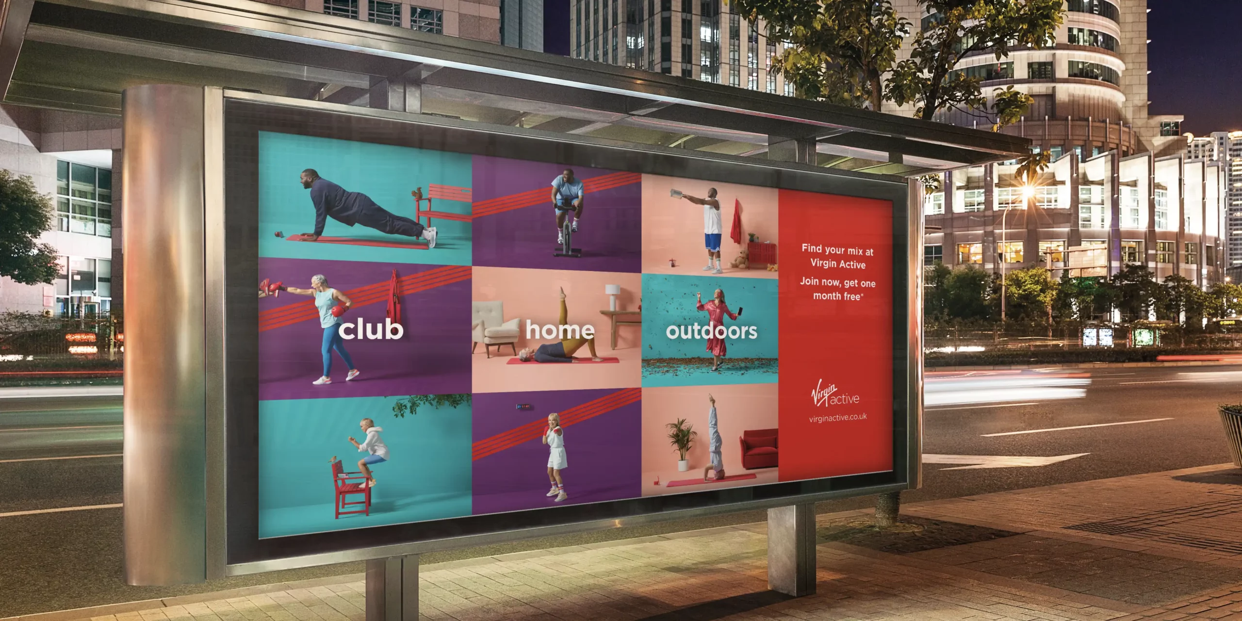
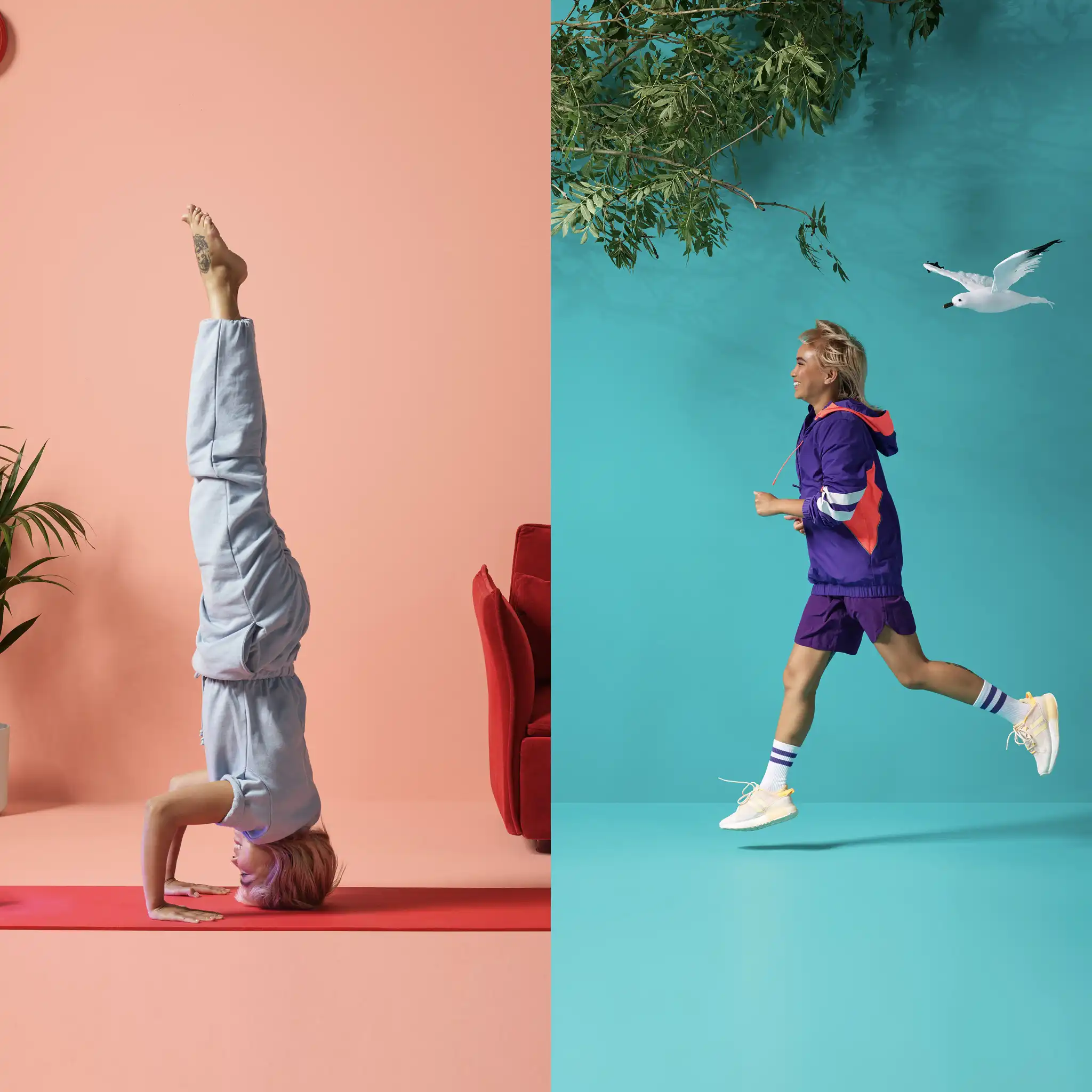
As Virgin Active’s creative partner, we regularly support their team with all areas of creative which we love being part of. It’s most exciting when it’s campaign time. This particular campaign is named ‘Mix it up’ and we were involved in the creative and delivery process from beginning to end.

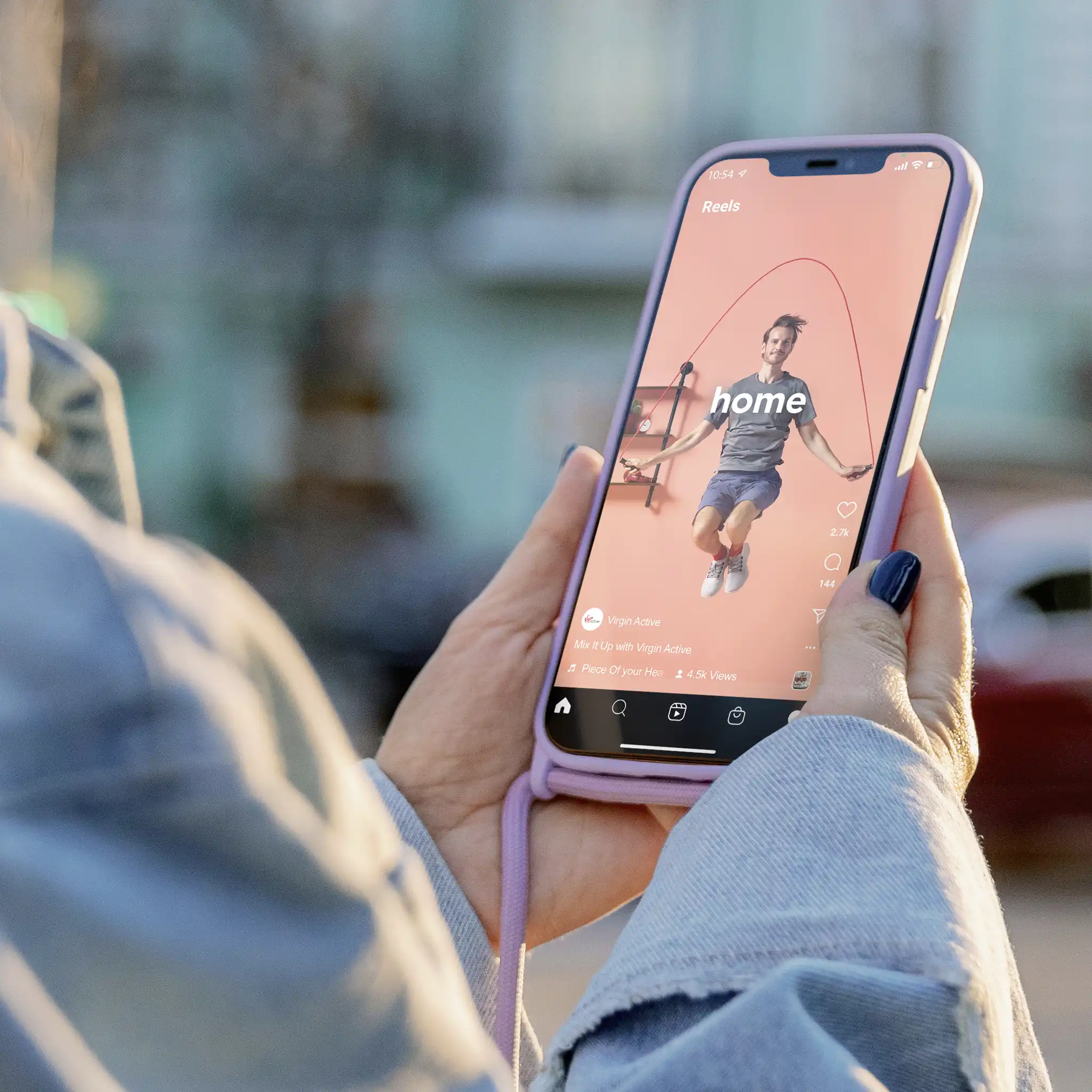
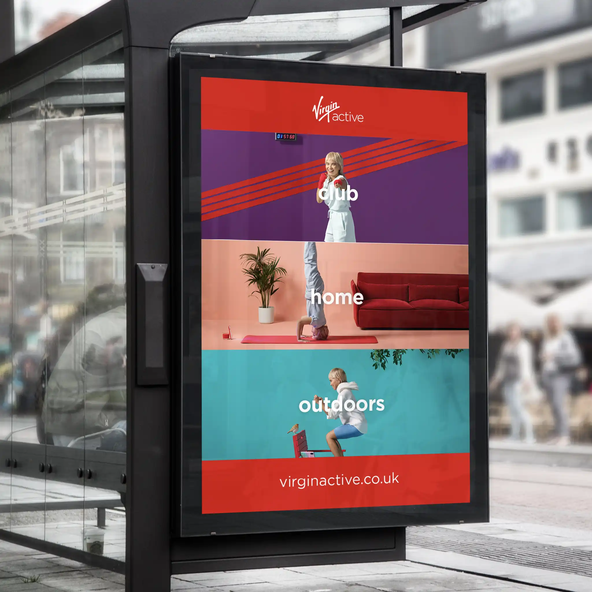
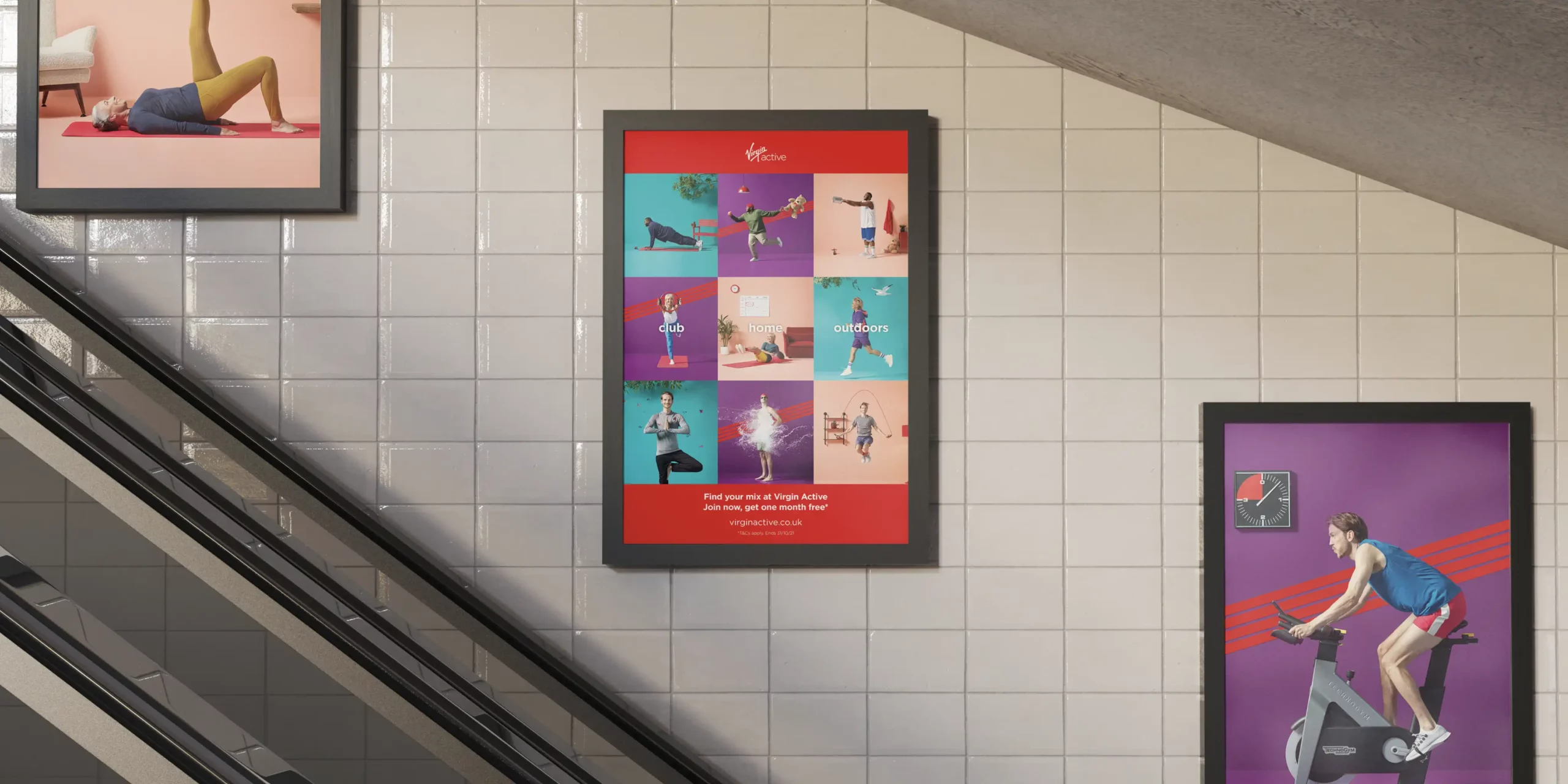
We developed the concept and how it was visually portrayed. Working with the script and actors to direct the characters within the ad, helping to create their unique little quips and quirks. Which brought the famous Virgin personality to the campaign. We worked closely with the team at Virgin Active and Virgin Group to make sure every aspect met with their brand vision and style.

The creative approach behind the Mix it up campaign was based on the premise that a Virgin Active club is the best of all worlds and offers a totally flexible approach to fitness. There’s so much choice and variation of activities all under one membership. Workouts are available to members in-club, outdoors or at home via their app. This campaign was distributed over Video on Demand, digital billboards, paid and organic social media, in-club digital screens and press ads.

It was great fun to work on with the whole team involved. Virgin were very pleased with the results and that makes us happy, and proud to have been a part of it.

Interested to see how we can help your brand?

Get in TouchSee More Creative

Interested to see how we can help your brand?

Get in TouchSee More Creative