Branding and Strategy
Campaign
- Brand Strategy
- Brand Development
- Creative Campaign
Printing solutions that press all the right buttons.
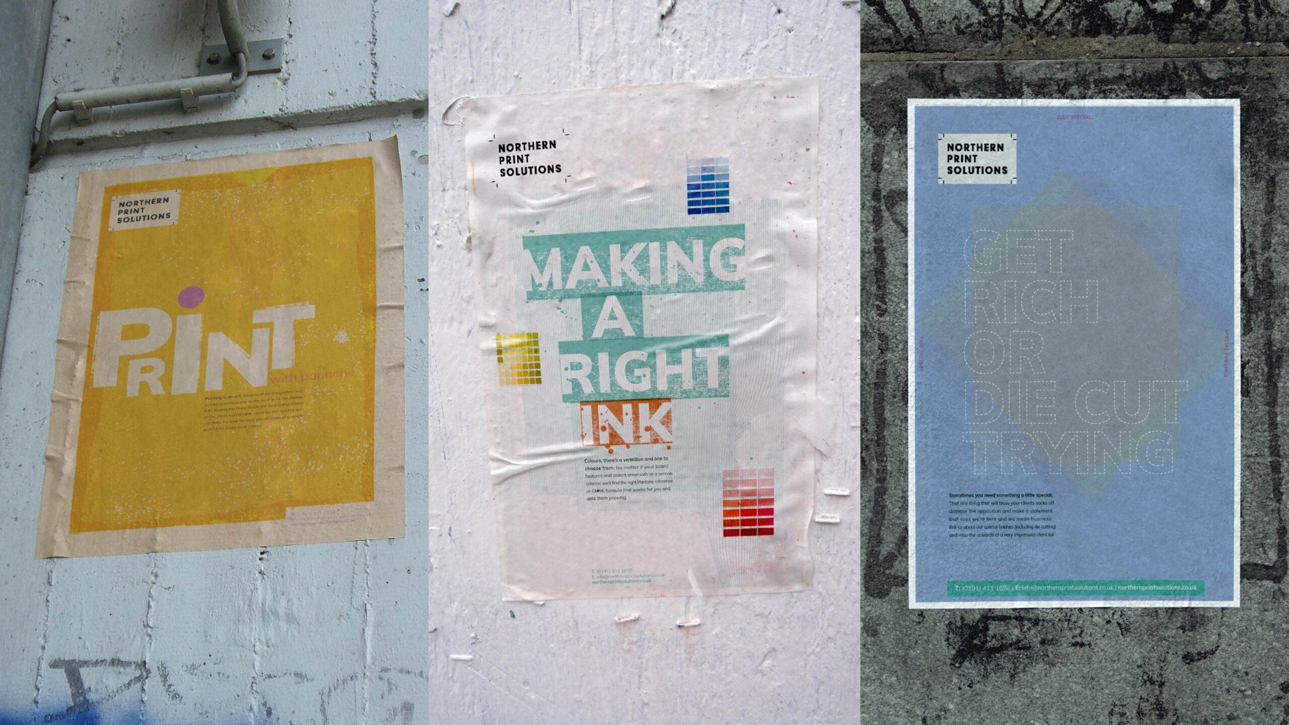
Northern Print Solutions are a bespoke printer based in the North East of England. We recently worked closely with them on their vision for moving forward with their branding and strategy to target specific markets.
It’s always good to hear from our clients how they felt about the journey of working with us.
Cath Riley, Director of Planning, People and Commercial Operations at Northern Print Solutions said:
With big ambitions for the next five years, our business recognised that the power of our brand would be fundamental to achieving the huge changes that we faced both externally and internally. The team at Curate invested significant time up front with us, getting to understand where our business was, where we wanted to be and the challenges we faced. With a fresh pair of eyes, they came up with a brand refresh that maintained the personality that our clients knew and loved us for, yet resonated significantly with our changing target market.
The results to date have been incredible, which has generated a significant step-change in the business, including:
- Greatly improved target market brand engagement, resulting in a positive change in our inbound leads
- Instead of 1/20 leads meeting target qualification 5/10 now meet qualification
- 20x ROI
- Enhanced rate of cultural change and adoption of business practices to meet our target market needs as our team understands tour brand more than ever
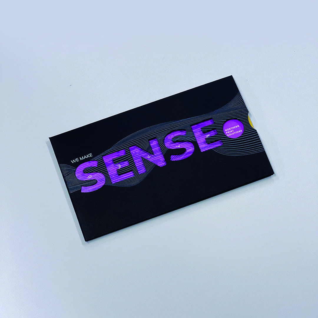
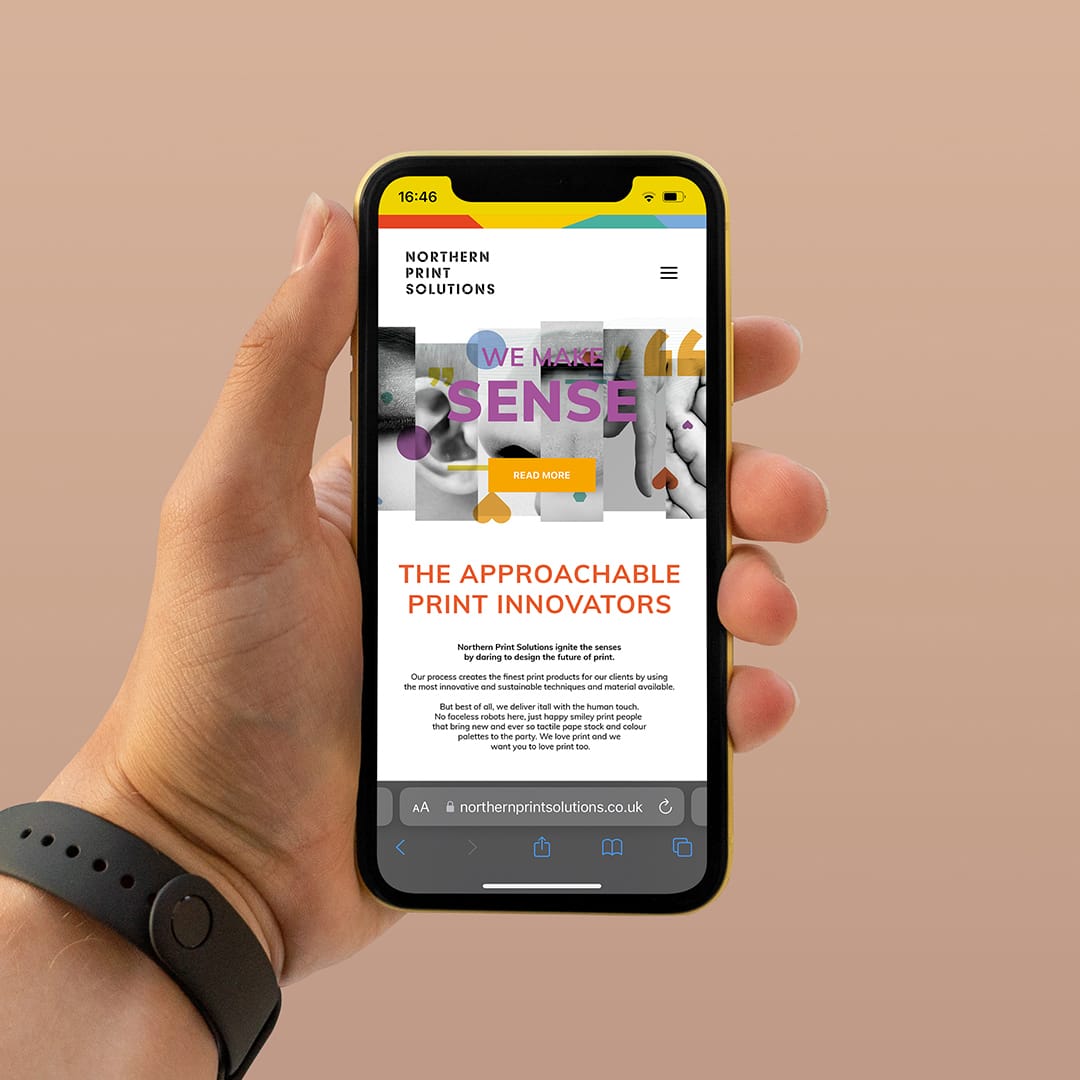
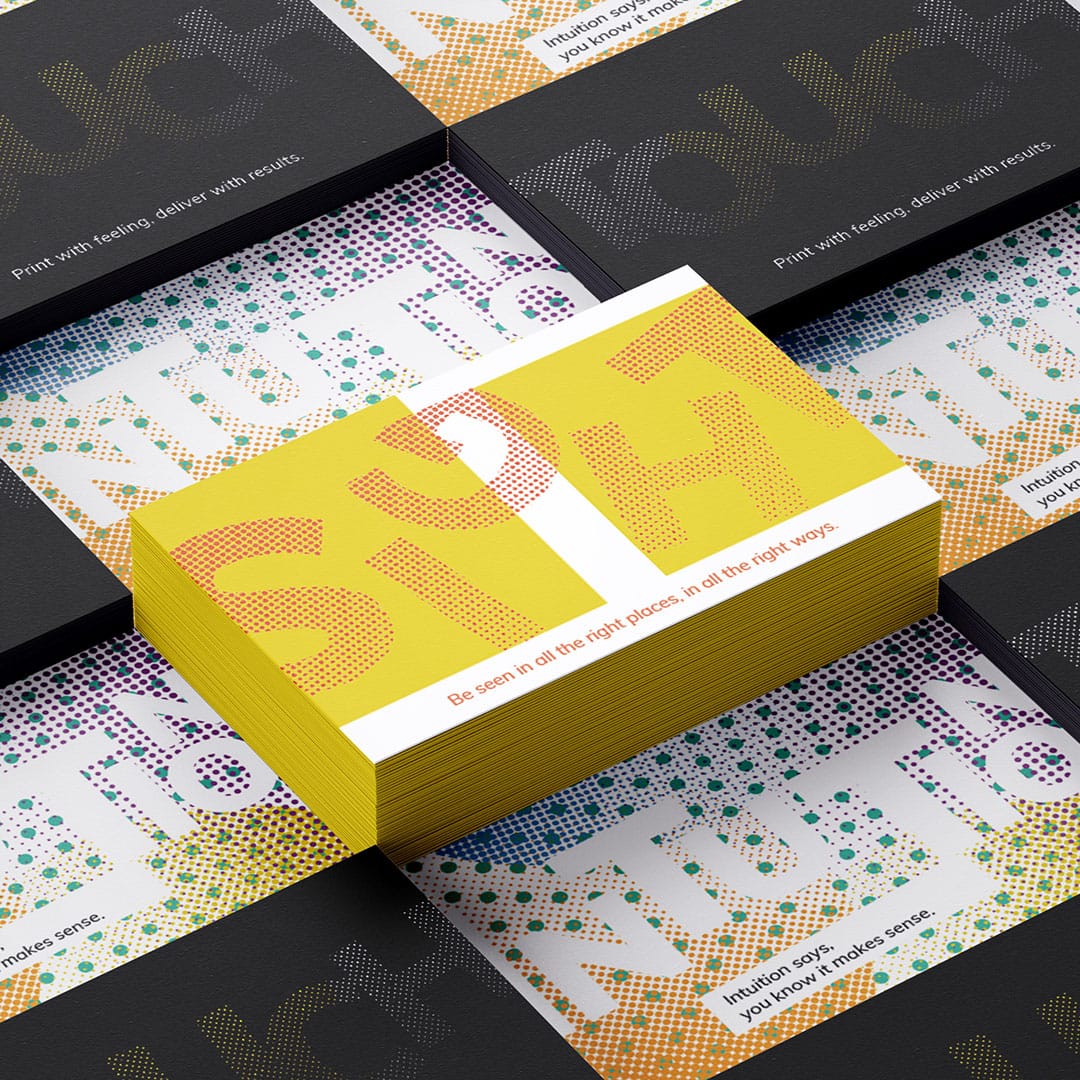
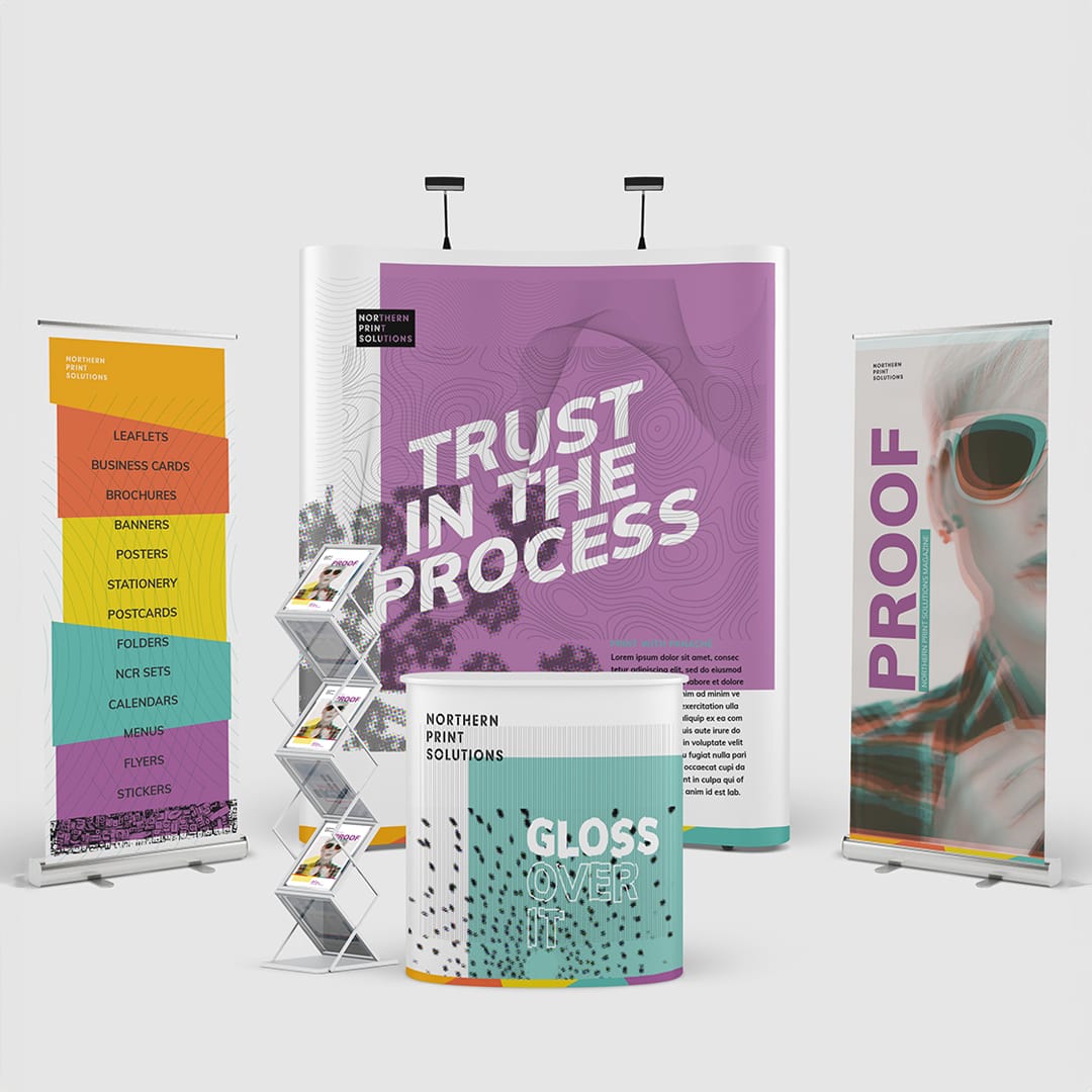
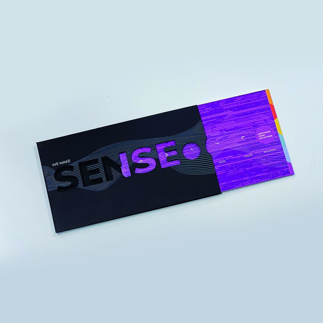
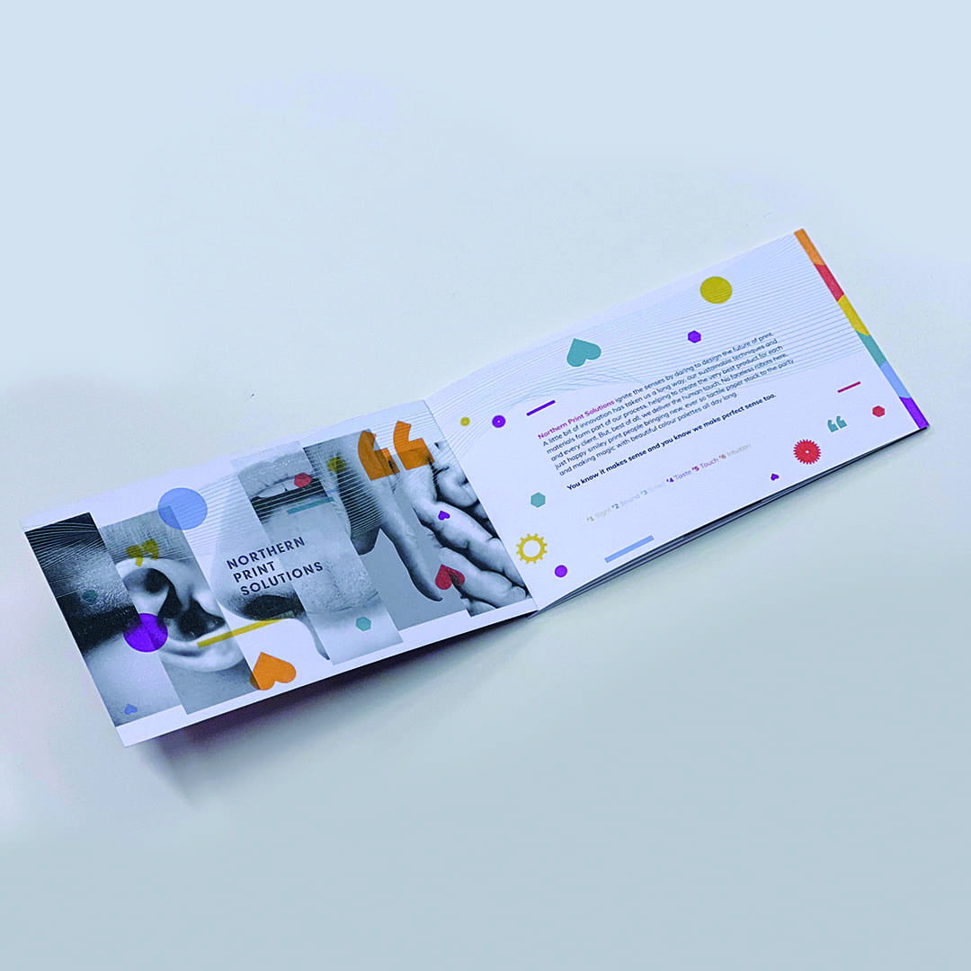
We created a thorough brand strategy document that built a pathway for the business to follow and worked closely with the whole team to encourage a greater understanding and belief in the changes that were being made. This included updating their brand guidelines to a new colour palette, more expressive typography and a range of graphics and visuals to represent printing techniques that worked whether they were communicating in print or digitally online so that their messaging could transition across a bespoke tactile print piece or across their website and social channels.
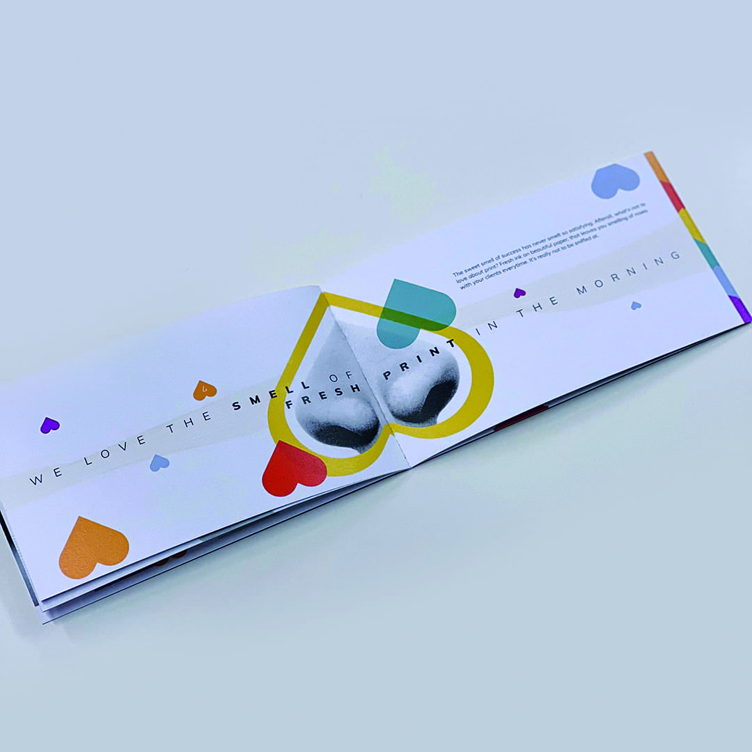
We then created a campaign that helped express their key message through all the senses and how their business effects them, “we make sense” from the sweet smell of fresh print to the tactile touch of a textured stock.
It’s a great feeling to see another happy client and some very positive results.
Restaurant Launch
Campaign
- Brand Support
- Promotional Creative
- Editorial Design
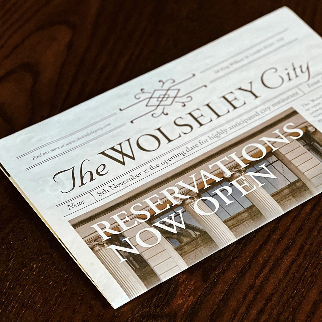
Roll up. Read all about it! As part of the promotional launch campaign for the opening of The Wolseley City restaurant in the heart of the City of London, we were asked to create a newspaper design which would be used as part of a promotional hamper and to be featured in the promotional video.
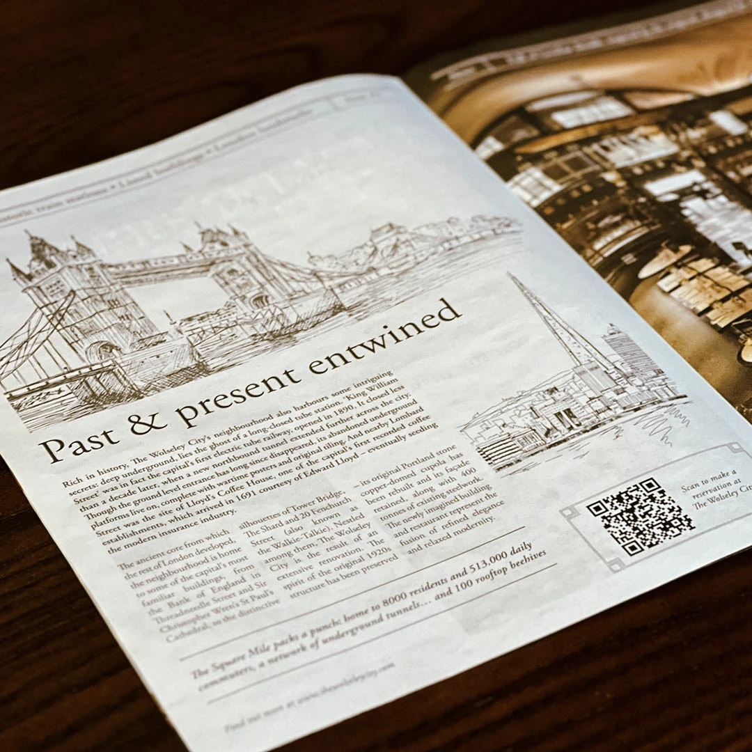
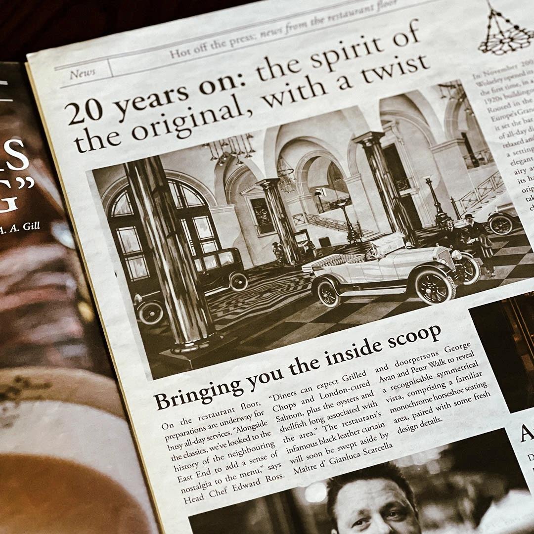
The classic and iconically elegant wonders of the original site in Piccadilly has now been introduced to the City. The newspaper was to feature all the special features that a Wolseley devotee would expect. We worked with stories about the heritage, signature dishes and cocktails, their famous Battenberg and the all important people in their team.
We created a broadsheet style newspaper design with a bespoke masthead and page details that made the piece feel and look authentic and connected with the brand with the brand elements incorporated.
The piece was then included in a special hamper that held a selection of goodies and was given to special guests and influencers. It was also featured in the hands of a queue of people in bowler hats within the promotional video for the launch of the opening.
There was a great response and you can now book your table at The Wolseley City.
TGI Fridays May Party Month Campaign
Campaign
- Brand support
- Campaign Creative
- Promotional Marketing
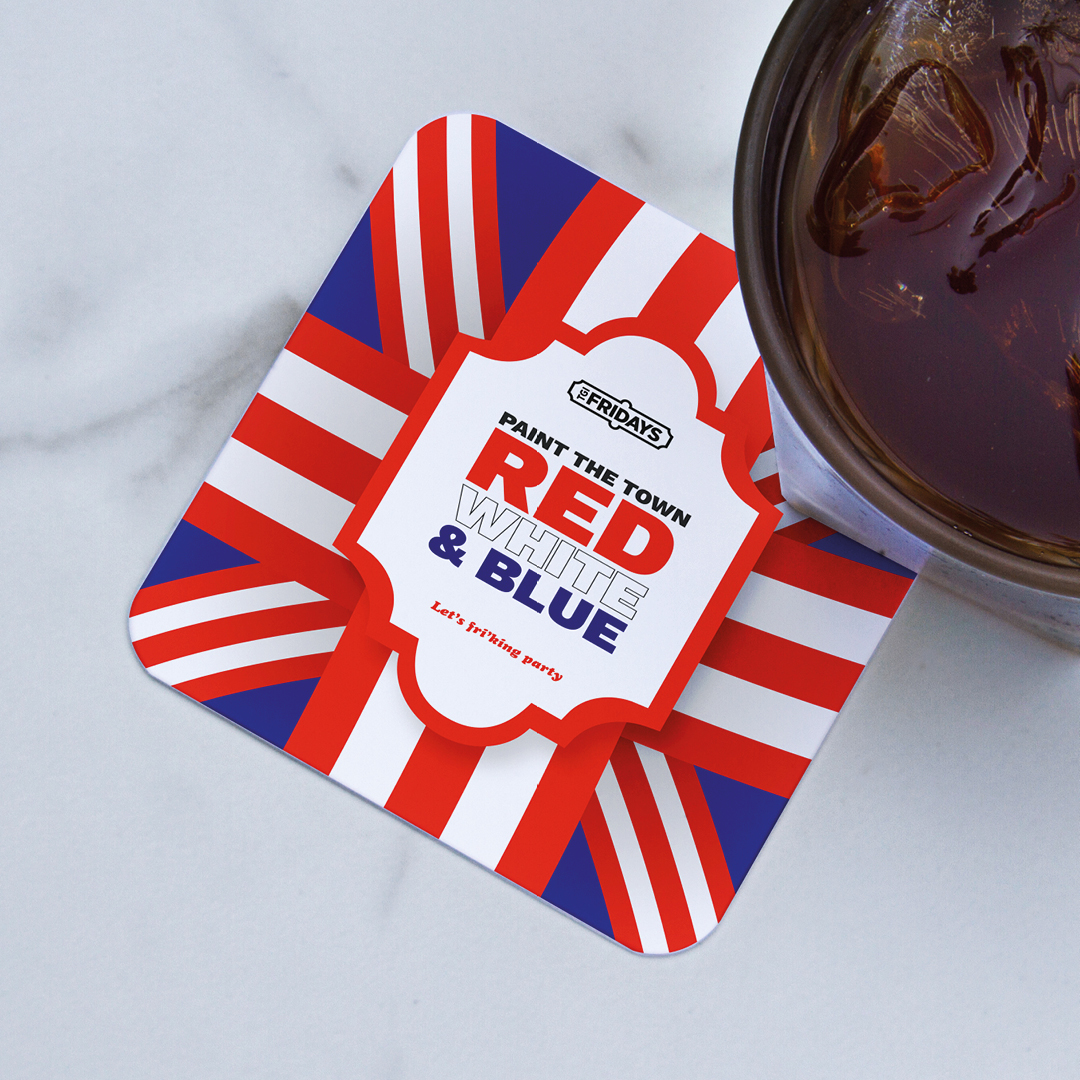
The month of May this year was certainly a month of celebrations. Eurovision, multiple Bank Holidays, The Royal Coronation, and of course a few Fridays in to boot! The team at TGI Fridays briefed us to create a series of campaign concepts to tie the whole month together as a ‘party month’ to celebrate and showcase all the activities, promotions and events they were holding during that time.
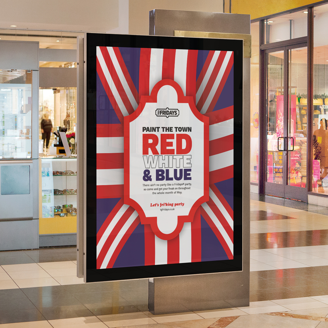
We presented a series of options to the marketing team and our “Paint the town red, white and blue” was a favourite within the directions. By adding blue to their usual palette of red and white stripes we were able to celebrate their unique perspective of celebrating a truly British summer from the viewpoint of an iconic American brand.
The campaign worked across multiple levels and a whole host of assets were created to support the planned in-store activity. These included posters, in-store screens, social media assets and table displays. Each working collectively to inform the customer of all the good times that TGI were creating for them.
A series of specially crafted cocktails were also created by the in-house mixologists and named with a distinctly Eurovision theme. It was British, it was European, it was American, it was unique, it was TGI in May.
Harbour Digital Activity
Campaign

- Brand support
- Digital Campaigns
- Social Media
Harbour Hotels have come a long long way since their initial conception. They now own and operate 15 hotels across the county, with ambitious plans to grow across the leisure and hospitality sector in the coming years.
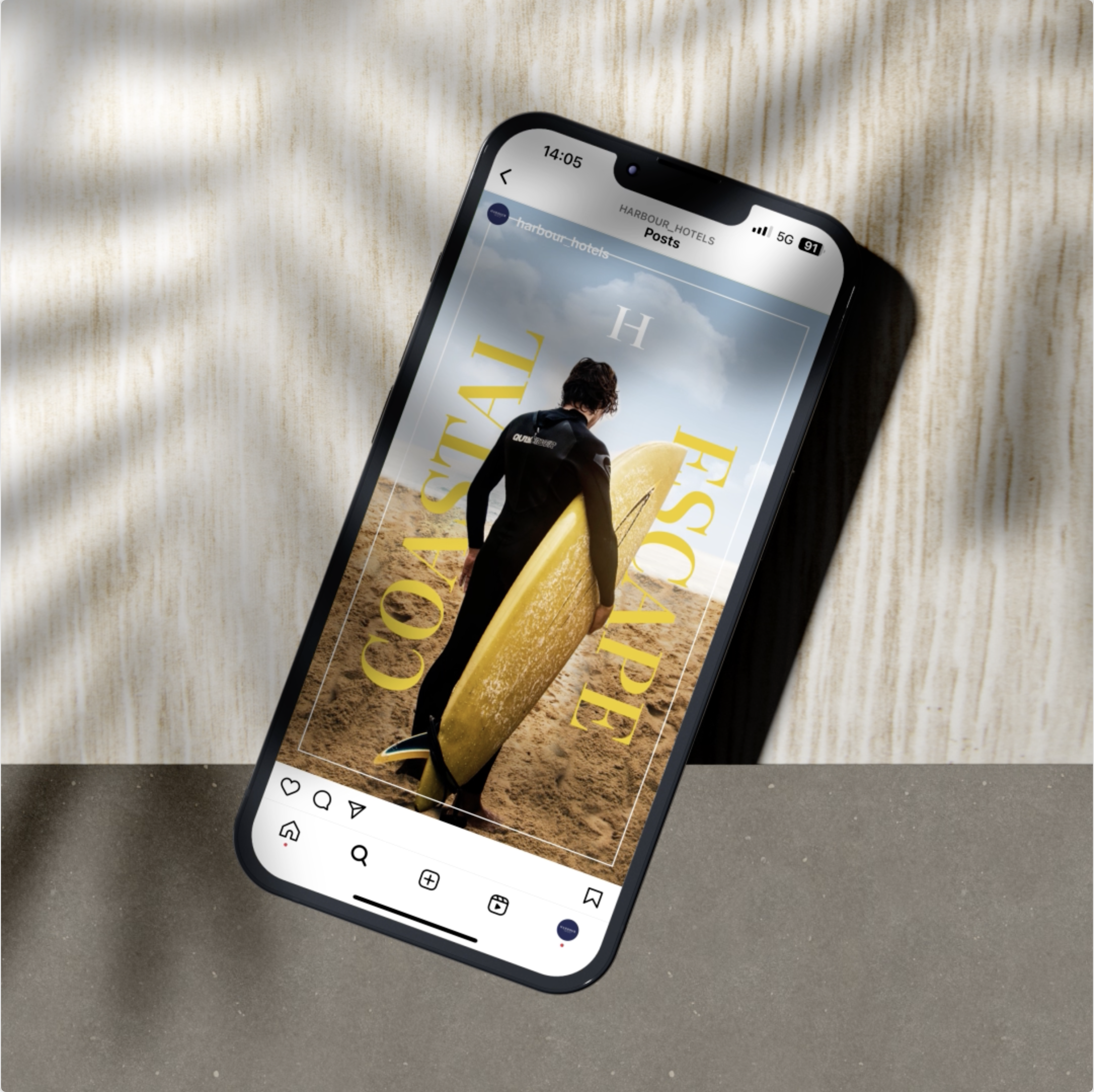
We were initially brought on board to create a stronger brand presence through the production of a solid, but flexible set of guidelines and collateral. These guidelines were set to work across the board, but had a strong emphasis on their printed and digital collateral. But times change and so did Harbour’s audience. As they became younger, more trend conscious they needed to create social media that engaged this increasingly more tech savy audience.
Harbour understoood that they couldn’t create posts and content that felt formulaic and standard. They needed to break the mould more often than not. As their creative partner, we understood the need for flexibility within their guidelines and this also applied when creating a set of engaging social media templates.
When is a template not a template? When we build them is the answer to that. Brands don’t want or need a structure that limits what and how they can communicate. They want to excite and grab the attention of the customer, without losing their core styling or tone of voice. Harbour’s social media doesn’t always have to play by the rules, it can break out to create impact for campaigns and offers and be more restrained for serious messages. It should always feel on brand but be willing to flex when needed.
Above all we made the process a simple one. Partnering up, understanding exactly what they needed and why, making impact where possible and engaging their audience with a graphical style that didn’t feel templated.
Virgin Active Summer Campaign
Campaign
- Campaign
- Brand Messaging
- Copywriting
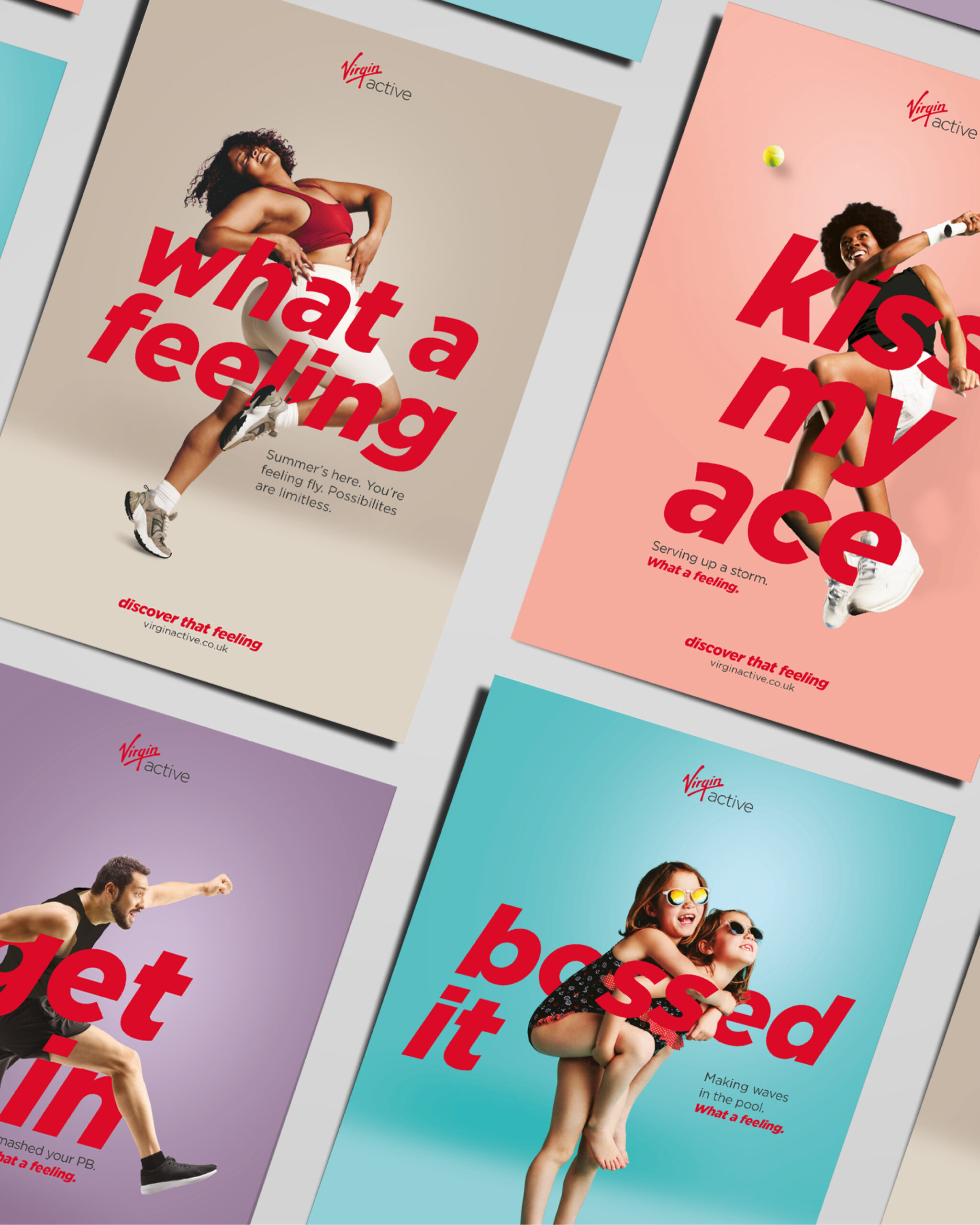
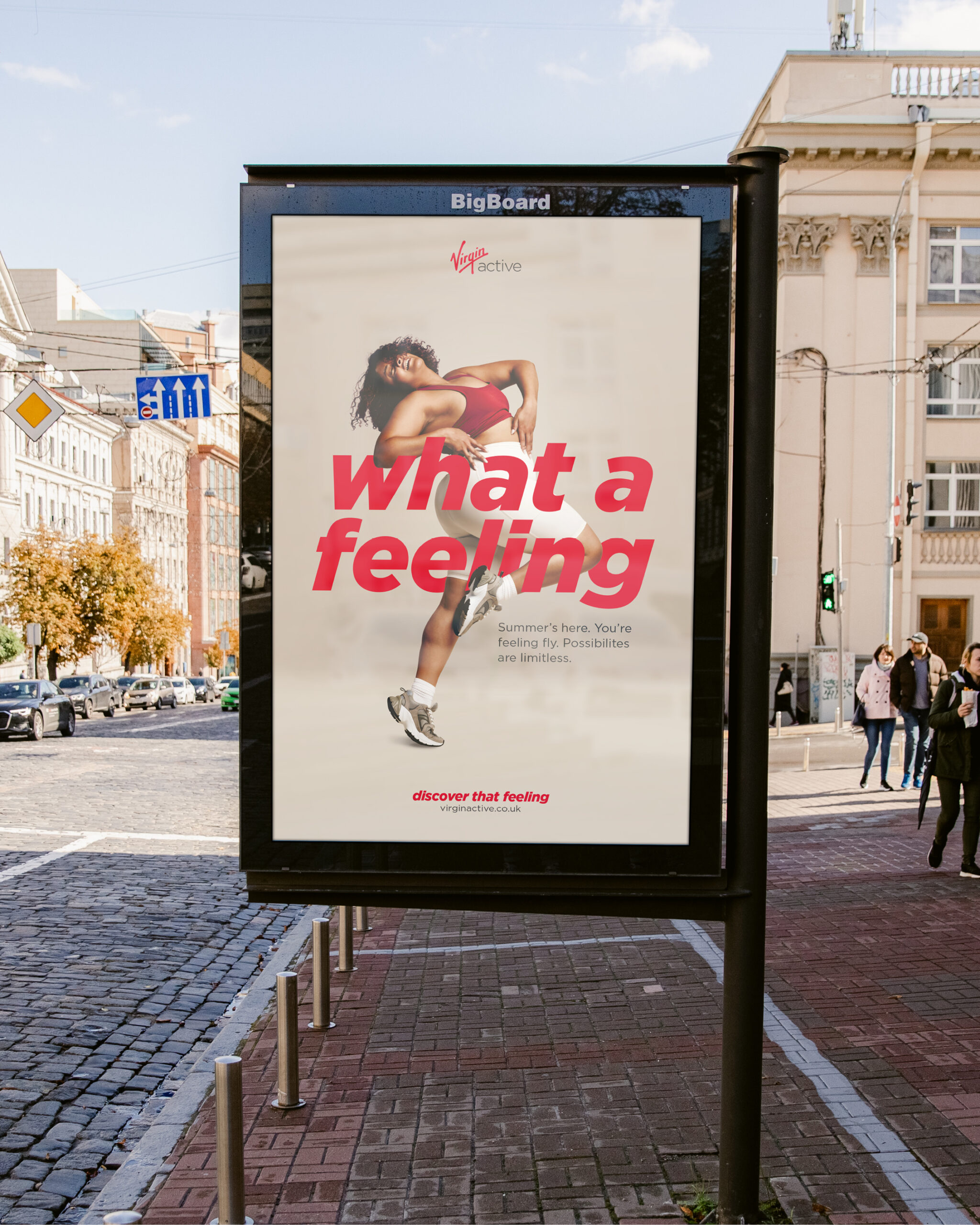
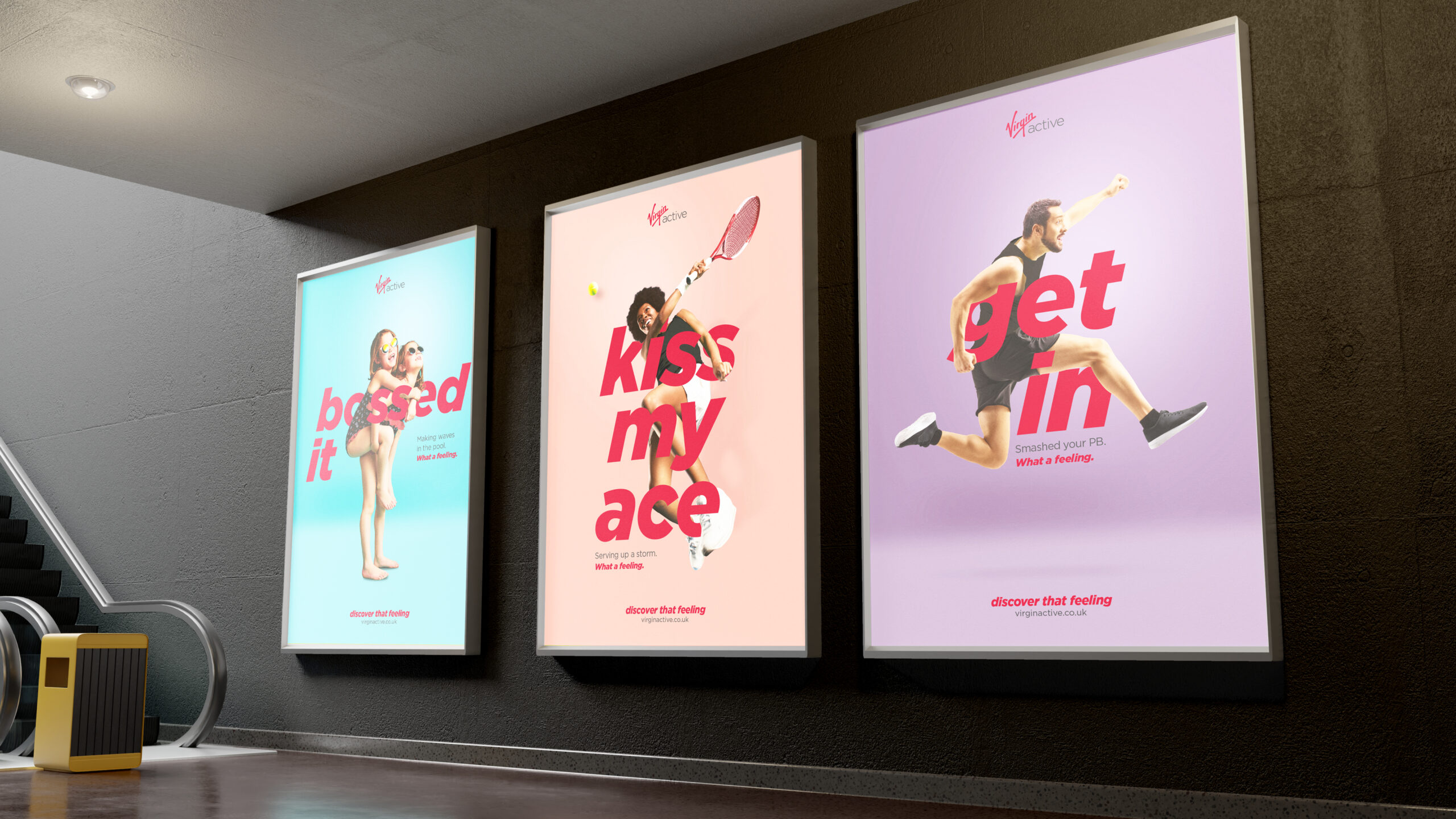
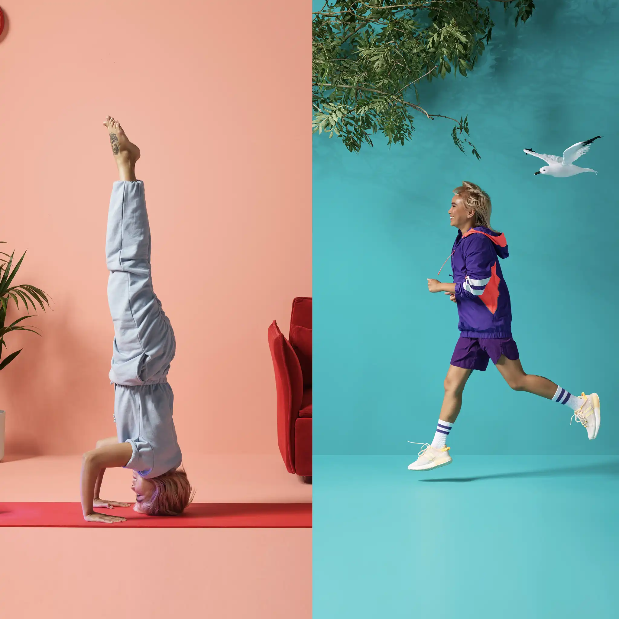
We wanted the imagery to be punchy and bold and really make a statement with the typography intertwined, working with the Virgin Active tone of voice and brand colours to create a premium feel. We chose the imagery with an emphasis on the emotion and feeling to really support the campaign headline of “What a feeling”.
The campaign assets are live in print and digital forms on the website, social media, leaflets, posters and digital screens. We also animated the digital assets to create energy and movement.
We’re so happy with the results. We just have to see if we can touch our toes now. What a feeling.
IPW1 Brand Development
Campaign
- Branding
- Brand Messaging
- Window and Wall Graphics
- Promotional Items
IPW1 is a leading independent printer based at Tower Bridge in London. With a dedicated team and excellence in service, they work with some of the largest restaurant chains, galleries and PR companies in the country, delivering top quality print and finishing.
We bonded over menus several years ago and have worked together ever since. So, we were delighted when they asked us to help develop their brand further with the specific request of ensuring it represented their full range of offering, stellar services and the great personalities within their team, whilst making a statement and creating a real business impact. Their brief was simple. To really express how they bring print projects to life, especially with their advanced use of colour. In general, the clients imagination is the only limit and IPW1 are 100% dedicated to deliver the highest standards in the industry.
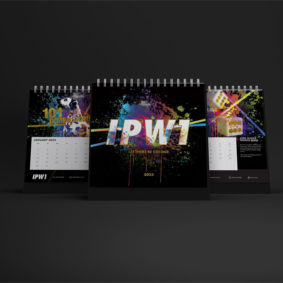
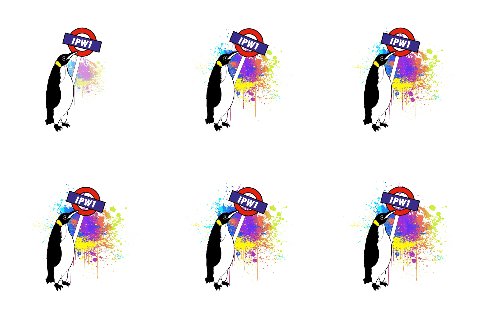
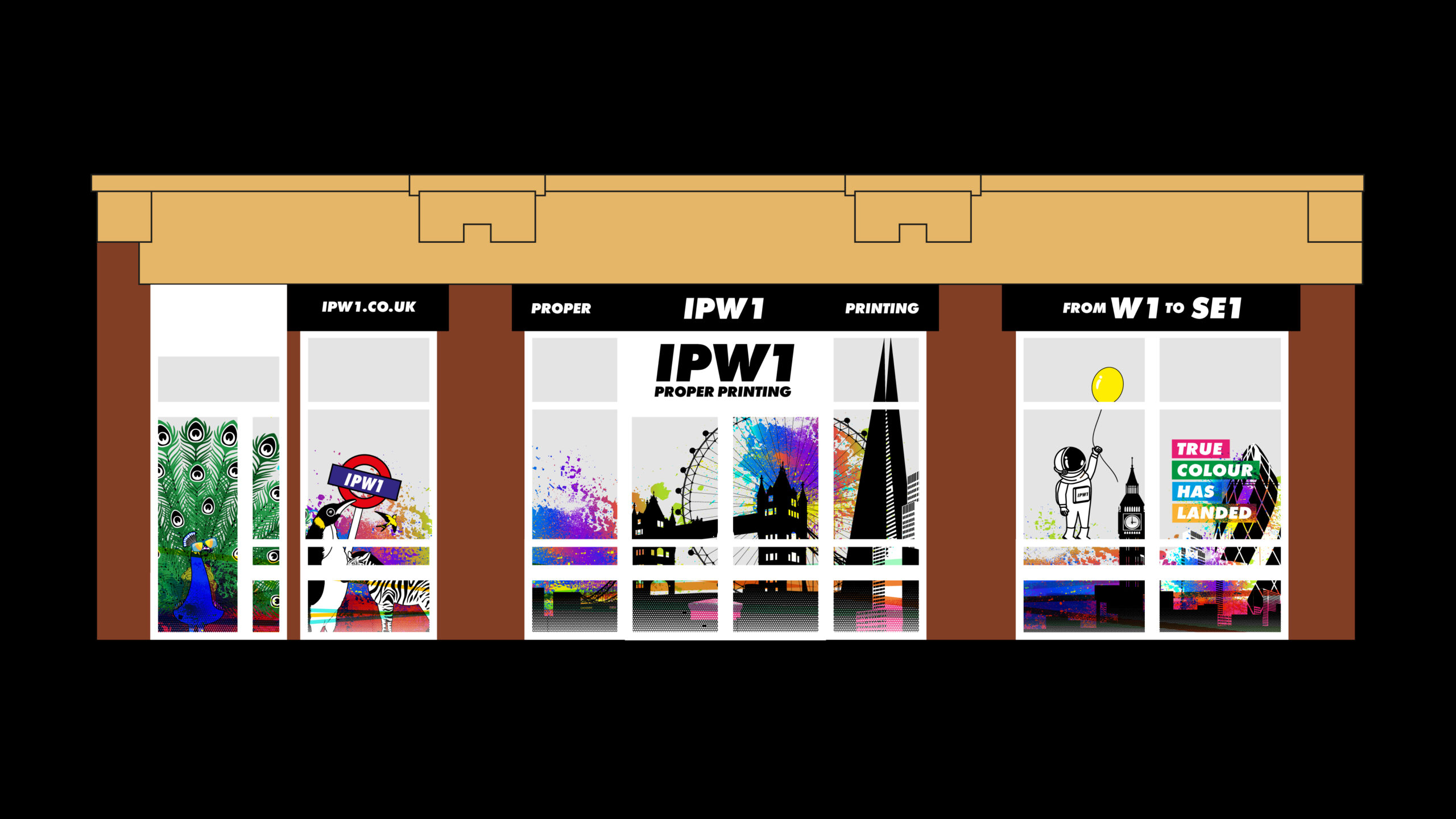
“We want to create The Colourdome” the owner Peter said. We love a brief where our imaginations can run riot! And so, The Colourdome was born. We created a world where anything goes. The usual black and white objects in the universe, were blasted with colour – the penguin, the football, the domino, the snowman…all featured in a colourful calendar and demonstrating various finishings examples as a promotional piece.
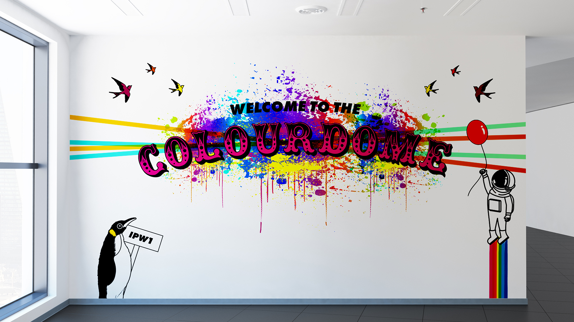
As they recently moved address, we also created window displays that illustrate an astronaut floating in with a balloon in a land of rainbows, zebras and peacocks, to show that ‘colour has landed’ in their new location.
It’s all very eye-catching, gets the message across clearly and is a really flexible addition to their brand assets and is a bit of fun – which we felt was crucial to get across their down to earth, friendly and attentive personalities and approach within the team.
It’s such a pleasure to work with open minds, creative briefs and a fantastic team. Keep an eye out for the next window instalment…
Acquisition Campaign – Mix it up
Campaign
- Campaign concept development
- Campaign direction
- Asset creation
- Campaign rollout
- Project Management
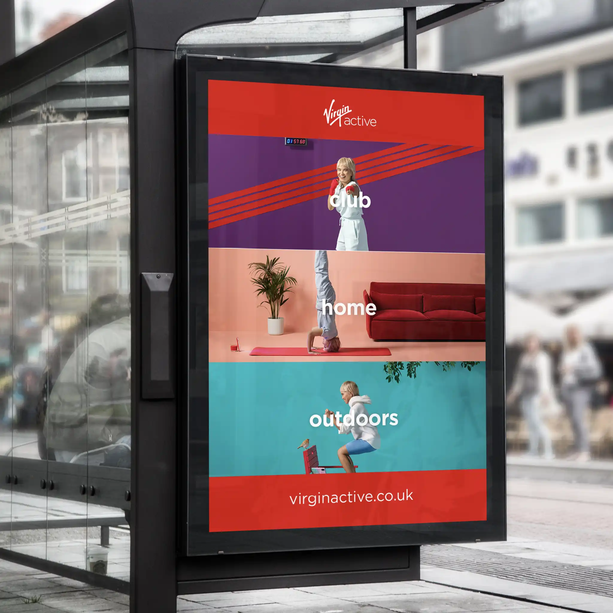
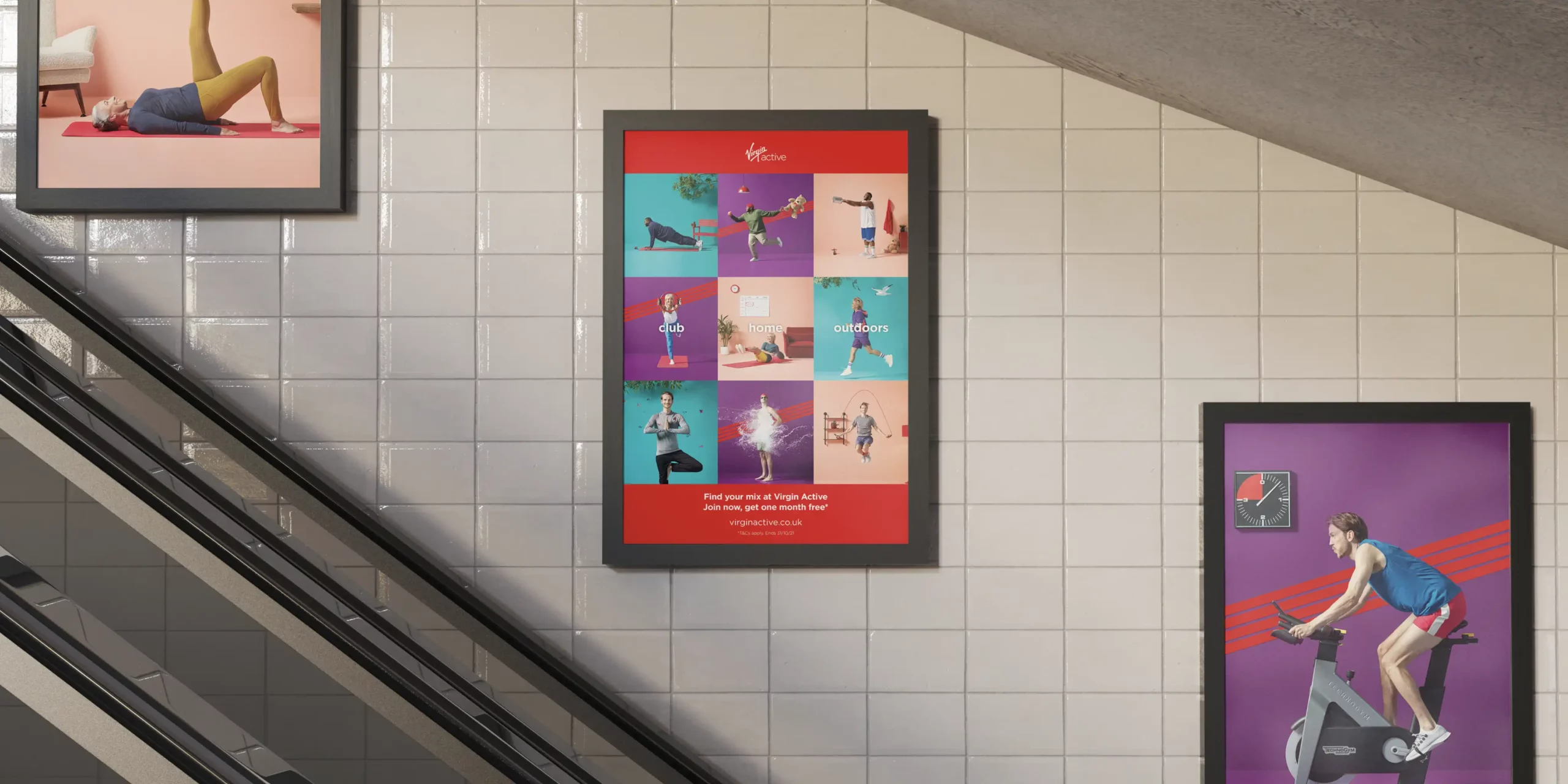
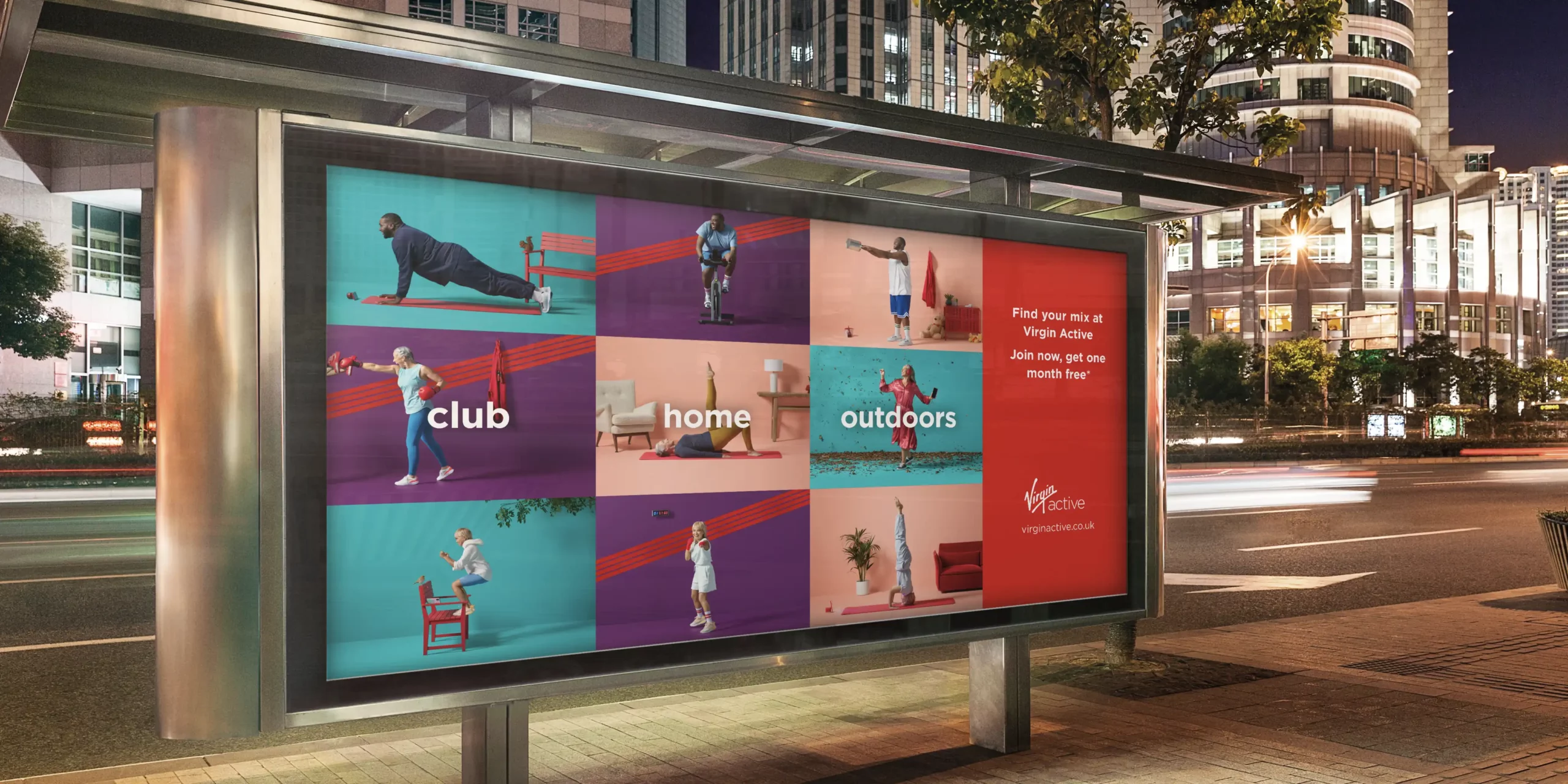
As Virgin Active’s creative partner, we regularly support their team with all areas of creative which we love being part of. It’s most exciting when it’s campaign time. This particular campaign is named ‘Mix it up’ and we were involved in the creative and delivery process from beginning to end.
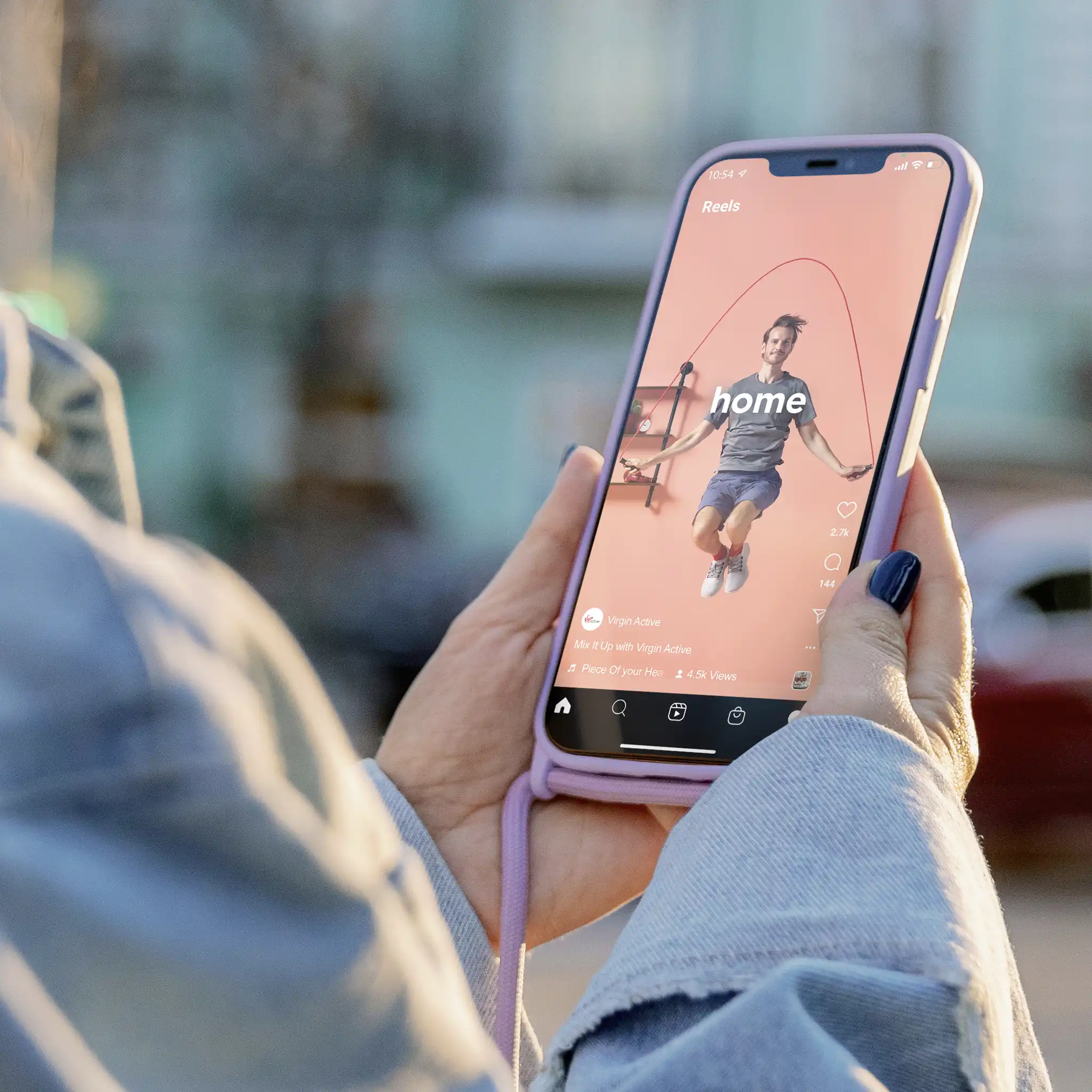
We developed the concept and how it was visually portrayed. Working with the script and actors to direct the characters within the ad, helping to create their unique little quips and quirks. Which brought the famous Virgin personality to the campaign. We worked closely with the team at Virgin Active and Virgin Group to make sure every aspect met with their brand vision and style.
The creative approach behind the Mix it up campaign was based on the premise that a Virgin Active club is the best of all worlds and offers a totally flexible approach to fitness. There’s so much choice and variation of activities all under one membership. Workouts are available to members in-club, outdoors or at home via their app. This campaign was distributed over Video on Demand, digital billboards, paid and organic social media, in-club digital screens and press ads.
It was great fun to work on with the whole team involved. Virgin were very pleased with the results and that makes us happy, and proud to have been a part of it.
