Tango Durham Branding
Design
- Branding Strategy
- Operational items and signage
- Website design and creation
- Menu redesign
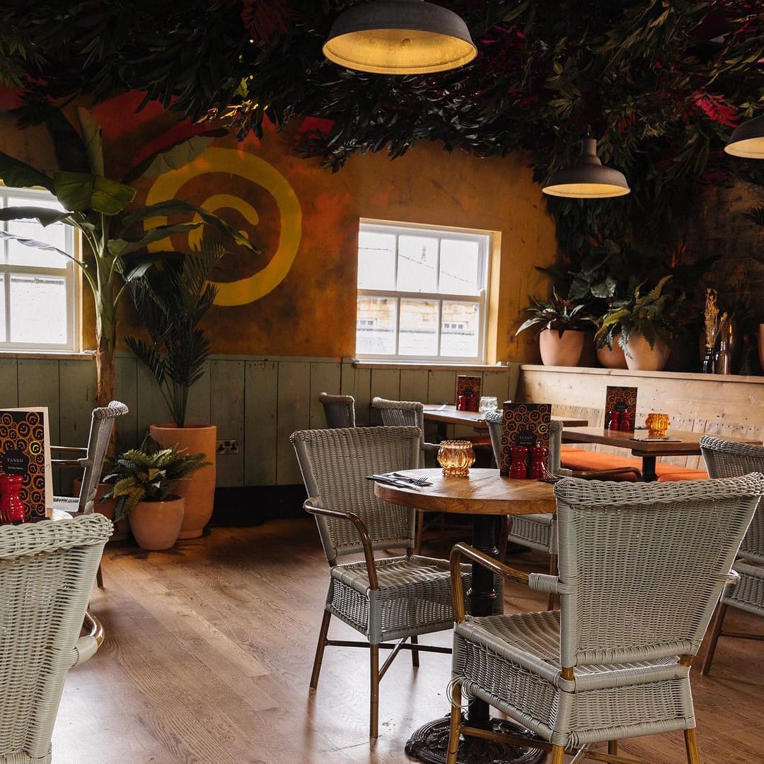
Tango is a burger-based restaurant in Durham, classed as local legends for their burgers within the area. Tango is our second project from the Zen Group’s portfolio, and we were tasked to revamp Tango as they were moving venue location within Durham and wished to build upon their current brand, focussing on their established customer but also attracting new markets whilst being able to grow the overall expanding offering.
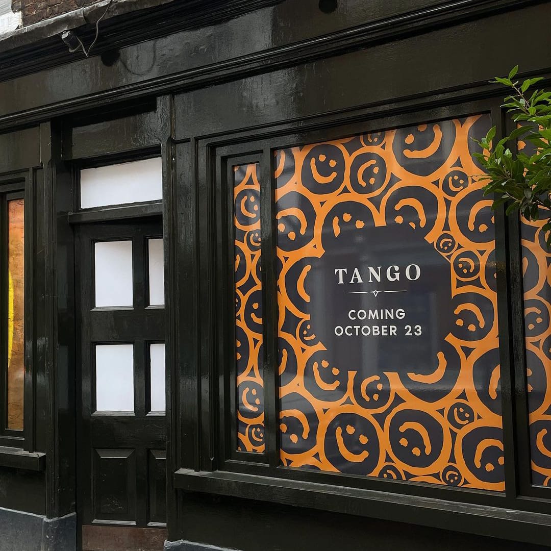
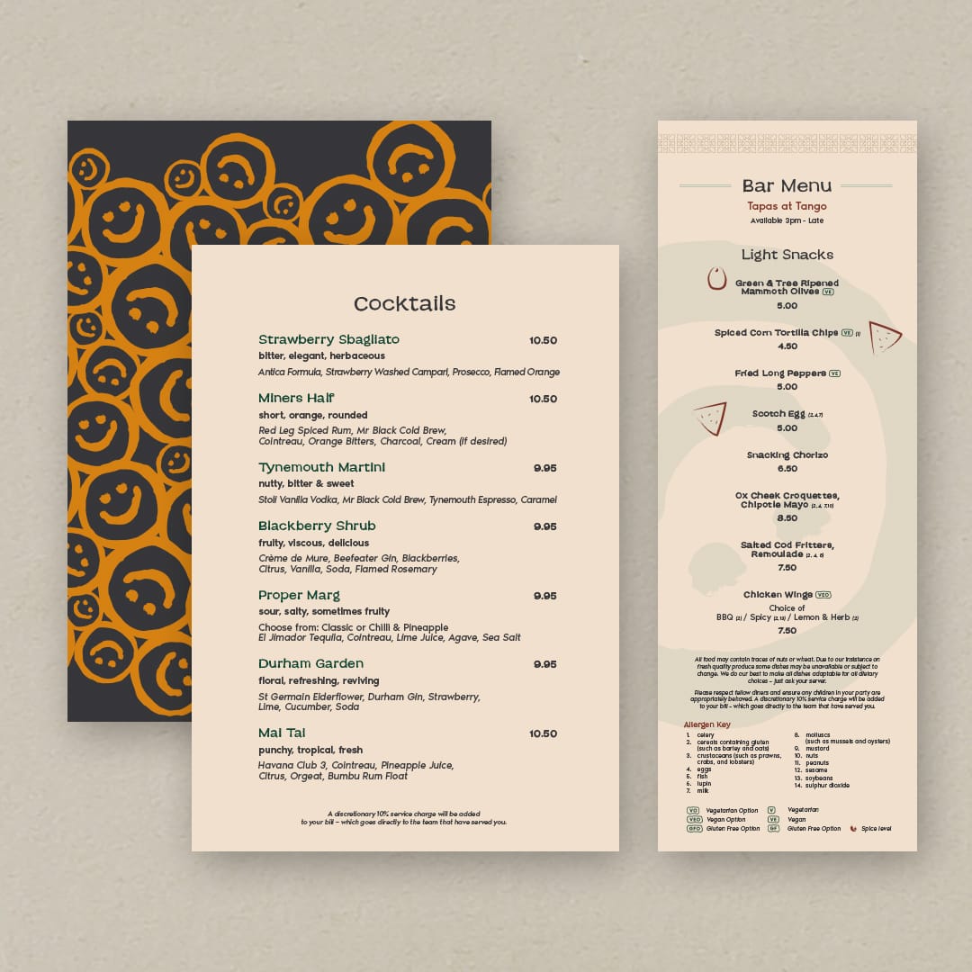
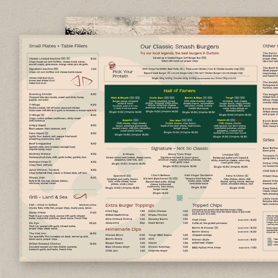
As with The Rabbit Hole, this project started with visits and workshops with the owners to understand their new vision for Tango, implementing our standard 3-point process, we were able to craft a new brand foundation. The result was to establish Tango as a ‘Social Bar and Kitchen’, allowing guests to “kindle conversations over Latin American inspired flavours that dance on the palate”.
For this branding update, we explored various themes relating to the Tango dance, the movements, and origins, plus, wider Latin American values and historic design. The logo itself had a minor refresh, but we were able to introduce a range of brand collateral and elements such as patterns, textures, colour, and iconography with influences from our research. One key element was a mural which fuses elements of Durham, such as the Elvet Bridge and connections to the area’s history with the smiley face icon as a pop of bright colour, into one piece of art. The mural was used in relocation advertising and you’ll now see it across a selection of menus.
We introduced the smiley face graphic icon as a key part of the brand which can be found on the mural, signage and across the website and menus. It’s all about bringing a cheeky splash of fun elements to the branding that represents one of the brand values.
We also redesigned the website to bring in the new branding, while re-working the user experience for easier access to see key information about Tango, such as the menus and booking platform.
The result creates a bigger, better Tango with respect to its roots and allows for a wider scope of offerings and audience, where guests can come together in the heart of Durham to share good times and great food.
The Rabbit Hole Branding
Design
- Branding Strategy
- Operational items and signage
- Website design and creation
- Brand social assets
The Rabbit Hole is a Cantonese Fusion Restaurant in the heart of Durham.
The concept is within the Zen Group’s portfolio. We were chosen to work on a complete revamp of the brand to clearly communicate their offering, feel approachable yet luxurious, and to create a cohesive brand language across all of a guest’s touchpoints.
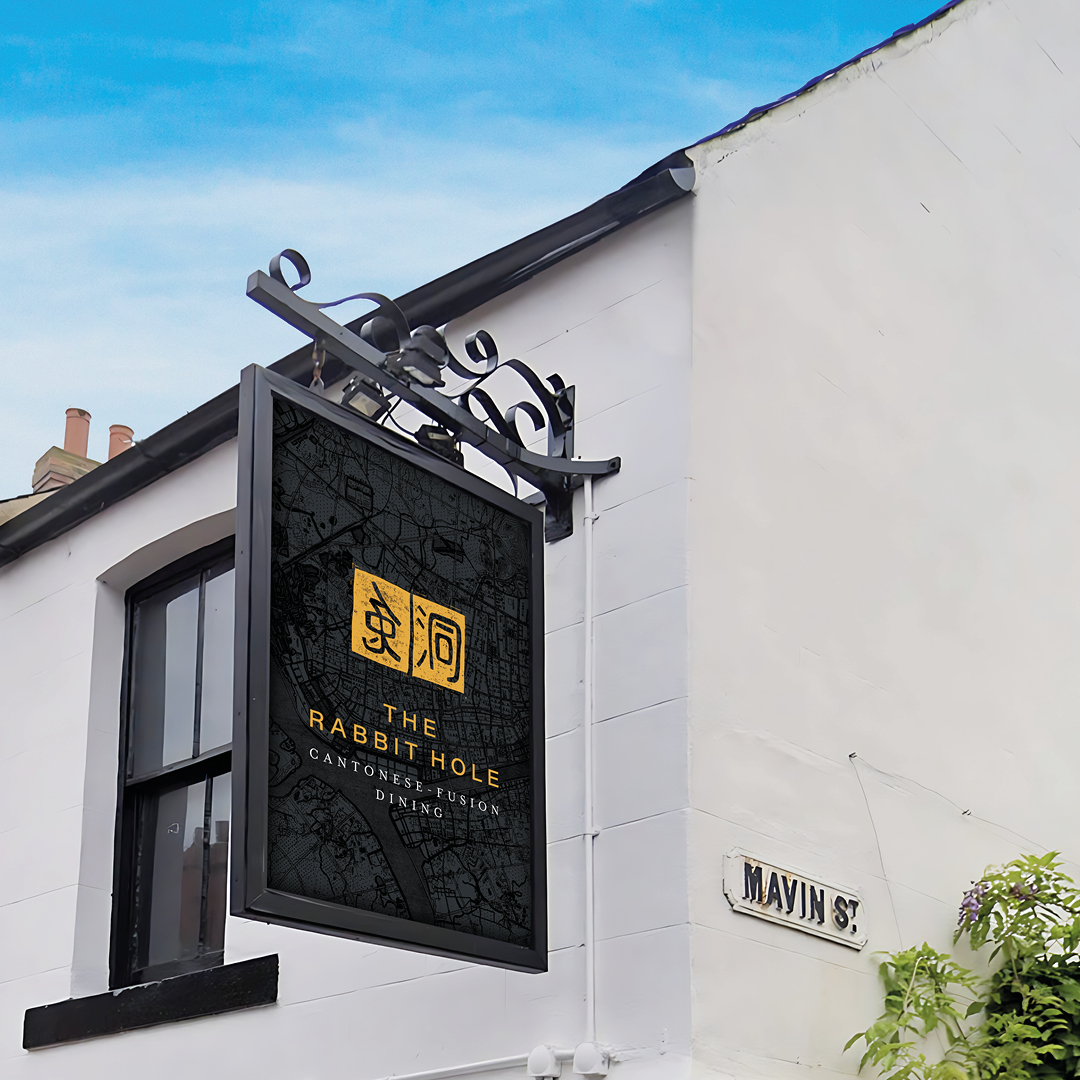
We were very excited to work with a local brand which was already established and loved in the area. Following initial visits to the site, discussions, and workshops with the owners, we got to understand their vision and the market we were targeting. We implemented our 3-point process. With research into the area, food, and culture, we created a story that encompassed the values and proposition of the brand. The results were ‘Explore time-honoured Cantonese and fusion dishes, uncovering new flavours that stir your senses.’
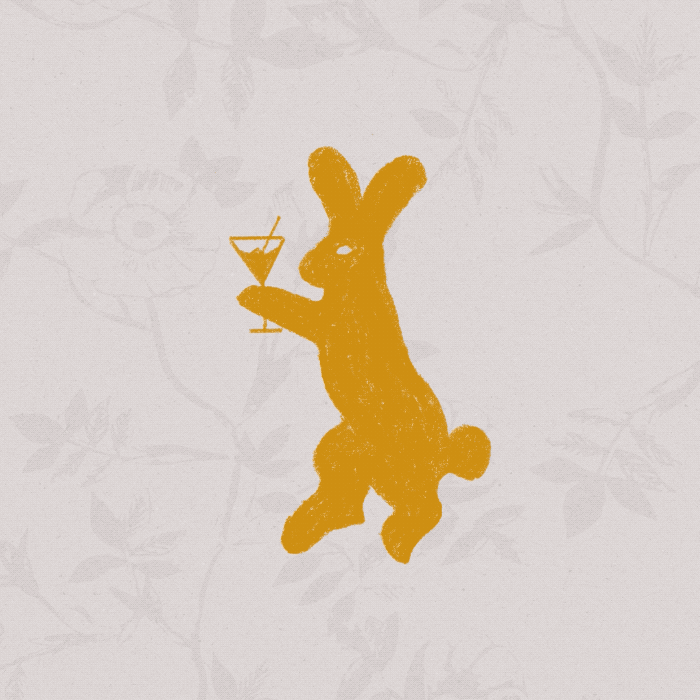
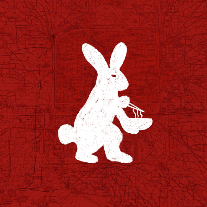
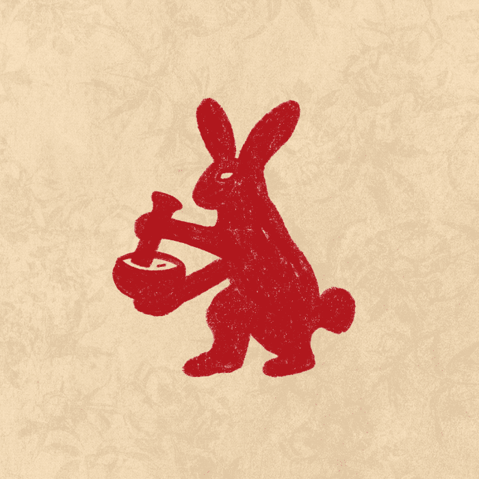
With further research into the culture of the rabbit name we discovered the rabbit has a lot of significant meanings and interpretations – The traditional Chinese character used for rabbit is a pictographic character of the wild rabbit with long ears and a short tail. The rabbit also symbolises the moon. According to ancient legend, Chang’e Flying to the Moon where Chang’e drank the elixir of life and flew to the moon with a white rabbit in her arms, therefore it was believed the spot on the moon to be the rabbit. The moon rabbit is seen pounding the elixir of life in a pestle and mortar.
We used this reference to create the new logo and we also created a character mascot of the rabbit as an illustration so that we could show him come to life in animation – grinding the pestle and mortar, lifting noodles from a bowl with chopsticks, sipping a martini, playing a saxophone – bringing him to life on the website and as social media assets that we created as part of the branding work to show all the offerings that the venue includes.
The website and items such as menus include textures and style references to Cantonese life and art, Chinese handscrolls and seals, and the logo created is styled as in Chinese culture, families and artists would use signature stamps to sign off important documents and pieces of artworks, so we created a unique stamp as The Rabbit Hole logo.
Colours and typefaces used all have a reason whether they relate to tradition, add richness or a splash of modern contrast.
Stirring the senses is at the heart of the story and sums up the experience at The Rabbit Hole as a journey of exploration.
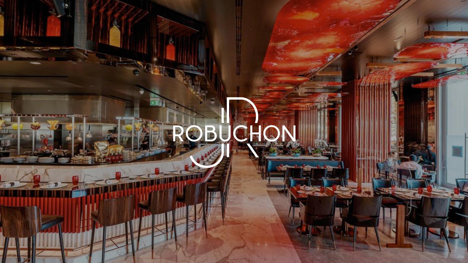
Robuchon Brand Strategy
Design
- Brand Strategy
- Research and Development
- Brand Support
There are moments that inspire you and stay with you.
We recently had one of those moments working behind the scenes with the team at Joël Robuchon International on some of their brand strategies. Whilst we can’t show the work for confidentiality reasons, we must say it was a pleasure and a privilege as part of our research to speak one-on-one with key members of the team who have been part of the business for so many years and worked with Joël Robuchon himself helping him to create his vision. And what a vision that was.
For those who may not be aware, he was a pioneer in the hospitality and restaurant world. He was the creator of counter dining, open kitchens and fusion – all part of the norm today but revolutionary when he first introduced them, and he has the most Michelin stars to this day.
His legend lives on in the people he worked with and the passion they speak with about their learnings and time with him and their love for the brand.
As designers and creatives with a love for the hospitality world, it was such a joy to hear the stories that mean so much to them. We had some very memorable conversations.
This is why we do it. The buzz of inspiration.
The people. The passion. The stories.
Here’s to more of it.
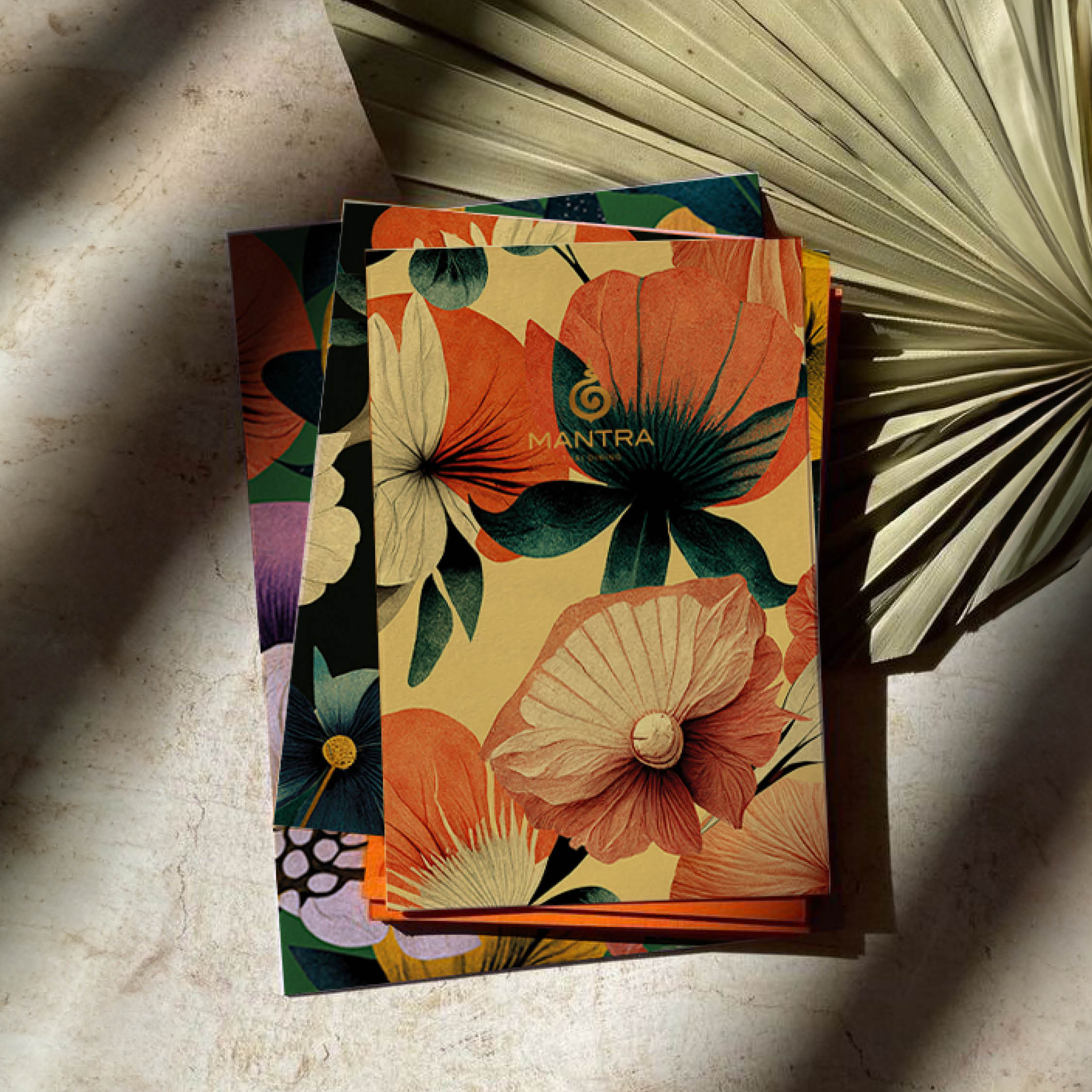
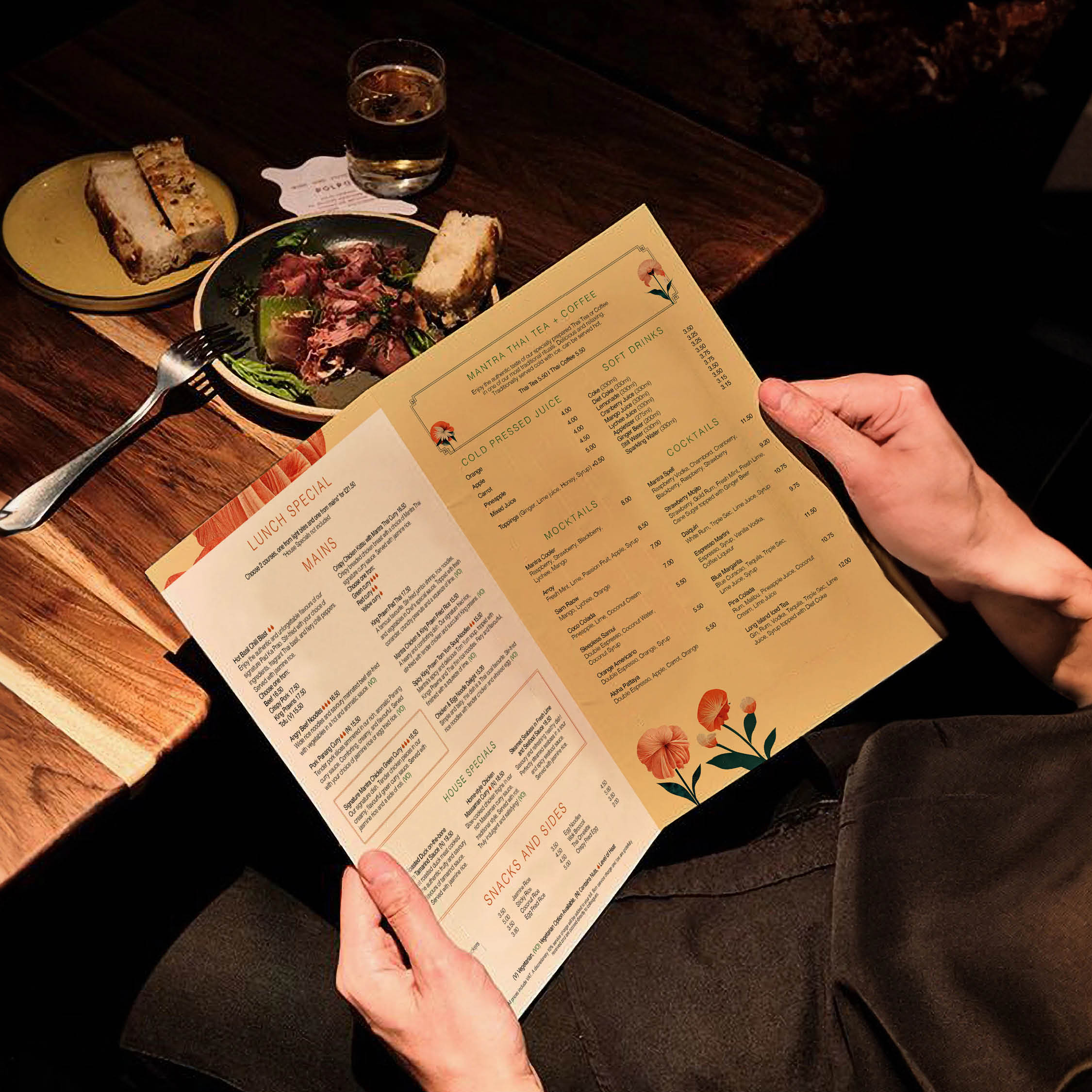
Mantra Thai Menu Design
Design

- Menu Strategy
- Menu Design and Creation
- Brand Development
As part of our overarching brand development and support work with Mantra Thai restaurant, we worked on their menu development to create a new refreshed menu suite. They had refurbished their lower floor area with Space ID one of our creative partners, with the intention to attract a more casual diner, for all day dining in a beautiful and relaxed lounge style atmosphere.
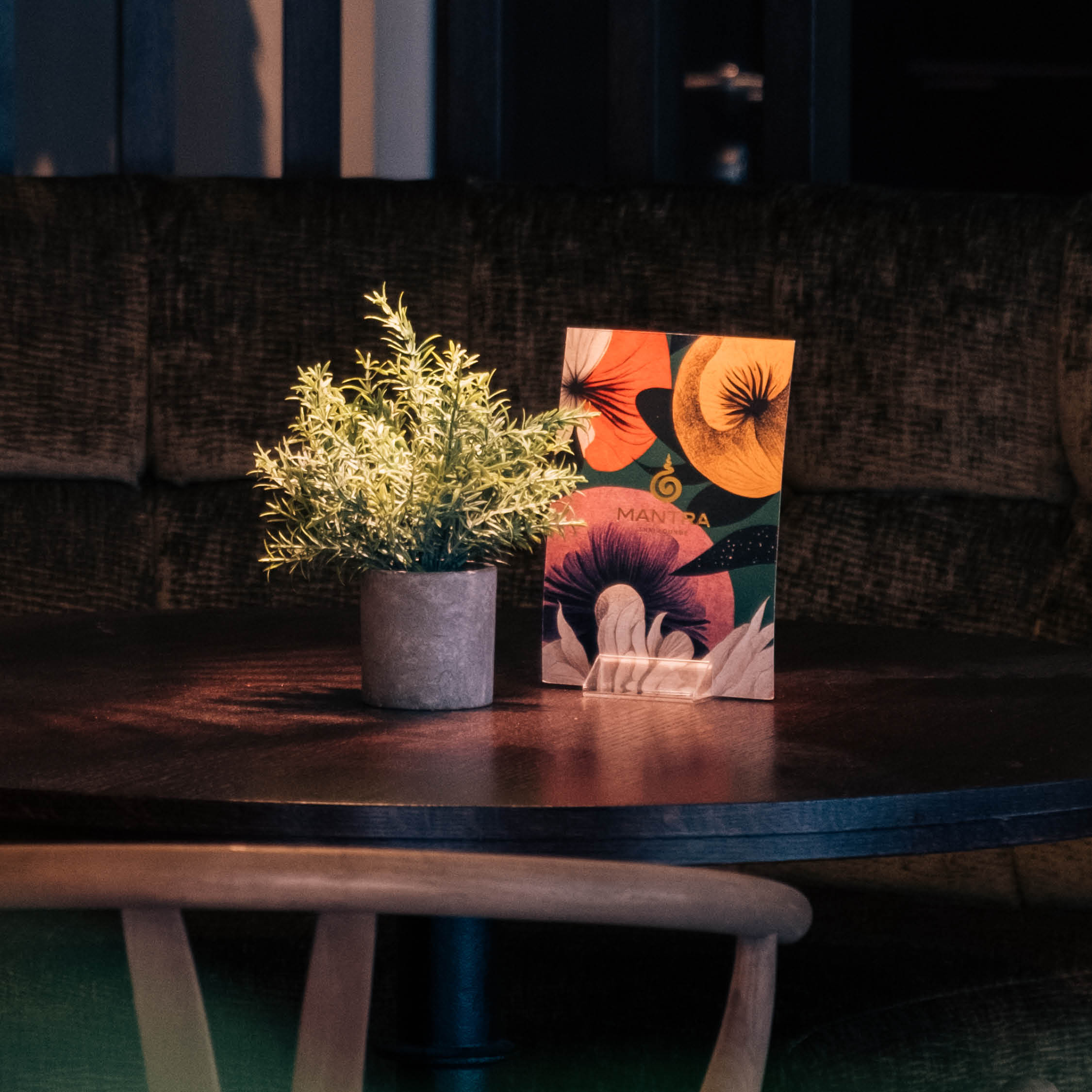
We met with the Mantra Thai team, Space ID and our PR partner Dee MacDonald to understand their purpose and goals for the brand moving forward. With the intention of attracting a new audience and to extend the offering to existing guests with additional reasons to dine with them. They wanted guests to feel they could have a range of flexible experiences to create happy memories and special moments, in a space that felt vibrant and more contemporary with comfortable seating, and a range of table choices from booths to high seating that would be ideal for leisurely coffees, lunch meetings, casual small plates with friends over drinks and even private hire for groups.
Our belief (in fact you might say one of our Mantras) is that the menu is an important sensory, tactile part of the brand and guest experience. We assessed their existing suite of menus and using our specifically designed menu process and menu psychology, we applied a new structure to the formatting and layout, we introduced a special lunch platter for a quicker, lighter lunch option that would appeal more to the office workers and lunch-time crowd, and we created a set of impactful designs for the backs of the menus.
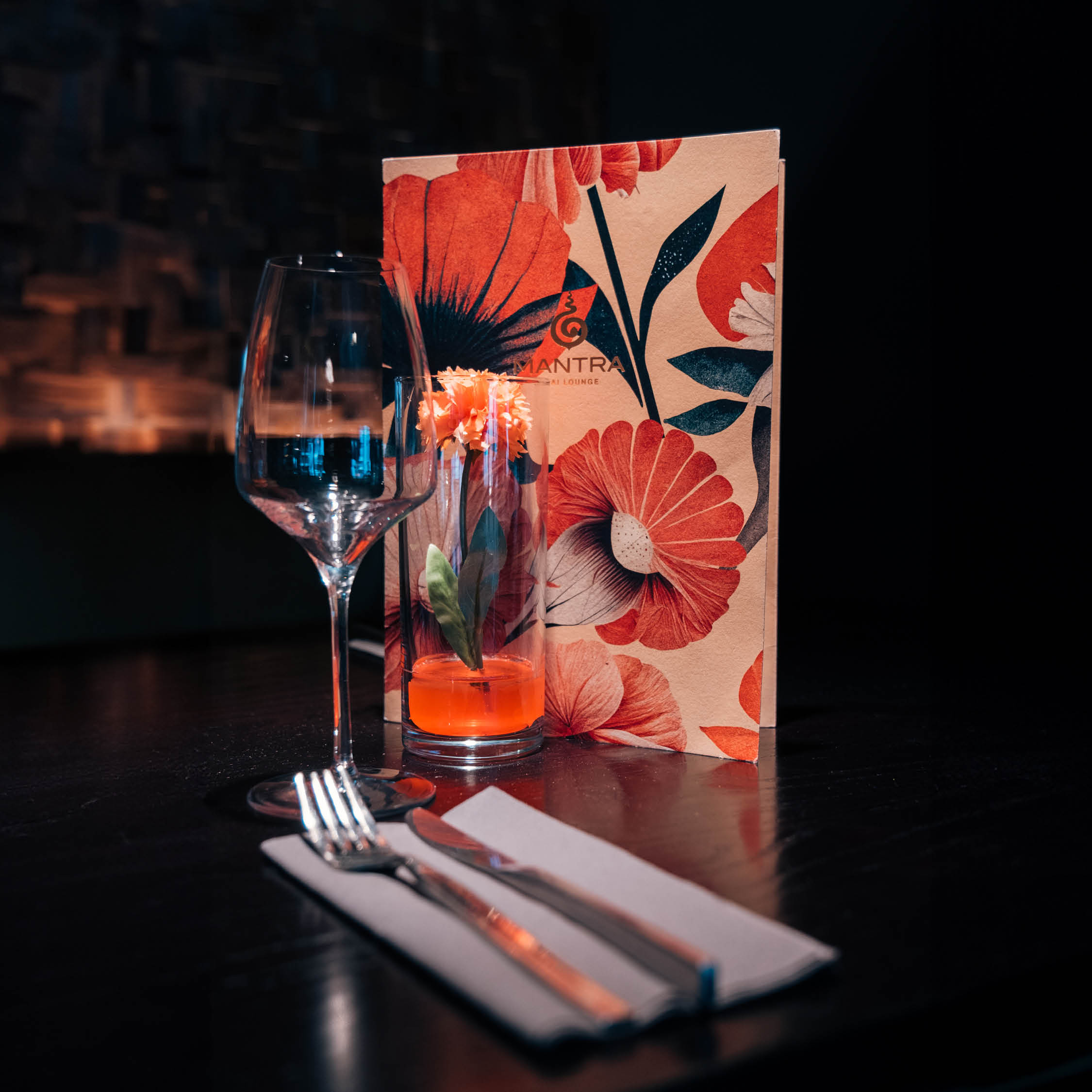
The menu back designs were created specifically to sit within the new interior design and have impact on the tables but whilst feeling part of the design scheme. We also applied a gold foil to the logo on the menus to elevate the tactile and visual feel and add to the luxury of the environment.
This style and imagery we then carried across into social media posts and promotional items to begin creating a brand consistency and visual recognition for this part of their business.
They had great feedback from their guests, some even wanted to take one as a momento.
A Brasserie Zedel Christmas
Design
- Illustration
- Brand support
- Digital animation
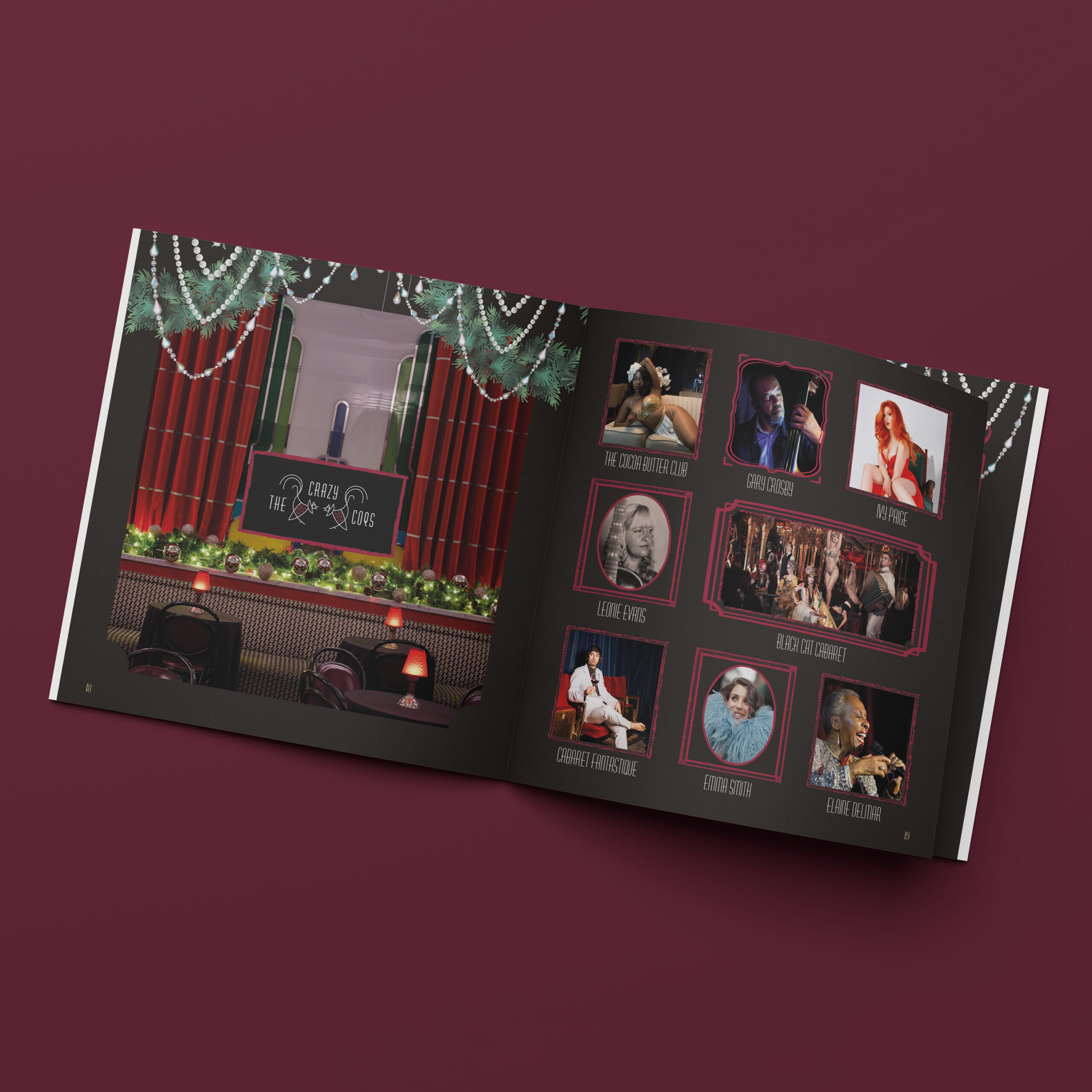
Located in the heart of Piccadilly, Braserie Zédel is a grand and bustling Parisian brasserie. The building also plays host to ZL Café - a casual pavement-level café, an authentic American Cocktail Bar – Bar Américain, and an intimate jazz and cabaret space – Crazy Coqs.
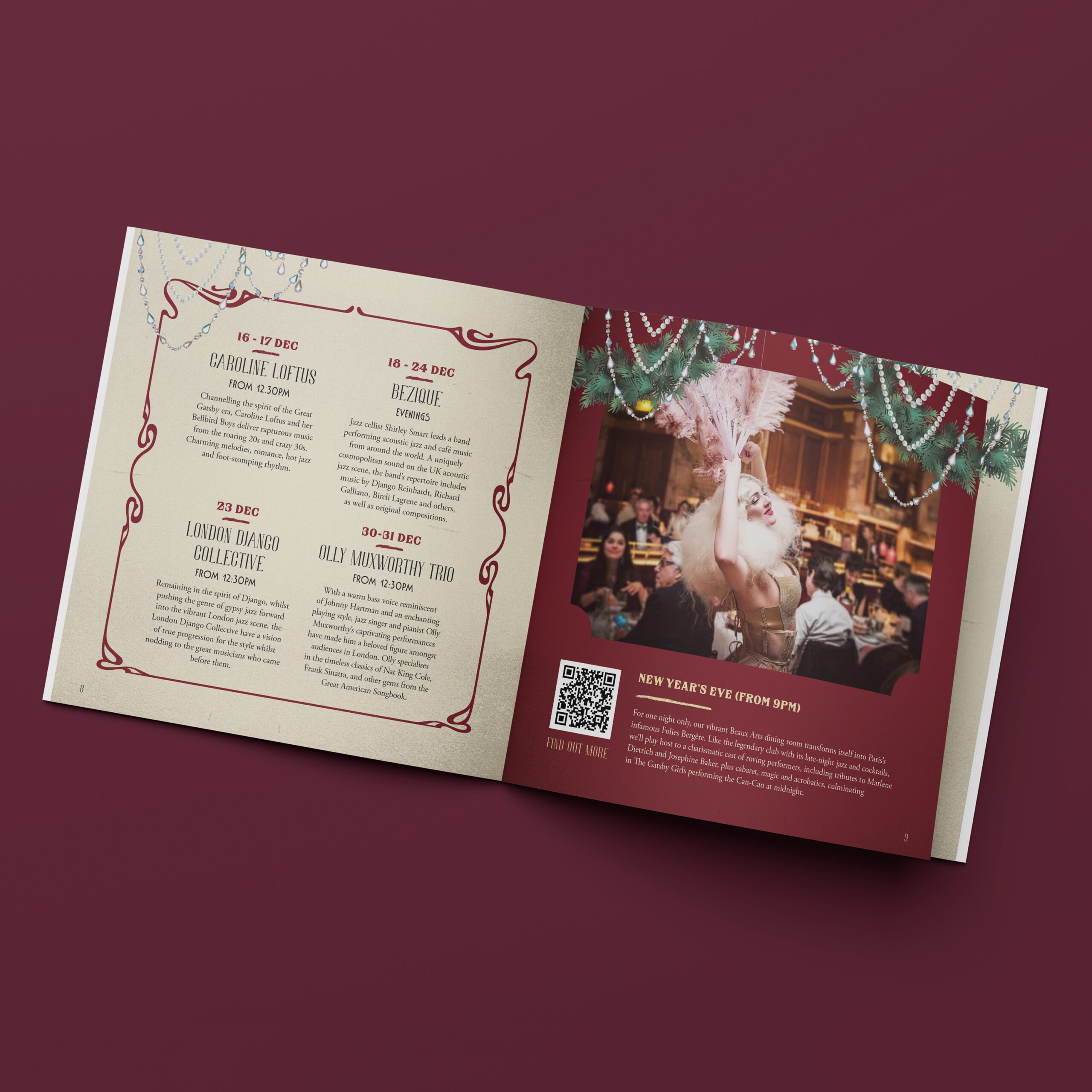
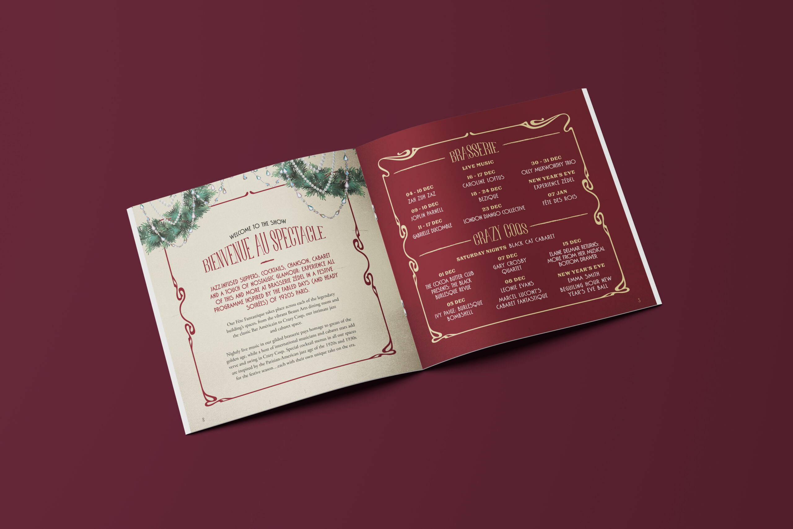
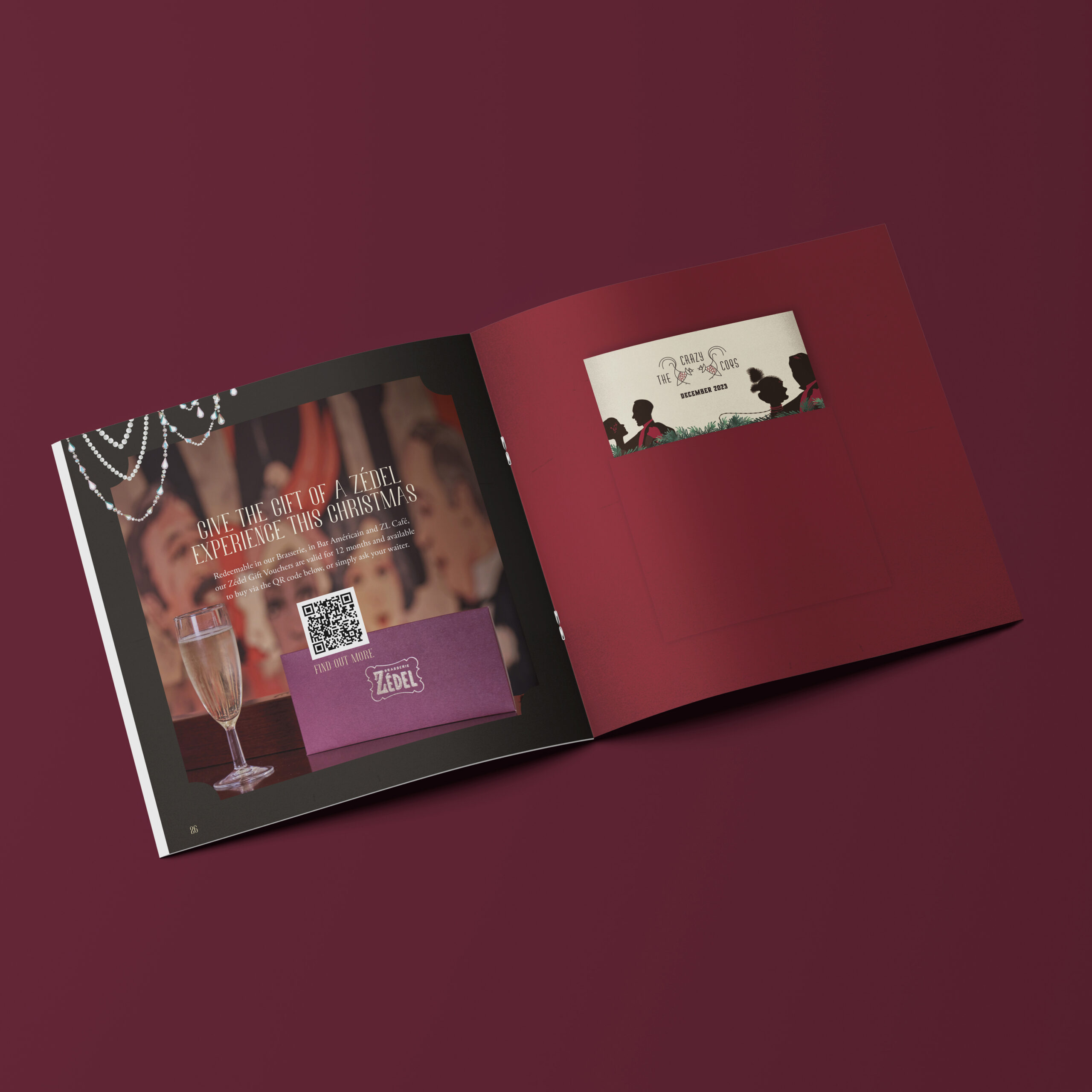
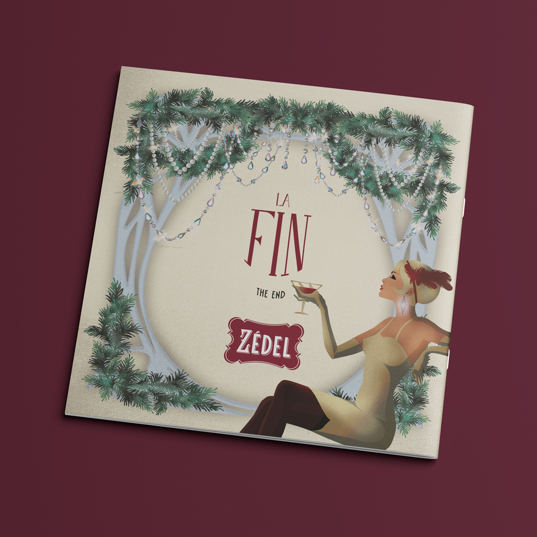
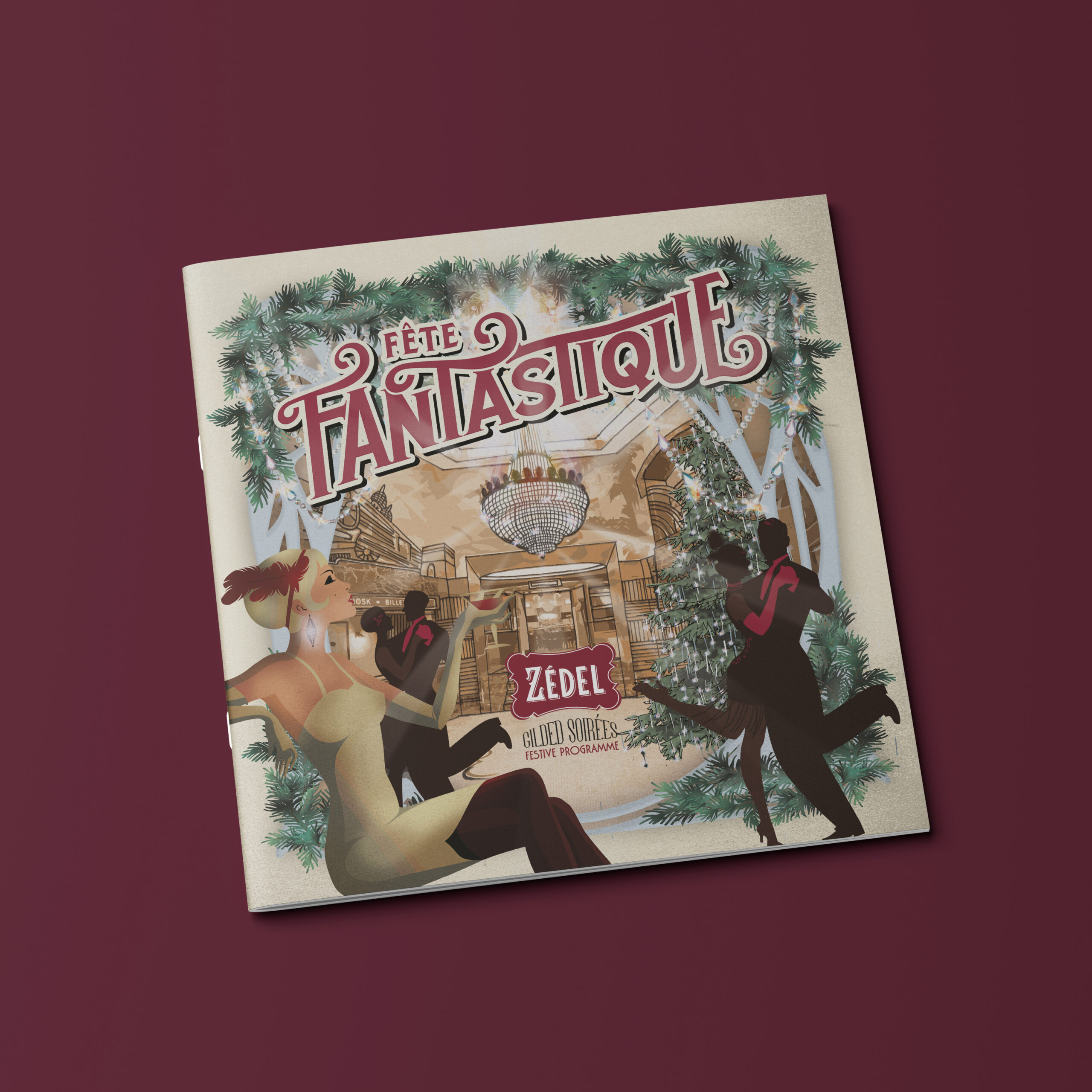
With lots of activity within the building for the Christmas and New Year guests, we were asked to help bring their festive theme to life – Fête Fantastique! A festive programme of events was put together including jazz-infused suppers, cocktails, chanson, cabaret and a touch of nostalgic glamour all inspired by 1920s Paris. We designed a booklet that contained all the information and created an illustration that focussed on the foyer area, with a sprinkle of glitz and glamour, a hint of cocktail, a fabulous Christmas tree representative of the one on site and the crystal decorations.
We ran the theme throughout the pages using elements of the illustration, and added a little pocket at the back of the brochure to hold a mini brochure of the Crazy Coqs shows.
We also animated the illustration for website and social assets to promote the festive period with added twinkle.
There was a good uplift on guests picking up the brochures, and a boost in bookings. Fantastique!
Branding and Strategy
Design

- Brand Strategy
- Brand Development
- Creative Campaign
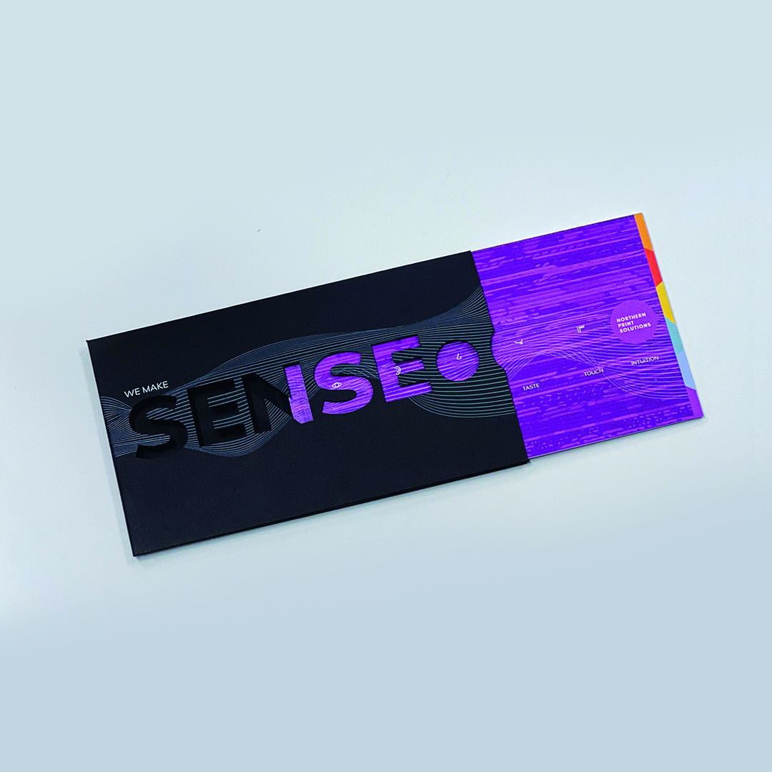
Printing solutions that press all the right buttons.
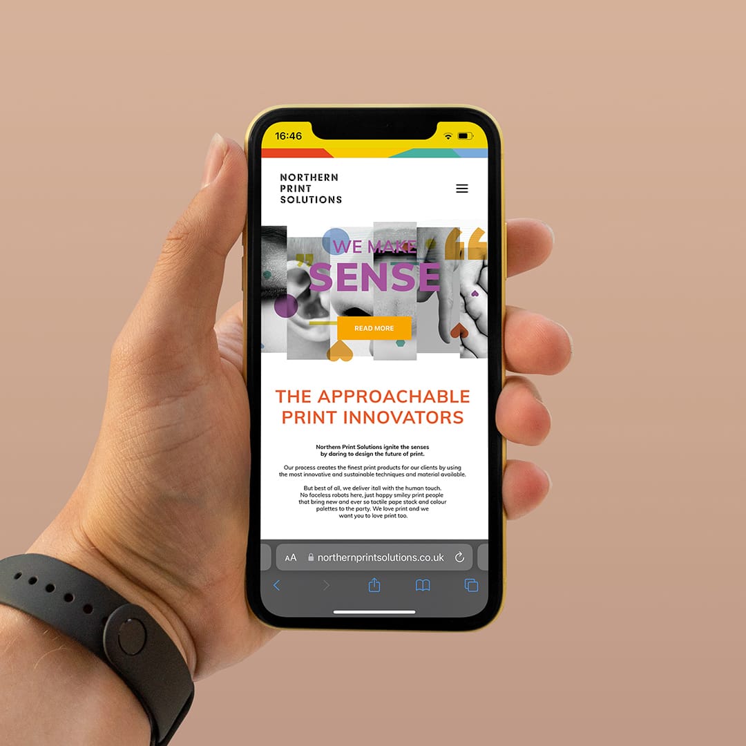
Northern Print Solutions are a bespoke printer based in the North East of England. We recently worked closely with them on their vision for moving forward with their branding and strategy to target specific markets.
It’s always good to hear from our clients how they felt about the journey of working with us.
Cath Riley, Director of Planning, People and Commercial Operations at Northern Print Solutions said:
With big ambitions for the next five years, our business recognised that the power of our brand would be fundamental to achieving the huge changes that we faced both externally and internally. The team at Curate invested significant time up front with us, getting to understand where our business was, where we wanted to be and the challenges we faced. With a fresh pair of eyes, they came up with a brand refresh that maintained the personality that our clients knew and loved us for, yet resonated significantly with our changing target market.
The results to date have been incredible, which has generated a significant step-change in the business, including:
- Greatly improved target market brand engagement, resulting in a positive change in our inbound leads
- Instead of 1/20 leads meeting target qualification 5/10 now meet qualification
- 20x ROI
- Enhanced rate of cultural change and adoption of business practices to meet our target market needs as our team understands tour brand more than ever
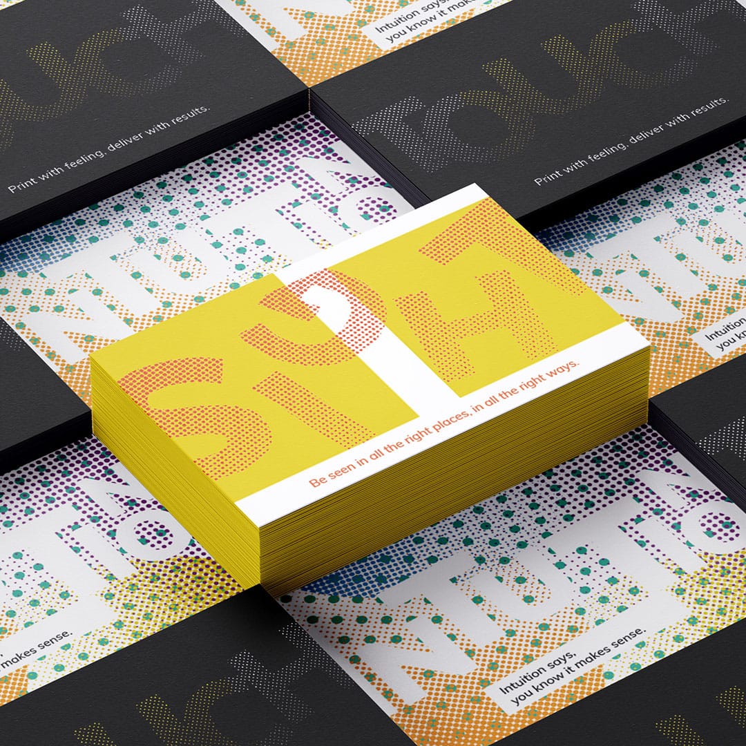
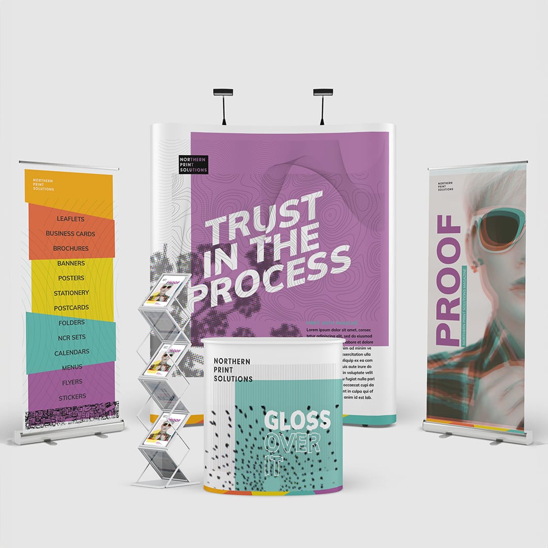
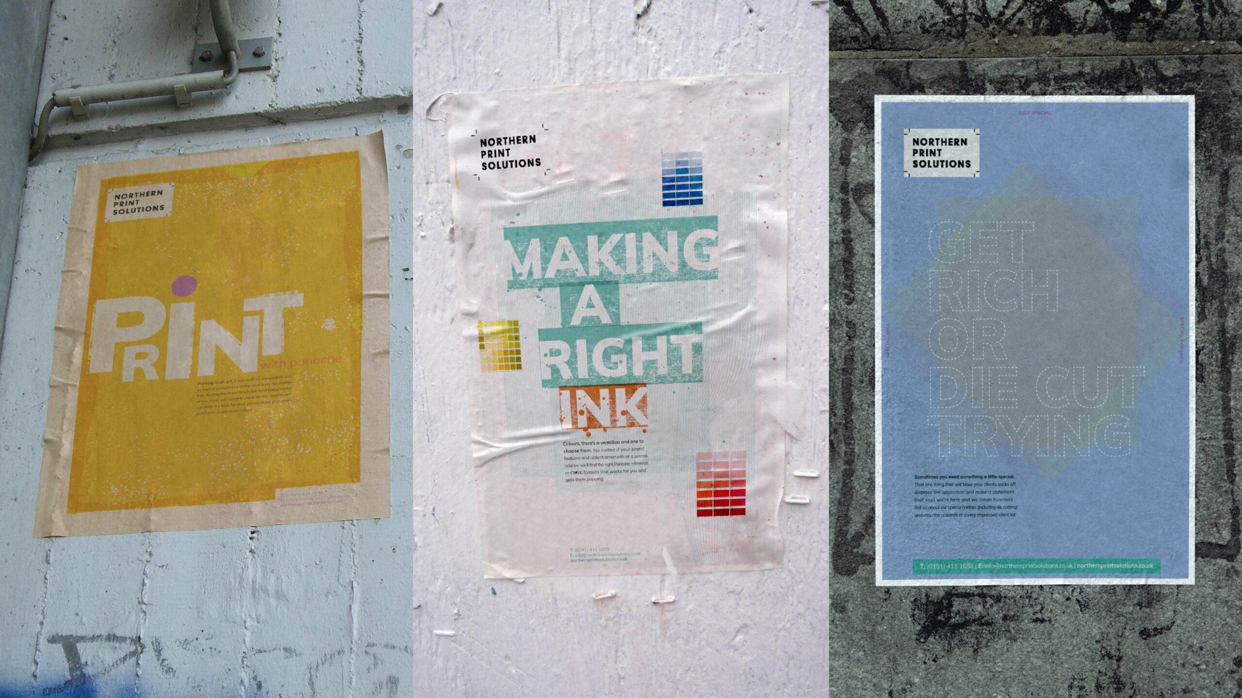
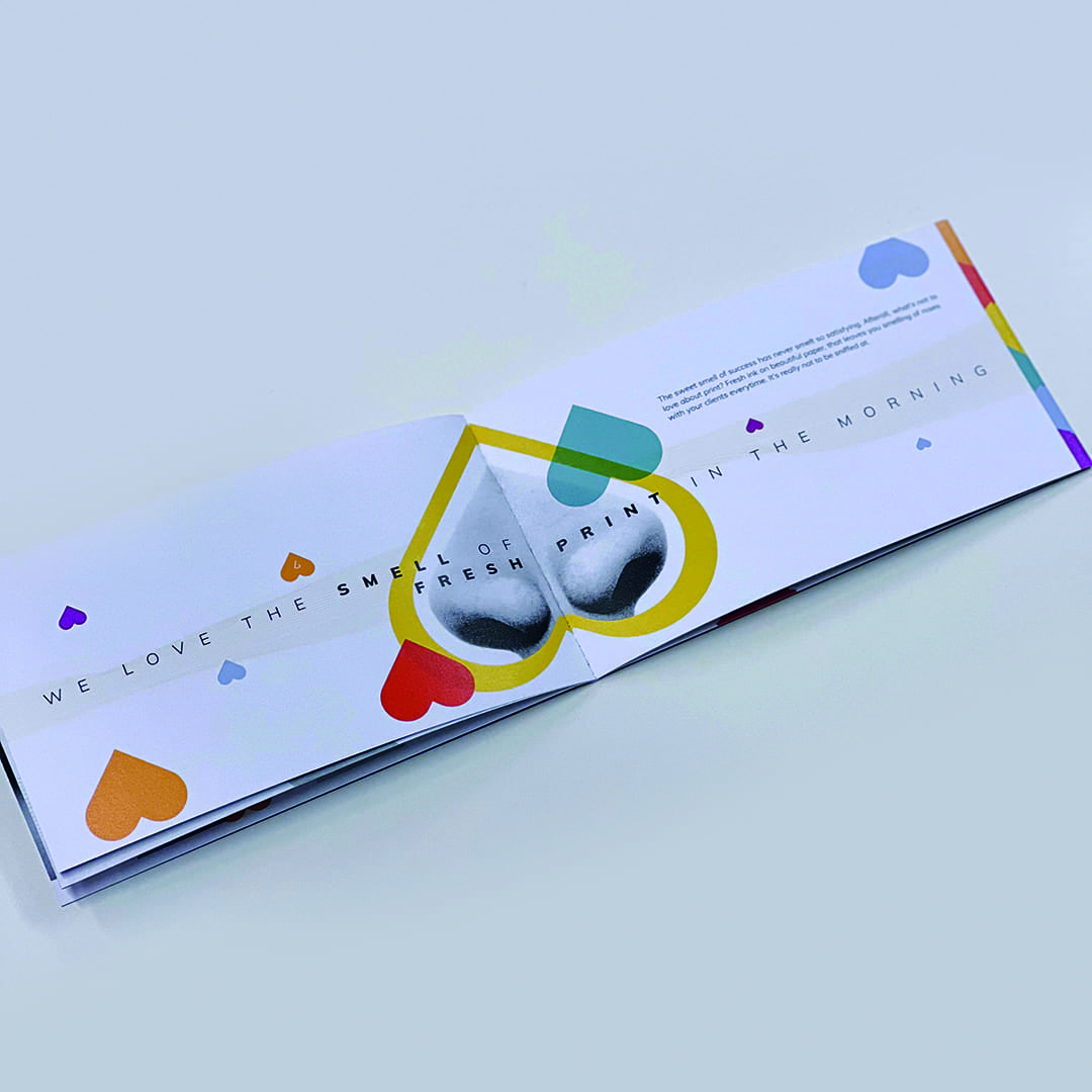
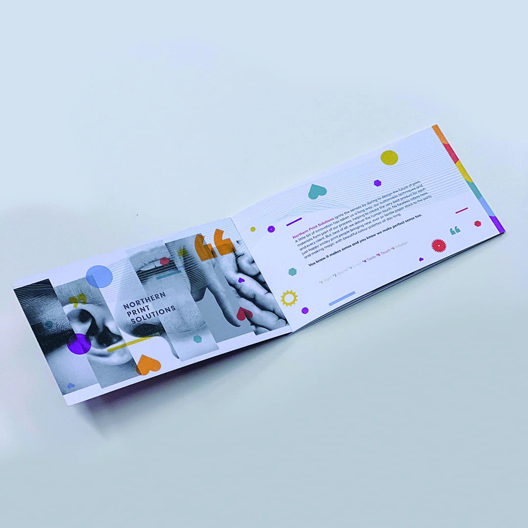
We created a thorough brand strategy document that built a pathway for the business to follow and worked closely with the whole team to encourage a greater understanding and belief in the changes that were being made. This included updating their brand guidelines to a new colour palette, more expressive typography and a range of graphics and visuals to represent printing techniques that worked whether they were communicating in print or digitally online so that their messaging could transition across a bespoke tactile print piece or across their website and social channels.
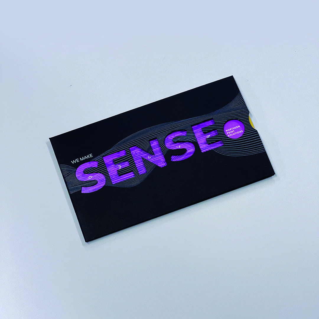
We then created a campaign that helped express their key message through all the senses and how their business effects them, “we make sense” from the sweet smell of fresh print to the tactile touch of a textured stock.
It’s a great feeling to see another happy client and some very positive results.
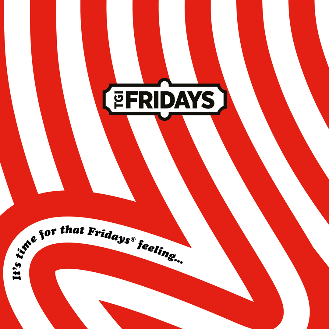
TGI Fridays May Party Month Campaign
Design
- Brand support
- Campaign Creative
- Promotional Marketing
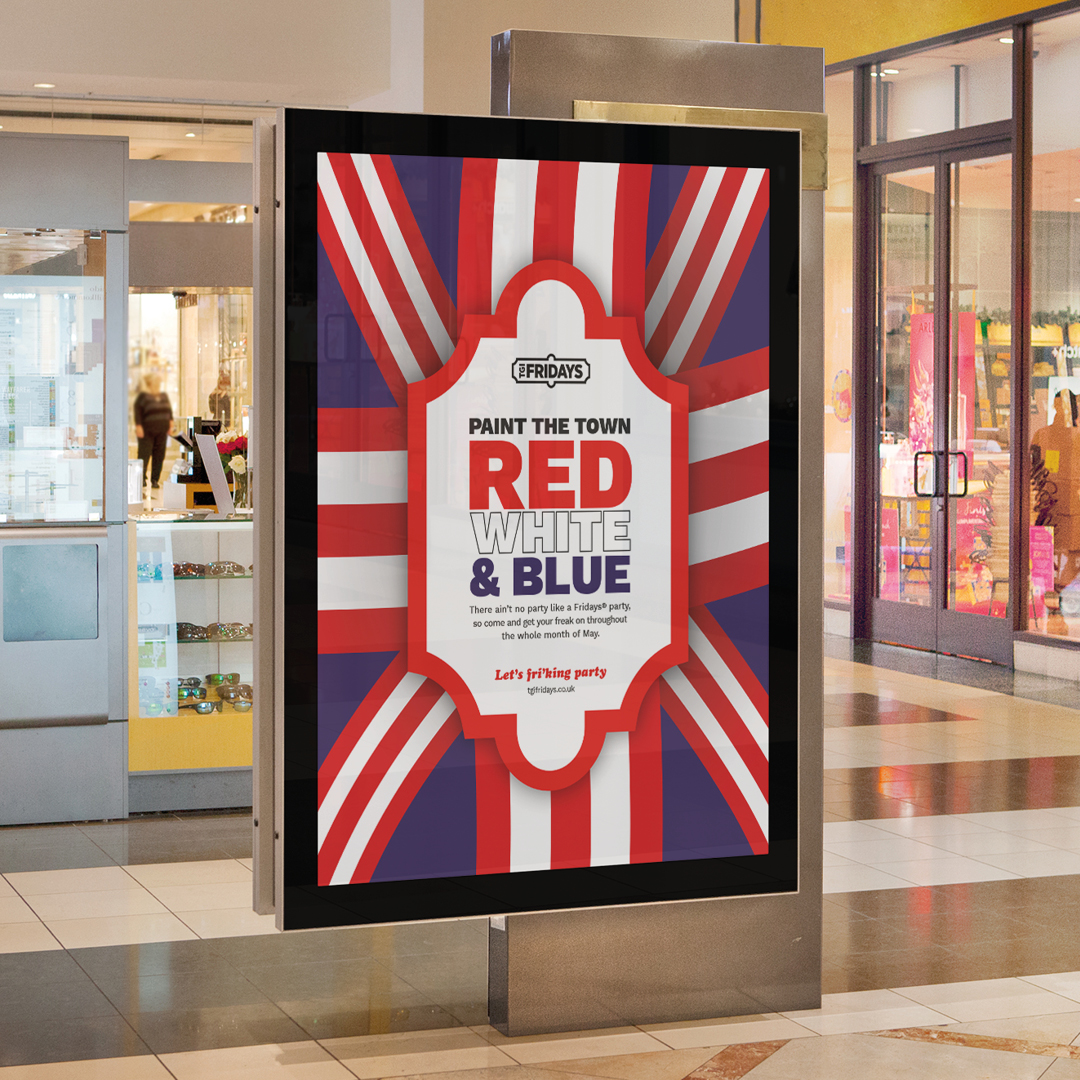
The month of May this year was certainly a month of celebrations. Eurovision, multiple Bank Holidays, The Royal Coronation, and of course a few Fridays in to boot! The team at TGI Fridays briefed us to create a series of campaign concepts to tie the whole month together as a ‘party month’ to celebrate and showcase all the activities, promotions and events they were holding during that time.
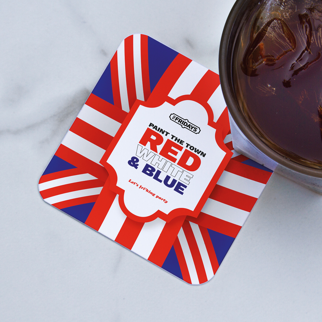
We presented a series of options to the marketing team and our “Paint the town red, white and blue” was a favourite within the directions. By adding blue to their usual palette of red and white stripes we were able to celebrate their unique perspective of celebrating a truly British summer from the viewpoint of an iconic American brand.
The campaign worked across multiple levels and a whole host of assets were created to support the planned in-store activity. These included posters, in-store screens, social media assets and table displays. Each working collectively to inform the customer of all the good times that TGI were creating for them.
A series of specially crafted cocktails were also created by the in-house mixologists and named with a distinctly Eurovision theme. It was British, it was European, it was American, it was unique, it was TGI in May.
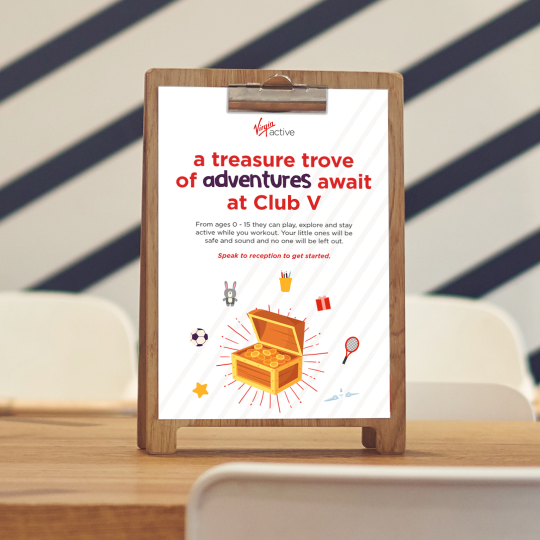
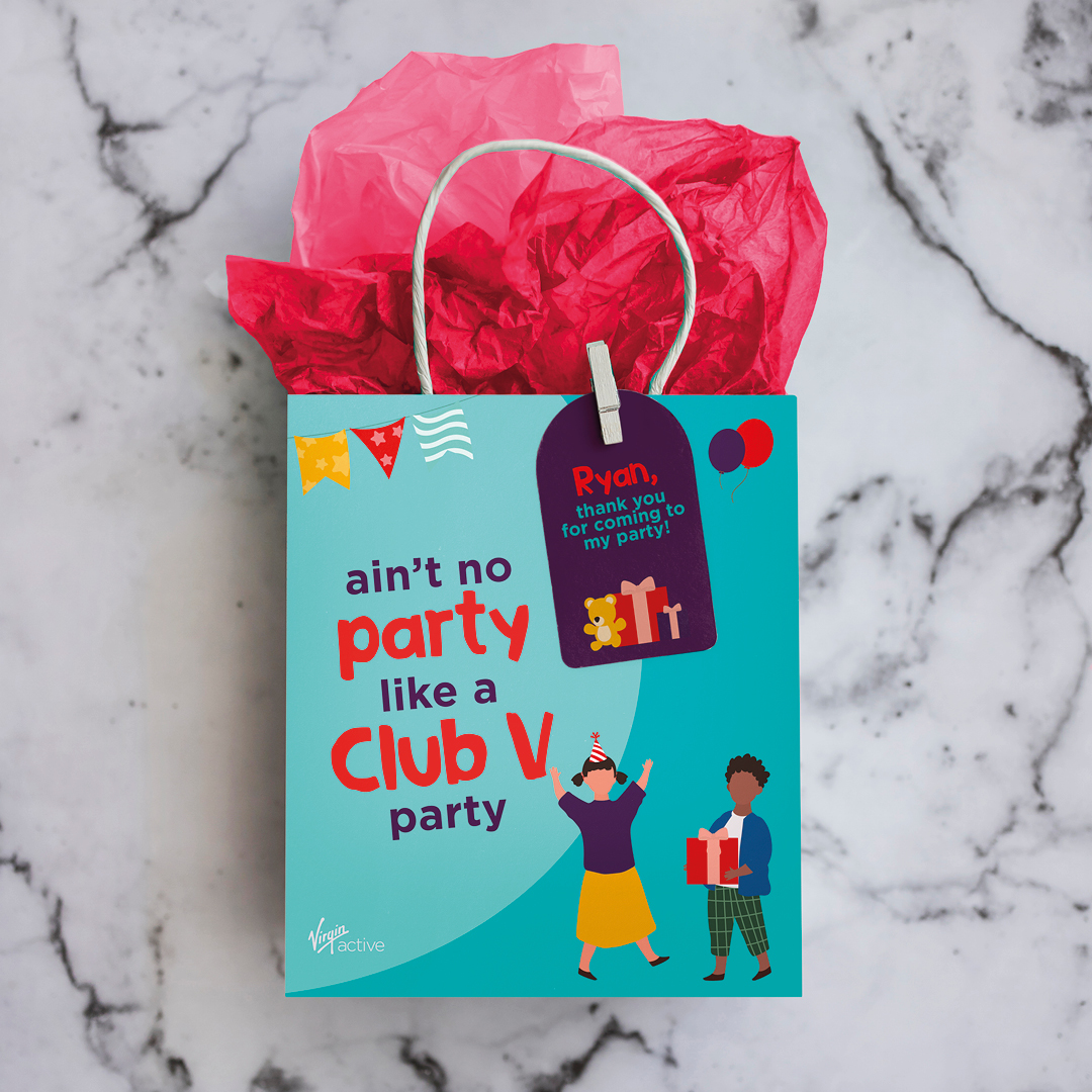
Virgin Active Family Branding
Design

- Family brand creation
- Illustration
- Animation
Virgin Active are all about movement for everyone. Their family clubs have an excellent offering for ages 6 weeks to 16 years, including a crèche, Club V full of engaging, inspiring activities, Kids’ camps and swim clubs and galas.
As their creative partner, we were asked to work on the family branding and communications as a sub-section of their overarching brand. Same values and purpose, but with more appeal to various age groups and activities.
To achieve this, we created a tiered design pack so that the style all looks consistent as part of a pack and works together with any cross over categories, but also had a visible difference between the items that are for younger age groups compared to the 14-16 year old range.
We designed a set of inclusive illustrations of young people engaged in all the different types of fitness and wellness activities. We included various pieces of equipment and accessories, so that we could use these to visually represent everything that Virgin Active offer. This was created as a flexible design pack so that we can always keep adding and creating new pieces when the need arises.
We included a mix of photography and smaller aspects of illustration when it gets to the older age groups within the pack and used the brand colours and added some specific new ones to this family brand pack to make sure we had enough flexibility to create the images required but still feel like part of the main Virgin Active palette. We also introduced an additional typeface to add character and a more fun element to highlight the words that were key, active words.
We then applied these to various pieces of collateral and communications, eg a brochure, emails, social media assets, digital screens, posters, flyers and invites.
A bit of subtle animation on the social assets and digital screens adds a bit of fun and brings them to life.
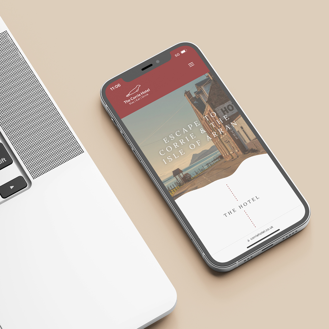
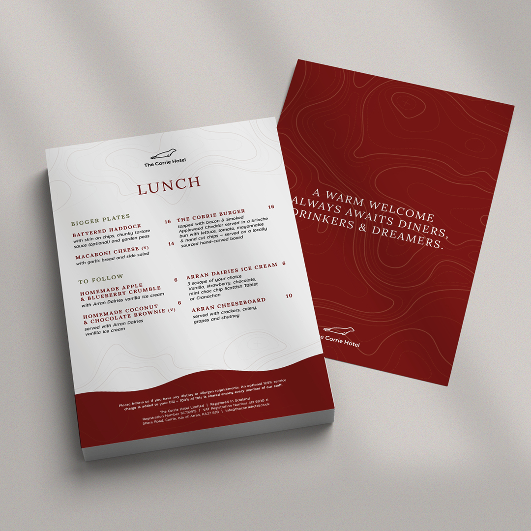
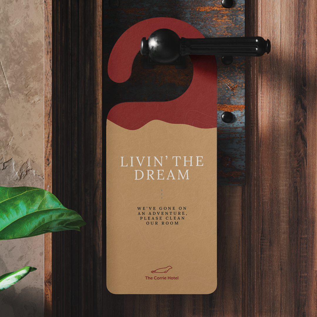
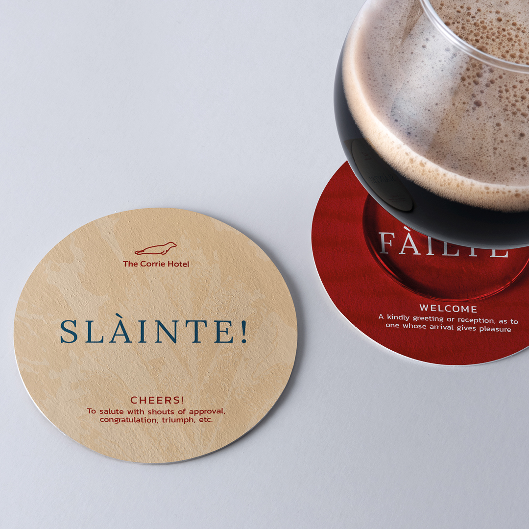
The Corrie Hotel Brand Development and Website
Design

- Brand development
- Menus
- Website design and build
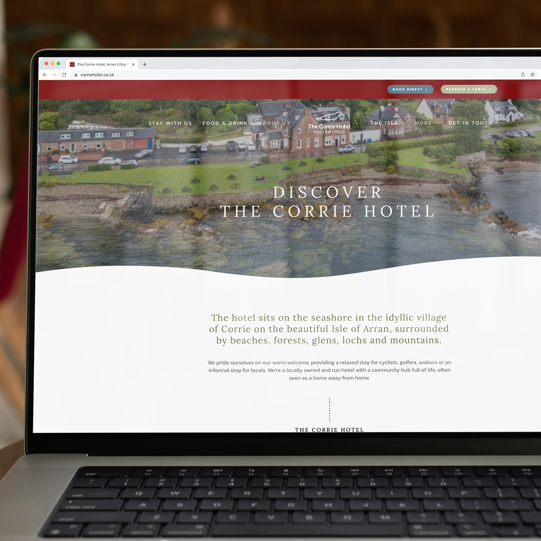
We were asked to help them transform their brand and proposition, (but not their logo), so that they could become a strong hub for visitors and locals on the island. They wanted their brand to be synonymous with The Isle of Arran and be one of the foremost recognisable places to visit.
So, for this we made a point of learning all about the history of the building and the location and to understand the attractions on the Isle. We investigated everything from weather patterns and topography to visitor attractions and ferry timetables. This gave us a great insight into any issues guests would have during a visit to what is a slightly more remote location.
By working with the team as a creative partner, we gained a real insight and started to understand the real hidden gems of such a trip, and this allowed us to create a full brand pack that promoted The Corrie Hotel in the best way to their guests. It was a useful process for their whole team and allowed the brand to become one of the most accessible in the region for tourism.
But the real cherry on the cake was when we applied all of this to their new website, which we developed from the ground up ensuring the user experience and information available all works together for the most enhanced guest journey. It has become a real shop window for The Corrie Hotel and shows the hotel interiors, beautiful location and localised information and attraction information to the fullest.
It was a real 360 approach as the website really thrives because of the work we put into establishing the brand proposition and the brand really works because it now has the website it deserves.
Andrew Garbutt and Rodger Meadows, The Corrie’s joint owners said:
The team at Curate were a pleasure to work with from the start to the fruition of our new website. They took time to understand our market, customer and business in depth and were great at both listening and getting the job done. They have a keen eye for design and ensuring it was the perfect match for our market and commercially for the business. They are also very likeable people, and we would have no reservations in recommending them to others.
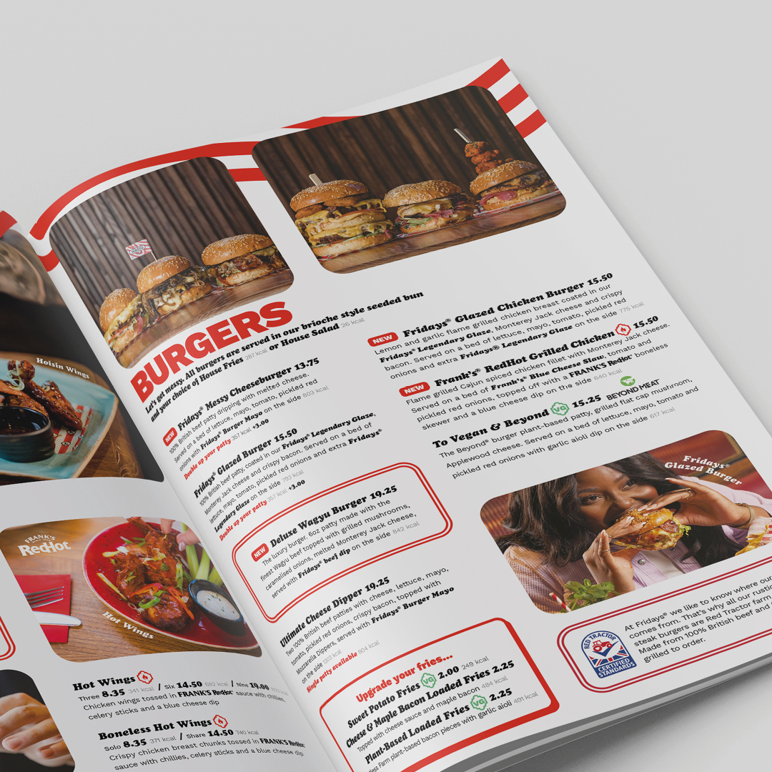
TGI Fridays Menu Development
Design
- Menu strategy
- Menu design
- Brand support
TGI Fridays is an American restaurant chain focusing primarily on American cuisine and casual dining. The first Fridays opened in New York in 1965 with the timeless promise “In here, it’s always Friday”. We love that Friday feeling, so we were delighted when the team at TGI Fridays asked us to take a look at their menu.
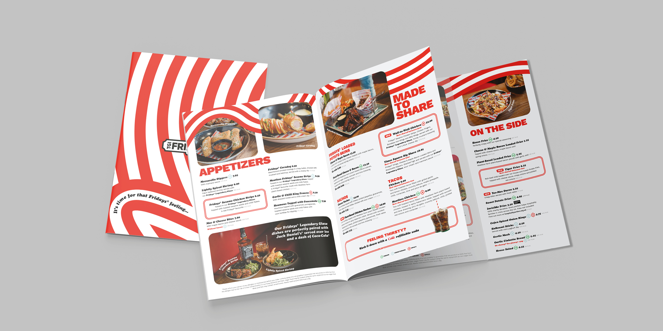
One of our many specialties at Curate is the creation of menus. We apply a rigorous process that has been created to assesses everything from the format to the layout and the presentation of the menu. We apply menu psychology, design experience and our knowledge of the hospitality sector, to make sure a menu works its hardest in when placed into a guest’s hands in situ. We see it as a major part of a hospitality brands make-up and the guest’s journey. It can be a piece of art, a tactile part of the experience or simply a tool to create clarity, but it always forms part of a guest’s memorable visit.
With TGI Fridays, we needed to make sure the Friday vibe was alive and kicking, that the dishes were clear and easy to follow, and that specific types of dishes stood out. Using their existing brand elements, we worked through options for the use of symbols, colour and typefaces. Photography of their dishes and environment is important to the brand so we made sure these were incorporated amongst their iconic brand assets of the stripes (Originally inspired by the Barnum & Bailey Circus with an ambition to put on the greatest show on earth, don’t you know!)
Despite what you may have heard, size does also matter, and as there are several sections to the menu, we used an easy-to-hold A4 booklet dimension, with a handy side flap that can be opened to be always visible, upselling the sides and keeping the desserts in mind so you don’t forget to leave room for that S’mores Sundae!
The team were ecstatic with the results and that always gives us that Friday feeling… even on a damp Tuesday in November. We think we’ve earned our stripes on this one.