Virgin Active Summer Campaign
featured

- Campaign
- Brand Messaging
- Copywriting
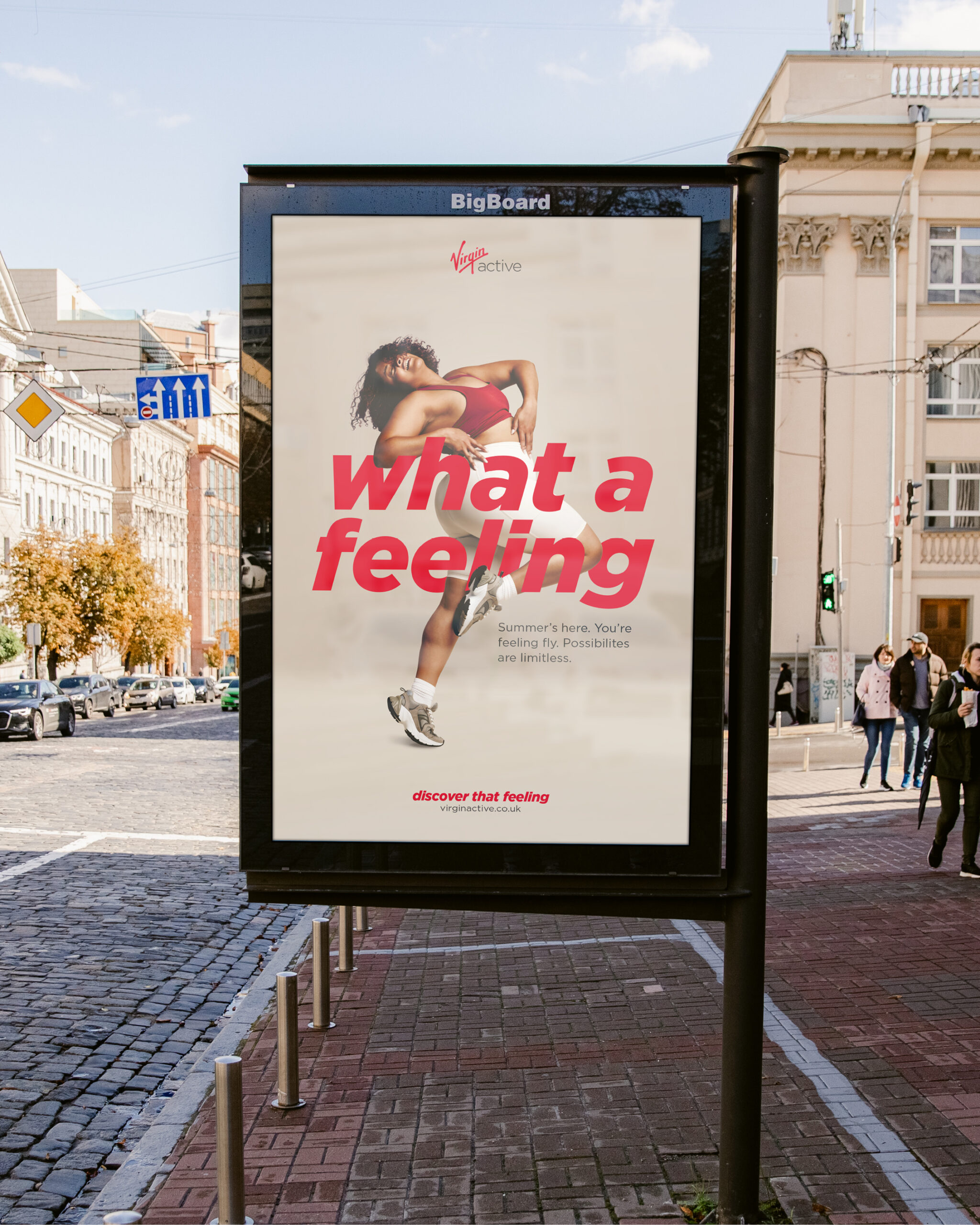
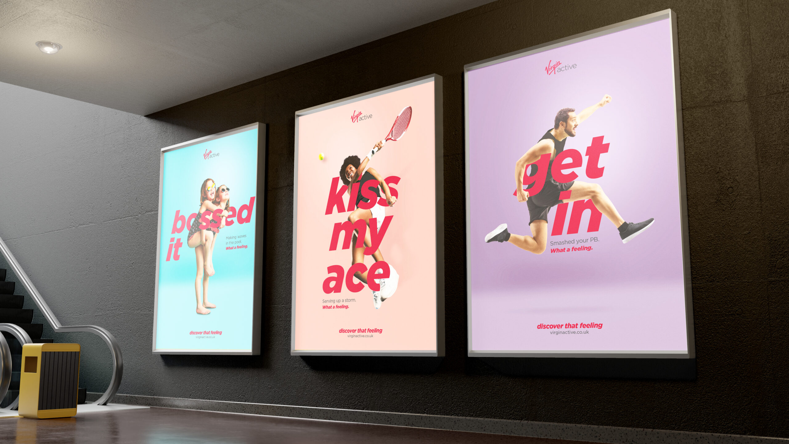
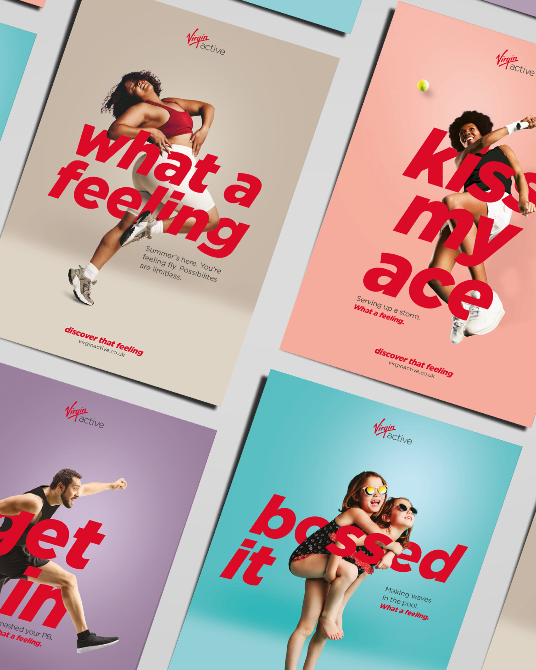
We wanted the imagery to be punchy and bold and really make a statement with the typography intertwined, working with the Virgin Active tone of voice and brand colours to create a premium feel. We chose the imagery with an emphasis on the emotion and feeling to really support the campaign headline of “What a feeling”.
The campaign assets are live in print and digital forms on the website, social media, leaflets, posters and digital screens. We also animated the digital assets to create energy and movement.
We’re so happy with the results. We just have to see if we can touch our toes now. What a feeling.
Menus, menus, menus
featured
- Brand support
- Menu design and creation
- Project management
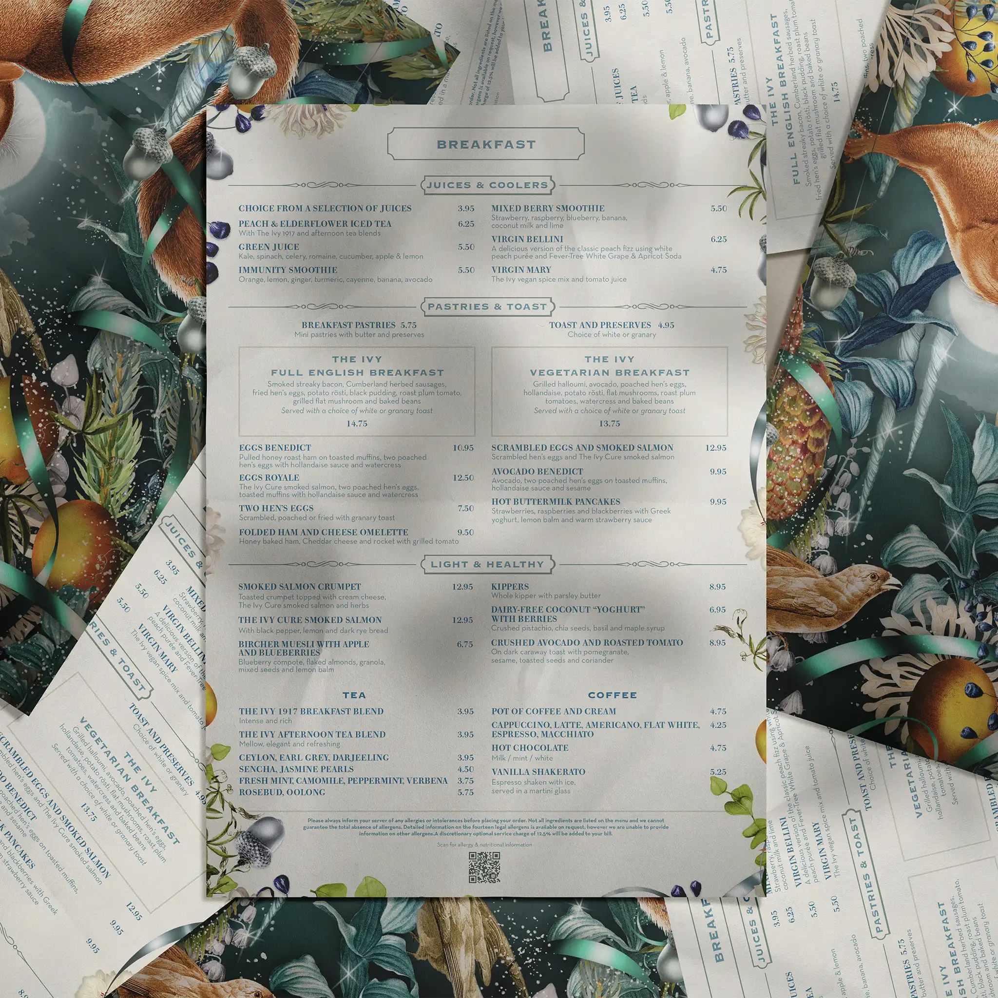
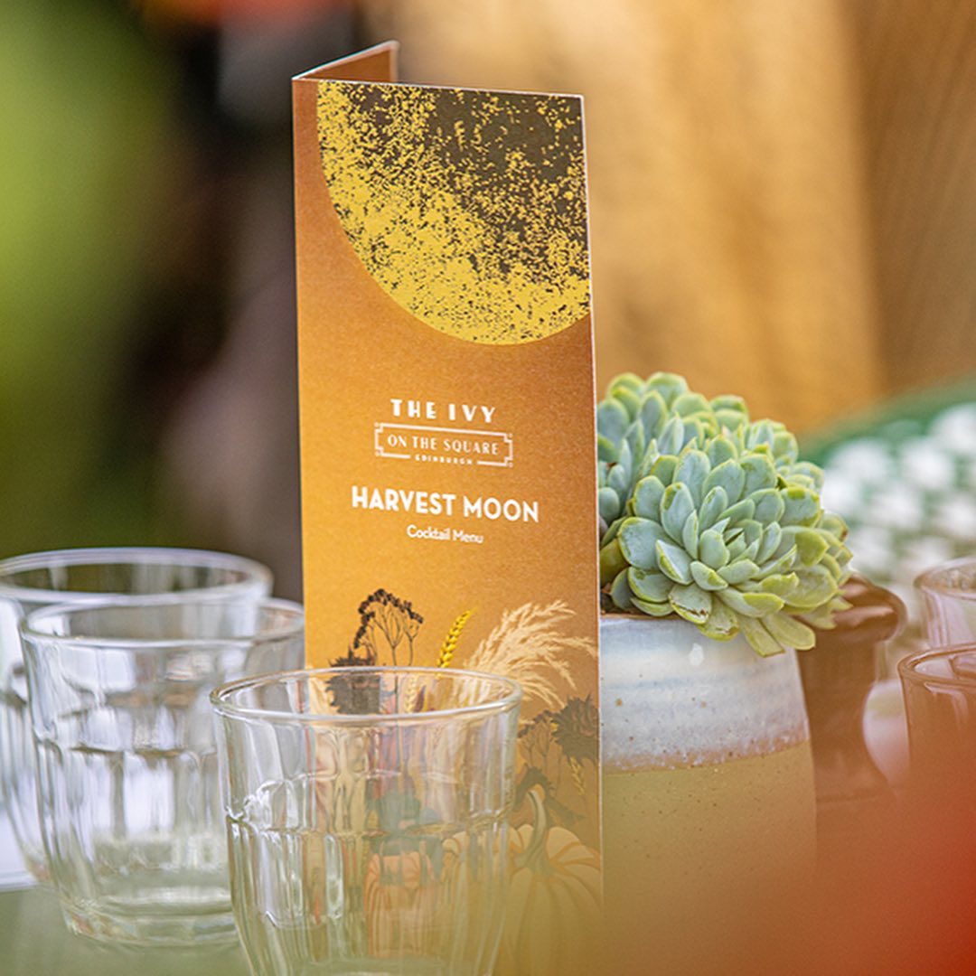
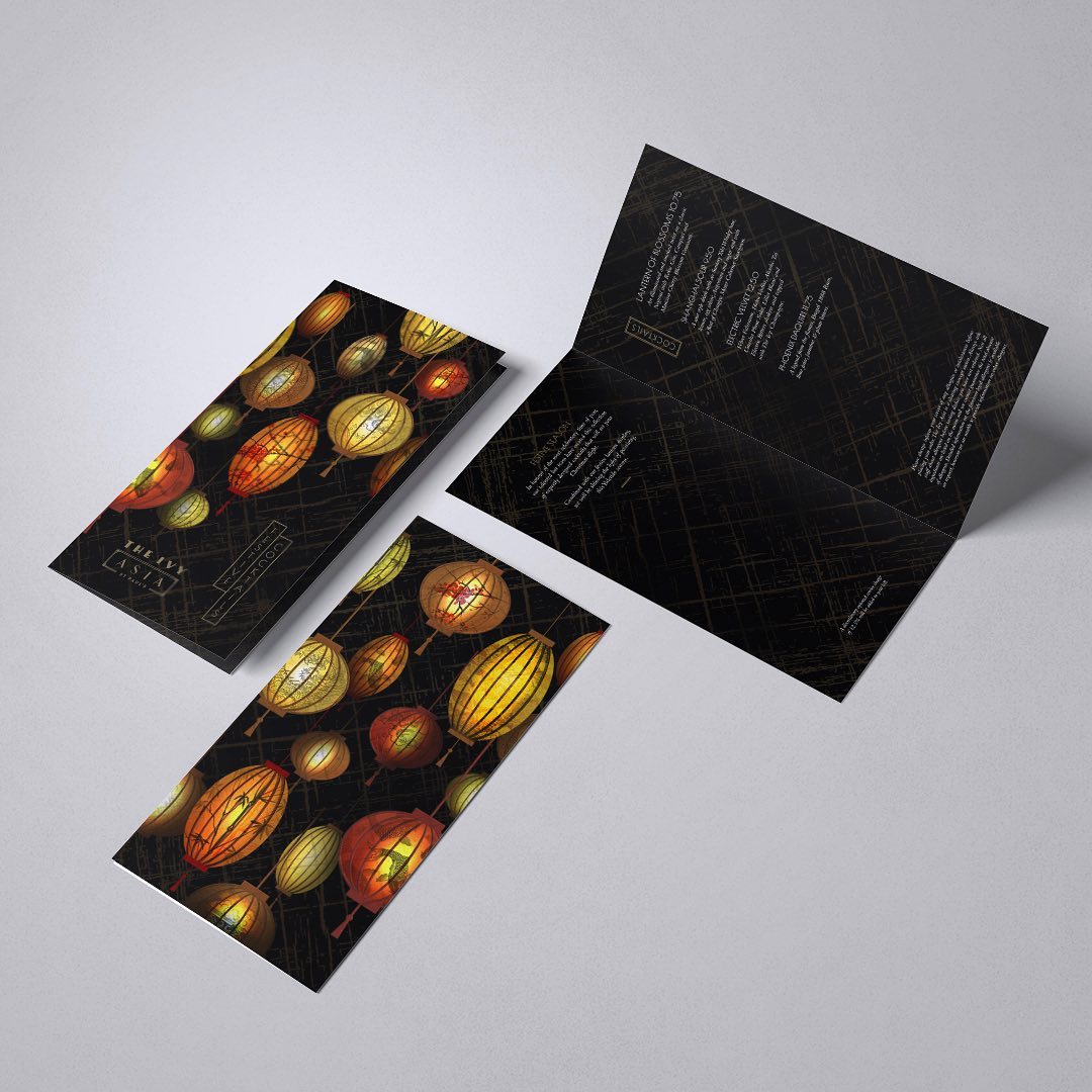
As The Ivy Collection’s creative partner, we work on a regular basis with their team to create and produce their suite of menus. As an iconic restaurant brand, these menus are an integral part of their brand vision and guest experience. We support their team with seasonal menu changes and any event and promotional menus throughout the year.
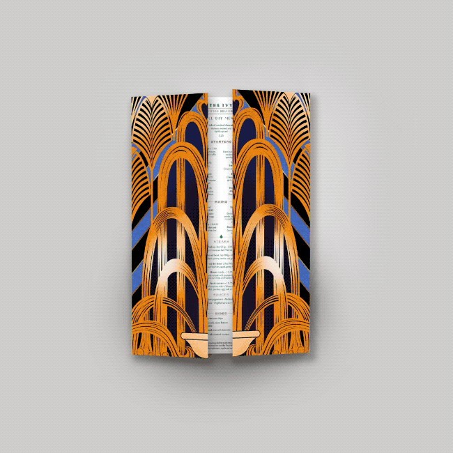
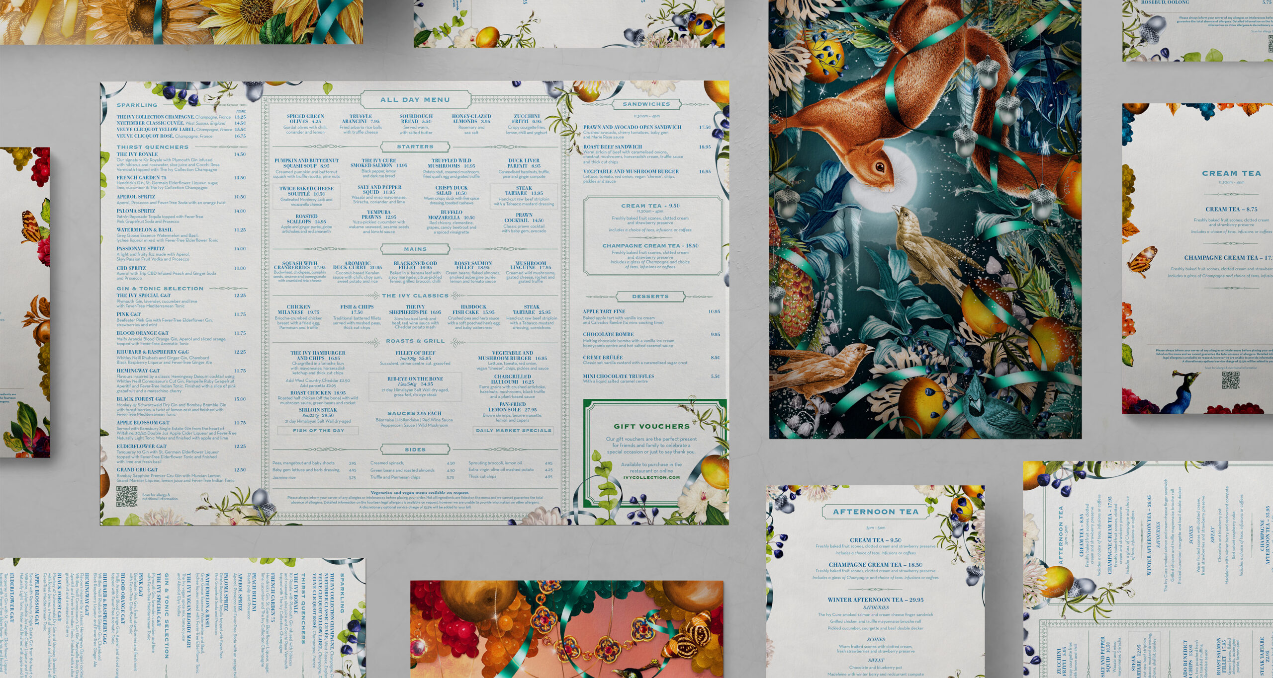
As an integrated part of the process, we work alongside The Ivy Collection’s brand & marketing team, food & beverage team and their Chef’s. The stunning illustrations created by Adam Ellis bring the seasonal menu changes to life and the print by IPW1 is meticulous and super-organised as these pieces are massively time sensitive. We’ve also been involved in creating some of the illustrations created for bespoke menus within our team at Curate.
These menus really exhibit the true ‘art of a menu’ and how a menu is a sensory, tactile part of the brand and guest experience. The production process is constantly being refined and improved, with a strong focus on team-work between the in-house team, printer and ourselves. The term ‘well-oiled machine’ describes this creative process perfectly, as it’s no mean-feat to turnaround such a vast amount in such a short period of time.
We think the results show the dedication all round and it brings a smile to our faces to witness a guest at The Ivy peruse the à la carte successfully.
Hotel Group Rebrand and Development
featured

- Brand support
- Menu design and creation
- Project management
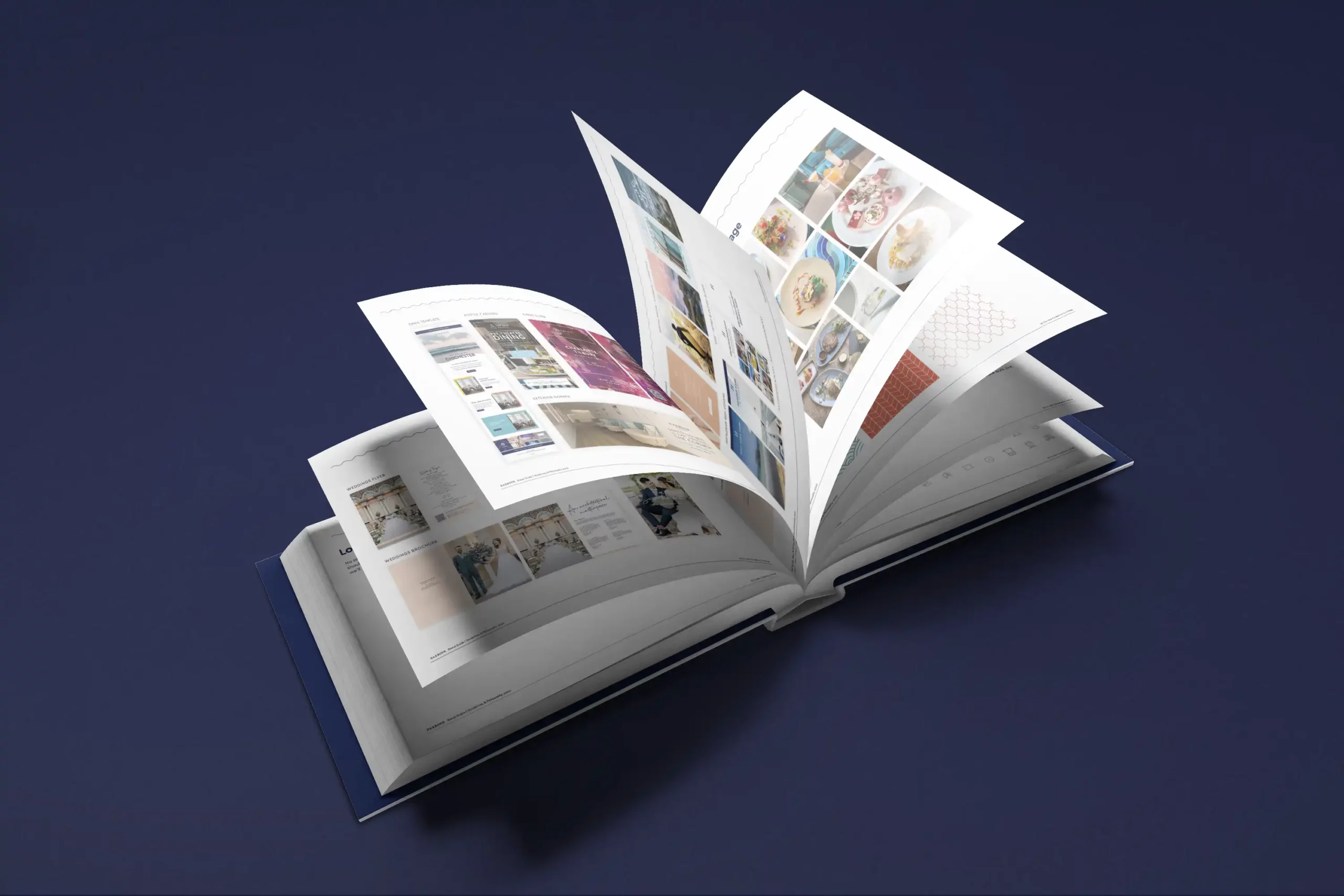
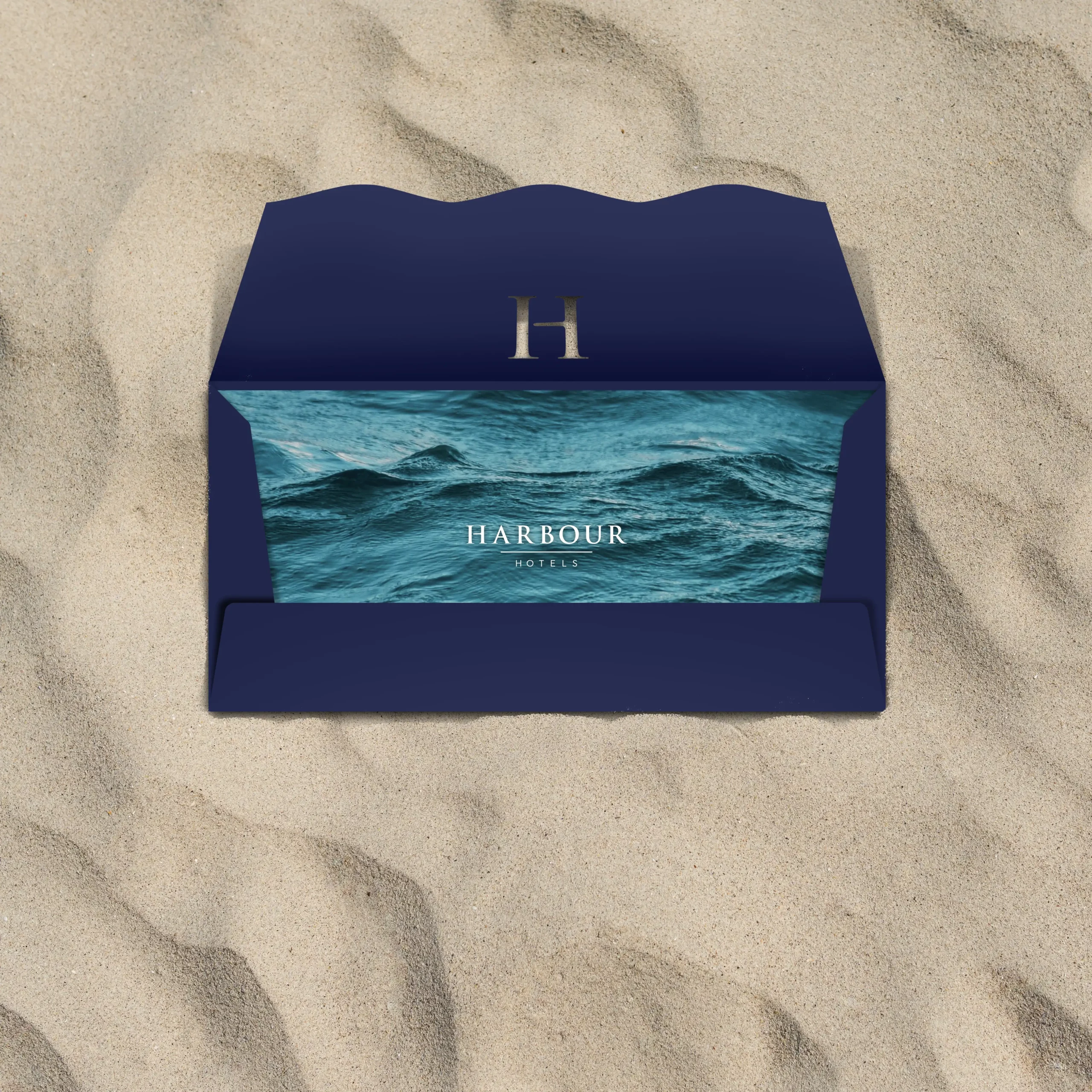
Harbour Hotels is the UK’s largest independently owned hotel group, with 15 locations across the South of England. We work together with Harbour Hotels as their creative partner. Initially, we were asked to come aboard to look at developing their overall brand and produce a full and extensive set of guidelines, which we were delighted to be involved with.
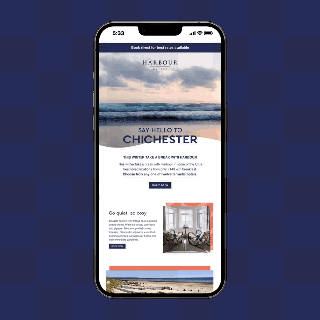
These guidelines as with any brand, evolve with time and working with their brand and marketing team we ensure these are kept up-to-date and relevant. We work as regular support to the brand from creation of top line campaigns to day-to-day menus and social media campaigns and assets.
As part of the guidelines, we have created colour palettes, usage of typography and designed pattern assets. We’ve also worked on the tone of voice which we feel is integral to any brand and this is carried across any campaigns, messaging, and the website.
Within the guidelines we have kept room for creative scope, so there is always brand consistency, but range for creative ideas and executions some of which are pictured here.
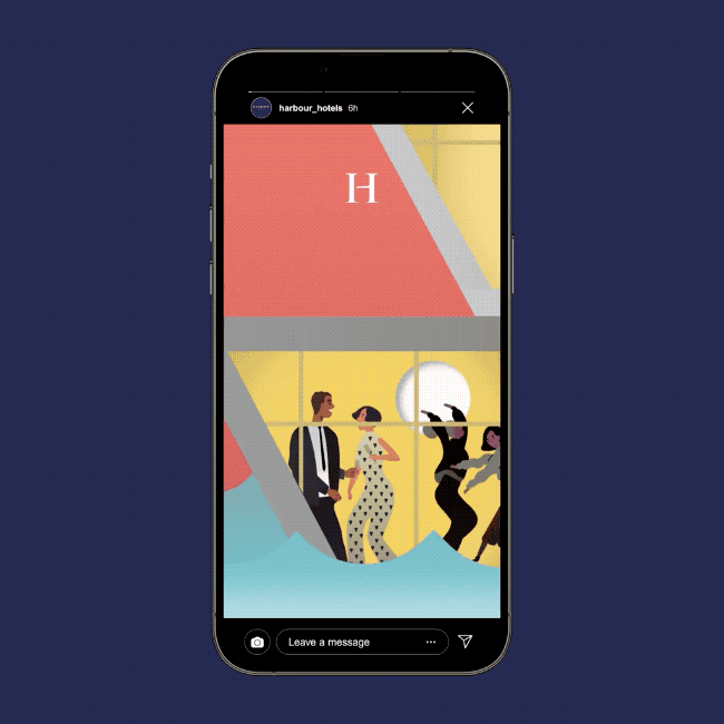
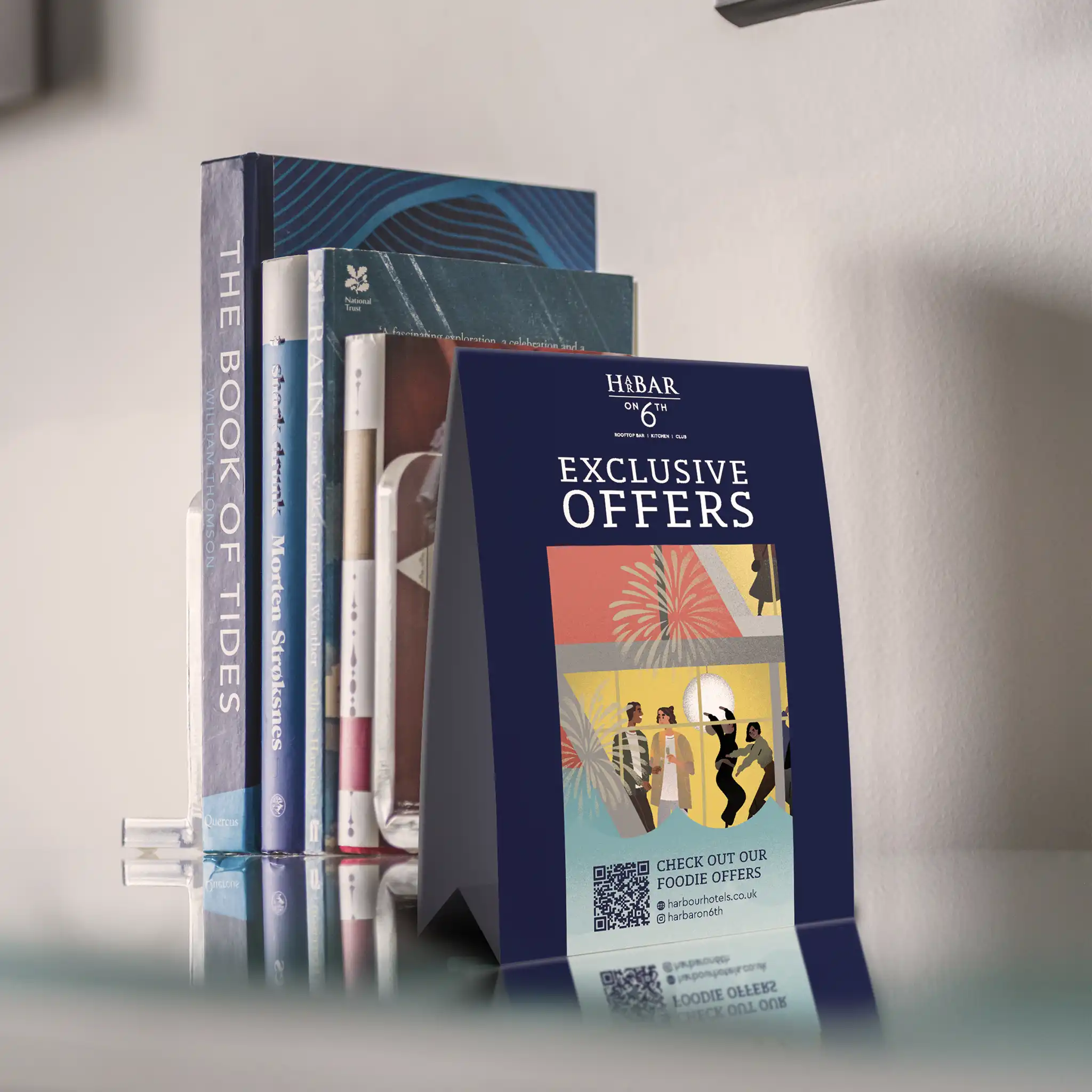
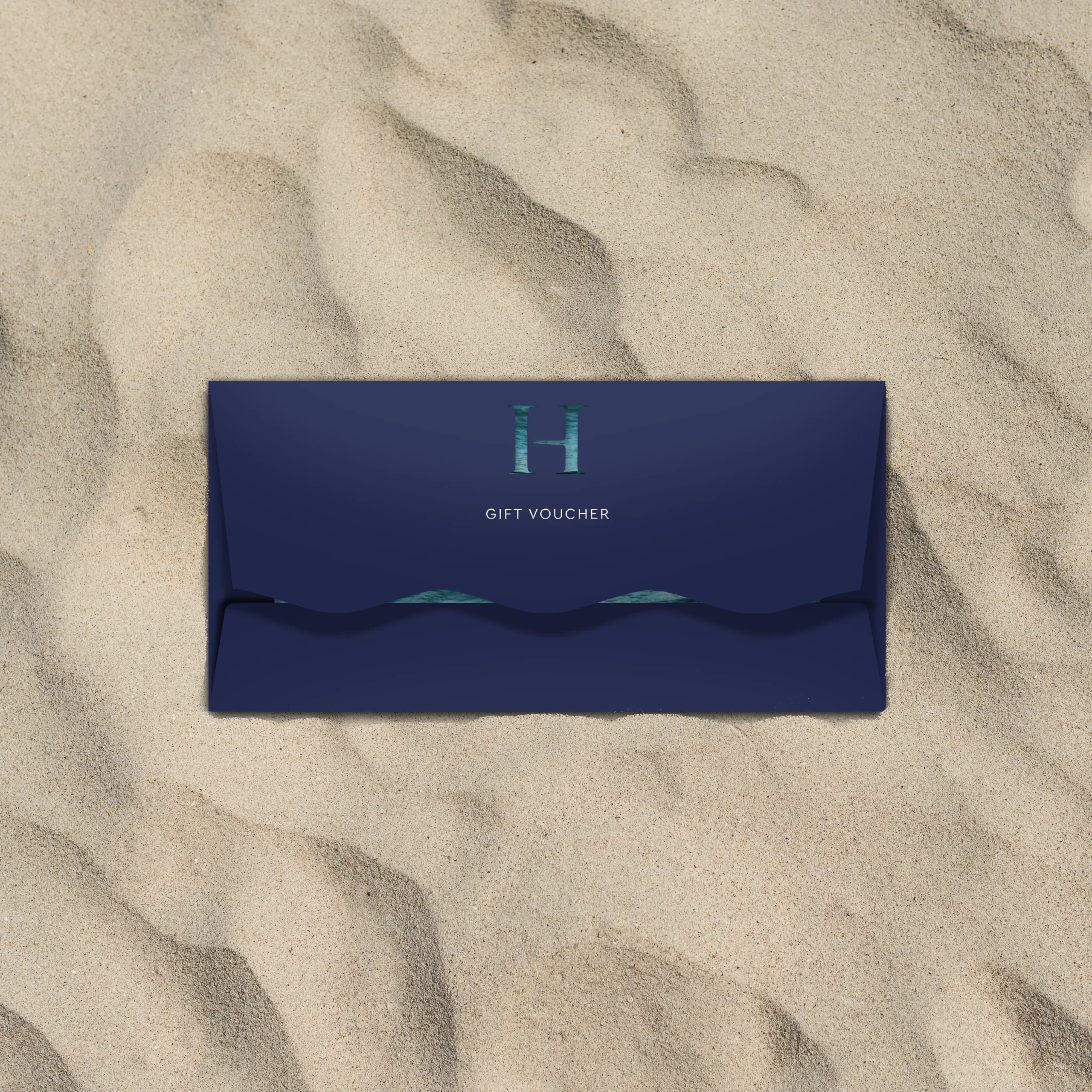
We have created illustrations for specific campaigns and then animated these over social assets. We’ve created gift cards and wallets that feel special to the recipient.
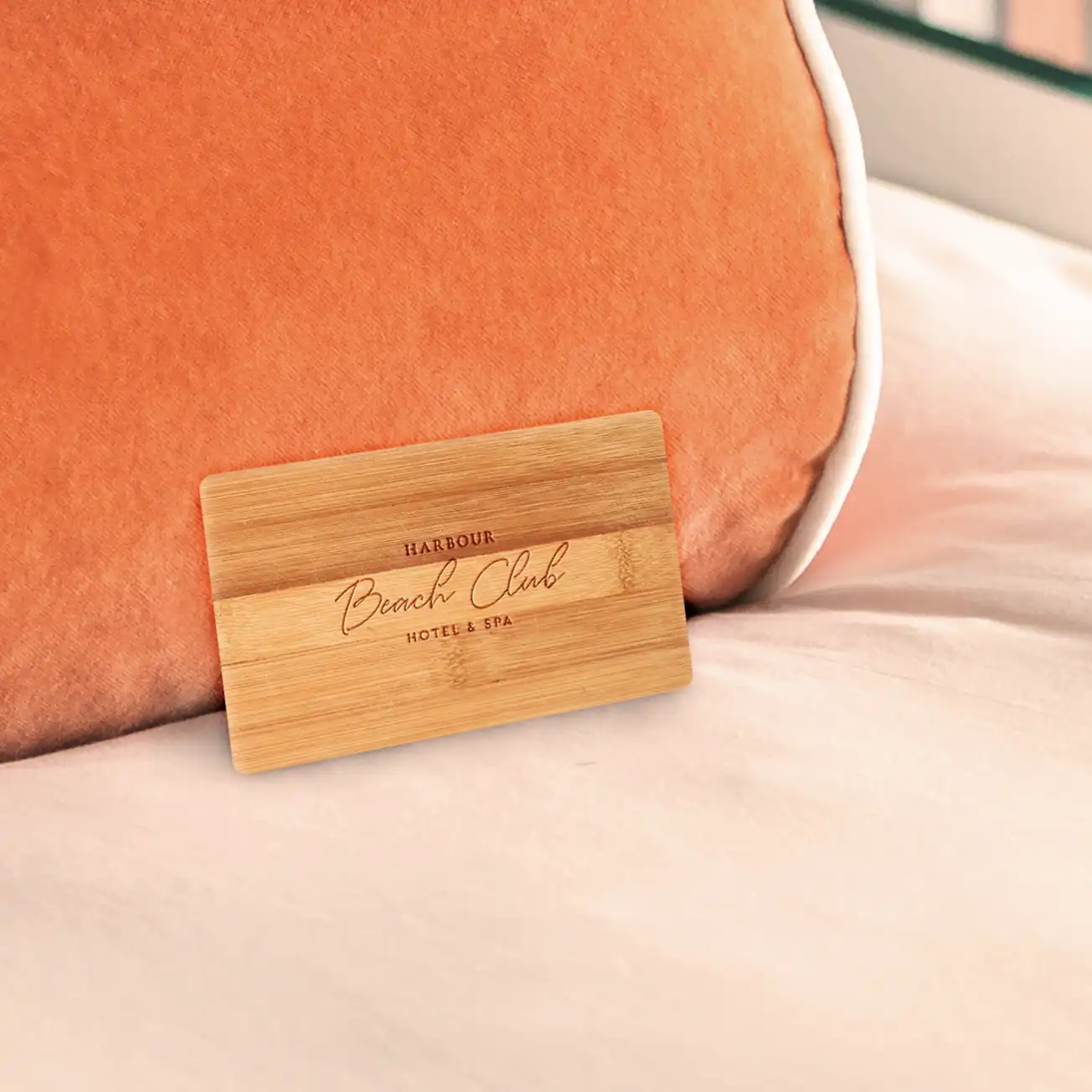
We work extremely closely with the brand to make sure their philosophies and beliefs are translated, such as the key card that is sustainable and created from bamboo. As it is one of their philosophies to be as plastic free as possible especially being largely coastal in location.
Watching their growth and being part of their development is something we’re extremely proud of.