Pink Lane Coffee Collective Brand Refresh

Packaging

  • Branding
  • Operational items and menus
  • Website design and implementation
  • Brand social assets
  • Merch design
  • Packaging

We were asked if we could work on developing the Pink Lane Coffee Collective brand. Being established for a while, they felt it was time in their business journey to refresh and unite their identity, unify messaging and create a consistent brand language that represented their offering, beliefs and purpose.

As a regular customer of Pink Lane Coffee since its opening in 2012, we’ve seen this company grow over the years to become an established part of the community. Forming a Collective, the four members have created an established coffee business, not just providing the locals with their daily caffeine hits, but also roasting their own, supplying wholesale and retail, and becoming a destination coffee stop for anyone visiting the city of Newcastle.

Following discussions with the PLCC team about their business drives, vision for PLCC, and the values they wanted to stand for, we understood it was vital to represent the four key individuals as one collective and that they all brought their own unique skills whilst working together as part of a unified force. The branding needed to be real, down to earth, unpretentious and contain a nod to retro design styles and colours.

After some in-depth research, we discovered that amongst other interesting features, the building that they are based within, used to be a camera shop. Of which film packaging at the time had some very distinctive colours and shapes. This style resonated well with the team, and within it we could create a modern take on this style, developing a set of patterns with one hero pattern that represented the four members of the Collective.

We created a colour palette influenced by the camera shop era, with a modern twist, and a base palette that could then hold a variety of colour combinations to distinguish different coffees on packaging labels and across socials and website.

The completed brand pack resulted in a flexible set of brand assets and a visual brand language that works across everything from packaging, to shop signage, social content, website design, merch including tote bags, tees and mugs, and their menu, and sale product manuals.


Interested to see how we can help your brand?

Get in TouchSee More Creative

Interested to see how we can help your brand?

Get in TouchSee More Creative

Brand Chocolate Packaging

Packaging

  • Creative packaging design
  • Project management
  • Brand strategy

Studio 28 Patisserie is the home of Naomi and her wonderful world of sweet treats. A boutique artisan chocolatier who creates works of edible art. After working on developing Naomi’s brand and website, we were asked to design and align all of the brand’s packaging to elevate the style and quality to be worthy of the high standard of the goodies inside.

We assessed all of the types and sizes of packaging so that we could align it all and make sure it was created efficiently. Working with a local printer we sourced packaging materials from sustainable sources and materials that have been fully carbon offset.

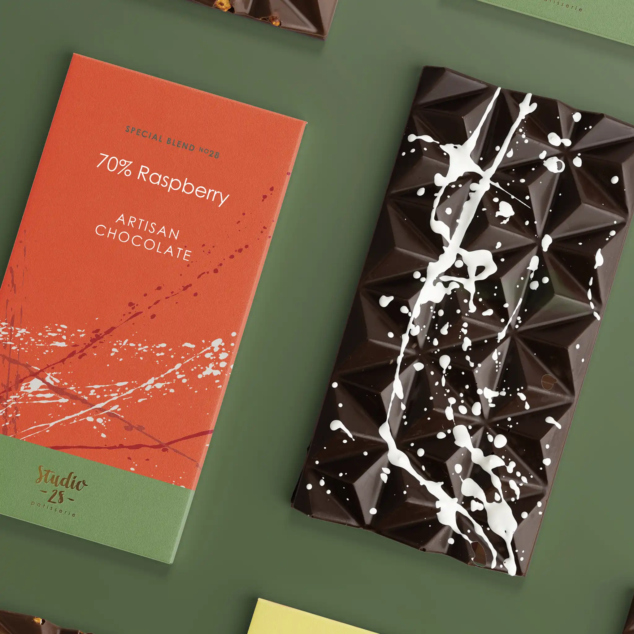
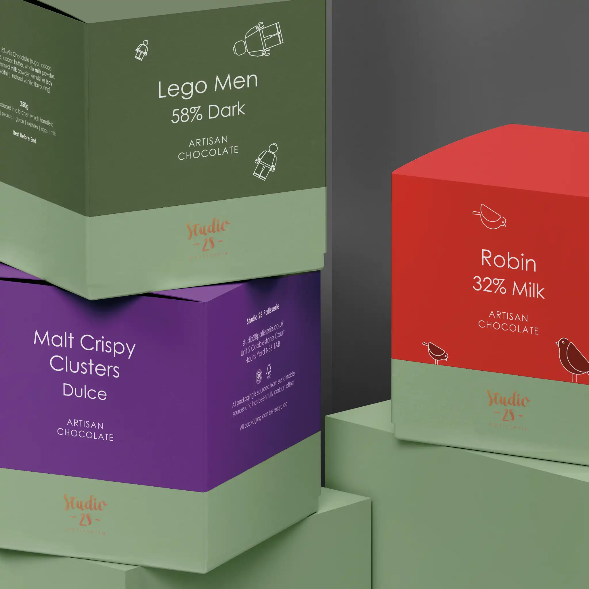
We wanted the design of the packaging to have a creative feel that was personal to Naomi as she puts her heart and soul into her creations. So we developed the beautiful splash effects she uses on her chocolates, and used a variety of these across the packaging. We created a colour palette to represent each flavour and chocolate type, and also created little illustrations for the boxes that included ‘fun’ elements inside such as lego men and Christmas robins.

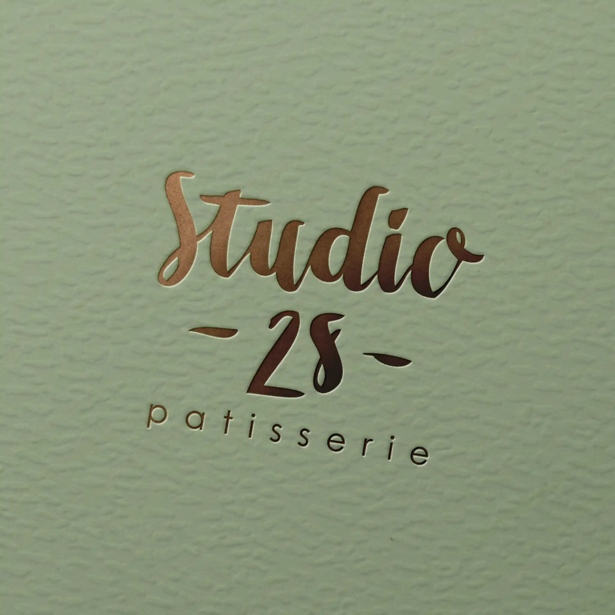
We decided to also foil the logo in certain positions to give the packaging a sense of luxury.

The finished result really works as a set on the shelves and on the website and we feel they now represent the quality of the product.

Interested to see how we can help your brand?

Get in TouchSee More Creative

Interested to see how we can help your brand?

Get in TouchSee More Creative